Open ganar opened 10 years ago
I'd be in favor of other charts as well.
I really think it's messed up that "dashboards" only hold relative metrics to the current time. Graphing is an area where one expands on statistics, preferably with high resolution.
It literally took me reading the code to figure out that only one value is passed to sparkline at a time. That somewhat skews the init metric, since preloading of values aren't supported either.
I'd really like to see simple area and bar charts, and that I get to decide how many datapoints I'm hydrating to the graph this update interaction.
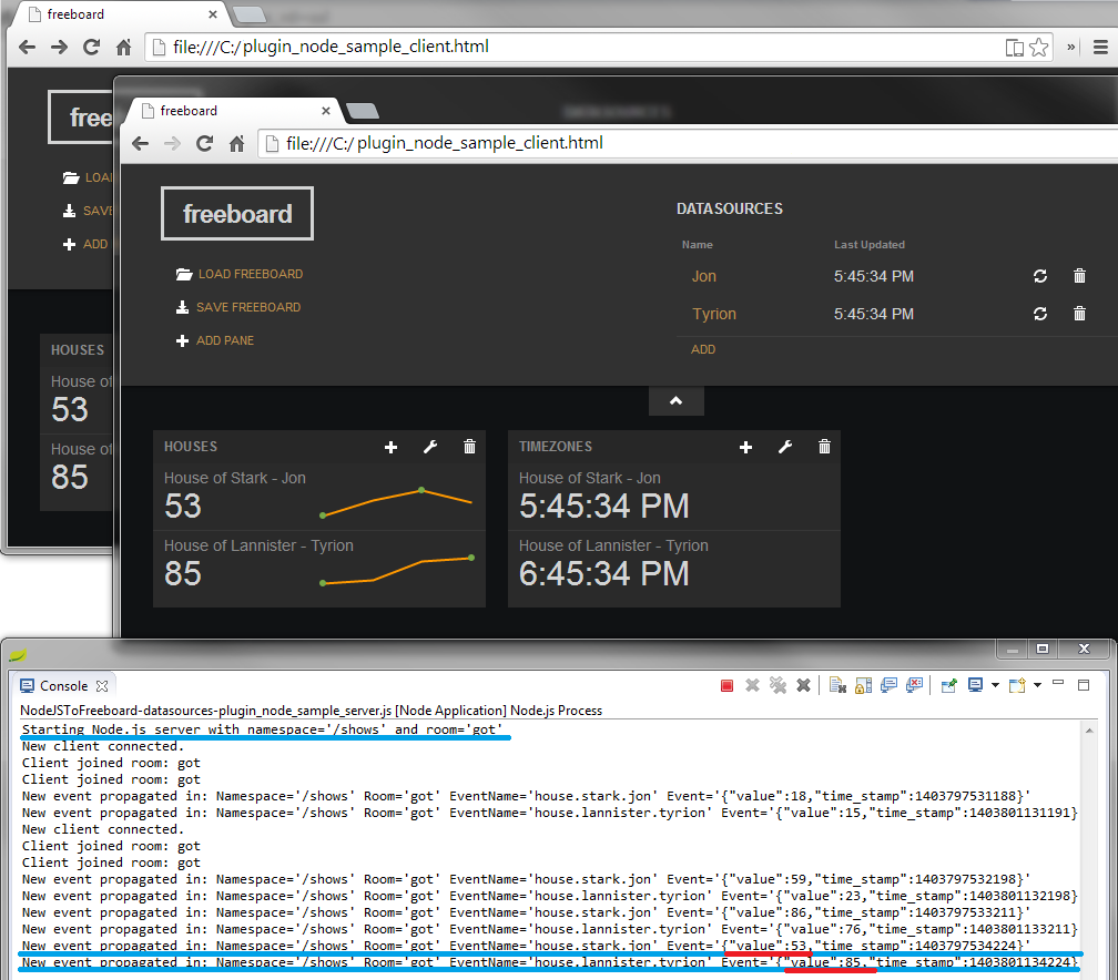
It maybe because the intent of the tool is not to be Geckoboard or Ducksboard but something to connect data generated from a small experiment or devices in the house.
I will experiment and try to build some of the widgets I need
@ganar well, as far as I can search, it's the only open source one, well, partly. I just don't see how I'm supposed to visualise metrics without either losing resolution or continuity.
But please share if you have anything. <-- everyone.
@uitgewis I just found this higchart plugin implementation for Freeboard (yai!) by @hugocore. The problem is that the documentation is thin.
Buried within the directories of the code is this picture, but it seems that the author is more interested on building a way to interact with the datasources than with the charts
Hey @ganar! Actually the reason for the lack of documentation is because that plugin is still in development. That picture belongs to another plugin "freeboard-node.js". I will see if in the following days I can finish things up and add some documentation about this plugin.
The plugin I am working on has line charts and pie charts widgets.
@hugocore Please do, will be much appreciated.
Also, we are working on an implementation based on http://nvd3.org/ in another branch. I am a big fan of Highcharts as well, but we don't want to take on a dependency on something that is not free for commercial use. But please continue the awesome work and share! Thanks for the support.
@jheising , actually I would like to have your feedback on some issues that I had with this plugin. You see, one idea is to have some sort of time series line chart, so one can see the progression of various datasources over time. Another idea is to have pie charts to compare several ratios quickly.
No matter what, there is always a need to have several datasources feeding one widget. This can be an arbritary number of datasources and therefore it complicate things with the current approach to configure widgets. At the moment widgets have one "calculated" field to reference ONE datasource. The optimal solution would be have a "array" field to allow the user to choose a set of datasources easily. The problem is that the library does not subscribe to update events with this type of fields.
The other issue, is that sometimes there is a need to update the widget based on two fields. For example, for the time series widget, there must exist an field for "timestamp" and another one for "value".
My solution so far is to have a fix number of "calculated" fields on the settings popup, each with two more "text" fields, to specify the name of the JSON fields for timestamp and value. But with the array field, everything would be some much easy, with each row having 3 fields (datasource, timestamp, value) and with any update event on any of those datasources, would call the update function and render the widget.
Looking forward to hear from you on all of these subjects.
Ps. In my case I had no trouble with the license because I developed this plugin during my master's thesis, thus I was using the non-commerce license. I leave you with a screenshot of what we accomplished. In addition, you can see the widgets that I just described before in action.
@hugocore you can try to mix the datasources before entering Freeboard (we did that for a project we are working on)
Somewhat offtopic: your Freeboard looks cool, but you do have to be more consistent with the description of the variables in general: the bar chart is great but it has no info regarding what the colors mean. This does affect the way the plugin is programmed
@jheising Im looking forward to the charts implementation
+1 for charts on the whole.
screenshot is great. highcharts is very cool would be possible to post a sample on how to use the plug-in?
thnx
Fyi...I built a charting plugin (based on jqplot) in case anyone is interested...
Oh that looks pretty nice. I'm going try that out when I get back in the offic . Thanks :) you should add it to the wiki as well.
can you help me in suggesting how to add Widget to show Date and Time.
Hi @hugocore thanks for sharing, looks like a very cool project! Could you share some of the code with us, especially for the Highcharts stuff? Thanks!
@jritsema How do i install freeboard-jqplot plugin in freeboard?
It doesn't recongnize the jqplot widget when I try it on google chrome. However, thanks for sharing
I found this plugin that has a great selection of charts: https://github.com/stufisher/freeboard-flot-extended
Sparklines are great for one variable, but it would be great to have other kind of charts available. What would it take to get a simple barchart with multiple variables working?