 ViralBShah
commented
5 years ago
ViralBShah
commented
5 years ago I love them all. Get me one of each please!
Closed cormullion closed 5 years ago
ViralBShah
commented
5 years ago I love them all. Get me one of each please!
ViralBShah
commented
5 years ago I like the vcat type pirate the best, followed by the dinosaur. Also being almost 40, I do know the DSOTM prism. Pretty cool idea!
Needs some mention of Julia or juliacon on the shirt.
 matbesancon
commented
5 years ago
matbesancon
commented
5 years ago The manifesto one is really cool, I don't know what would be the best format. It feels like a great poster to hang in a lab / office.
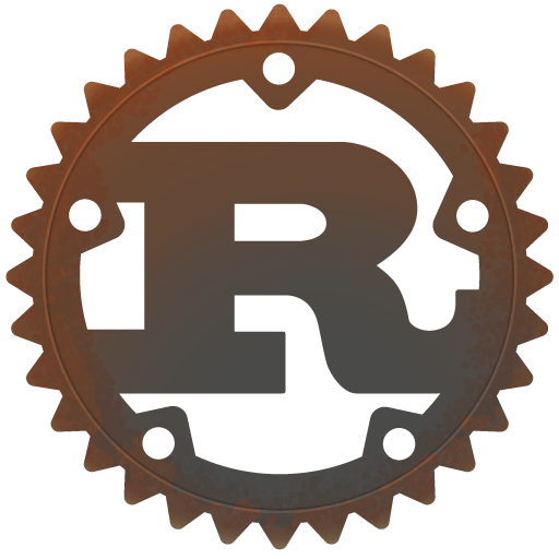
But the splat named tuples is terrific! Especially the red-ish version. It would be awesome as a sticker or TShirt. The only drawback is that it looks somehow similar to the Rust logo
 xorJane
commented
5 years ago
xorJane
commented
5 years ago These are so great! I especially love the splatting of Named Tuples t-shirt! Also all the sticker ideas.
 ararslan
commented
5 years ago
ararslan
commented
5 years ago These are wonderful. Great work as always, @cormullion. I agree with Mathieu that the splatting named tuples design looking a bit too reminiscent of the Rust logo though.
For the JuliaCon 2019 images, my favorite is the very top left, X[1,1], followed by X[4,3] and X[3,3]. For the "even more" images, I love the radio waves and colored BikeShed.jl.
 cormullion
commented
5 years ago
cormullion
commented
5 years ago Thanks!
I added another take on the hipster badge, to avoid re-inventing the Rust logo's wheel.
I was also trying to think of a "one-indexing" slogan, but couldn't.
ararslan
commented
5 years ago I really like that new one. The best one-indexing slogan I can think of is "My indices start from one," which kinda sucks. :grimacing:
ararslan
commented
5 years ago The one issue I have with these is with the Jurassic Park parody: 1. are there copyright concerns with the design? and 2. people don't really call Julia "JuliaLang," and hopefully they don't start doing so...
cormullion
commented
5 years ago 1 - Probably not, it's most likely covered under fair use/transformative/parody, and you can't copyright ideas (it's just using colors and shapes that remind you of the original anyway). 2 - Fair point; it probably wouldn't work without it though...
(I'm not attached to it - it was a stretch, so the concept probably doesn't have legs ... 🦖🦕🦖🦕 )
 StefanKarpinski
commented
5 years ago
StefanKarpinski
commented
5 years ago So I quite like the prism, the Illuminati and the one based on the Joy Division pulsar cover art. I also like the less Rust-like tessellation image, although I don't really care that much for the "I splat named tuples for breakfast"—I don't really get it, is that a thing that people do in Julia programming that much? Some thoughts:
cormullion
commented
5 years ago I don't really get it
:) It's just a placeholder, a temporary Lorem Ipsum, but I thought it was quite funny, for some reason. Rejected alternatives included "One language to rule them all", "Just My Type (system)", "Make Arrays Great Again", "Snakes. Why does it always have to be snakes?", "Linter is coming", "Resolving Ousterhout’s Dichotomy since 2012", etc. so you see why I opted for that one.
StefanKarpinski
commented
5 years ago It's just a placeholder, a temporary Lorem Ipsum, but I thought it was quite funny, for some reason.
Ah ok. Yes, it is amusing :)
matbesancon
commented
5 years ago +1 for the tessellation one
StefanKarpinski
commented
5 years ago Slogan brainstorming...
ararslan
commented
5 years ago "All your arguments are belong to dispatch"
matbesancon
commented
5 years ago Dispatch me if you can
On Tue, May 21, 2019, 19:50 Alex Arslan notifications@github.com wrote:
"All your arguments are belong to dispatch"
— You are receiving this because you commented. Reply to this email directly, view it on GitHub https://github.com/JuliaCon/www.juliacon.org/issues/186?email_source=notifications&email_token=AB2FDMQULHQQFXGMTY7CM63PWQY5TA5CNFSM4HN4EEY2YY3PNVWWK3TUL52HS4DFVREXG43VMVBW63LNMVXHJKTDN5WW2ZLOORPWSZGODV4VRSA#issuecomment-494491848, or mute the thread https://github.com/notifications/unsubscribe-auth/AB2FDMSQMSYT5DS6A7YGGY3PWQY5TANCNFSM4HN4EEYQ .
cormullion
commented
5 years ago Ignoring the slogan for now...
I varied some of the parameters of the tile design, found some interesting design axes:

StefanKarpinski
commented
5 years ago Oh man, I love these! I'm really a sucker for the colorful ones but the black and white ones look good too. These will make same great stickers and/or t-shirts.
ararslan
commented
5 years ago I think the light colors on white is my favorite design yet! Excellent work!
cormullion
commented
5 years ago Some suggestions from a Slack chat:
"what would white writing on black in these designs look like if you add color to the dots in the “Julia” at center"
and
"maybe if the tiles were themselves also coloured with the Julia logo colours?"

You get very little color for your money with the first suggestion... :)
StefanKarpinski
commented
5 years ago If we're springing for color, we may as well use it. So my vote would be for colorful (bottom row) and the first or second column since I think that too fine detail will not print as well as coarser detail. I suspect the second column hits the sweet spot between being printable and having an interesting amount of detail.
xorJane
commented
5 years ago Ohhh I love these! I prefer the second and later columns strongly to the first. I'm not totally sure how much detail is too much for printing. Perhaps the third column would also be okay if the image were large enough. :)
On Tue, Jun 11, 2019 at 11:10 AM Stefan Karpinski notifications@github.com wrote:
If we're springing for color, we may as well use it. So my vote would be for colorful (bottom row) and the first or second column since I think that too fine detail will not print as well as coarser detail. I suspect the second column hits the sweet spot between being printable and having an interesting amount of detail.
— You are receiving this because you commented. Reply to this email directly, view it on GitHub https://github.com/JuliaCon/www.juliacon.org/issues/186?email_source=notifications&email_token=ACRRSZZ7Q2EQB3UTDEF5JYLPZ7TAFA5CNFSM4HN4EEY2YY3PNVWWK3TUL52HS4DFVREXG43VMVBW63LNMVXHJKTDN5WW2ZLOORPWSZGODXOAVPA#issuecomment-500959932, or mute the thread https://github.com/notifications/unsubscribe-auth/ACRRSZY5QVZ4P5FDYA3YQHDPZ7TAFANCNFSM4HN4EEYQ .
 aviks
commented
5 years ago
aviks
commented
5 years ago Would the dinosaur one fall foul of copyright? I'm planning on getting stickers or magnets done for the joy division one. And I believe the kaleidoscope one is going on the T-shirt.
aviks
commented
5 years ago I can add the Illuminati one on our Numfocus swag store for people to buy? @cormullion do you have high resolution versions for all of these?
ViralBShah
commented
5 years ago Dinosaur one may be best avoided for copyright reasons.
cormullion
commented
5 years ago Wow, would be cool to see ideas become solid! Like the decisiveness, Avik.
(You’re probably wise to avoid dinosaurs. There’s no copyright material there, and you can’t copyright an idea, but when you’re spending someone else’s money it’s best to be cautious. 🤓 Being sued by Universal Studios (oops, shouldn’t have said that) would be something to tell the grandchildren though. It would look nice printed out and put up on the wall of a Hackathon, perhaps....)
I put some SVGs, PDFs, and PNGs here.
I spent some time this weekend assembling some graphics. Perhaps there are some ideas here which you can use; if not, no problem, it was fun anyway!
Square graphic
I like the current JuliaCon banner. However, it does have a high 3:1 aspect ratio, and occasionally you want something which makes better use of a square area, like badges or stickers. Here are a few ideas for more squarish graphics.
Of course, if you want to put a graphic on a pen, say, these wouldn't be very suitable!
More ideas
For designs that look good on t-shirts, it depends on whether you're printing in one color or many, and whether on dark or light colors.
A simple one-color idea like this:
looks like this when mocked up:
(Sorry about the slogan, I couldn't think of anything wittier...;) )
Simpler would be:
Edit
To avoid confusing Julia with Rust, here's a less wheel-like version.
Vcat the pirate cat is another single-color idea:
If you have text, it's nice to have one or more colors. For some text-based ideas, you could go with stuff like this:
or a little more stylishly:
Or even use this classic text from way back:
which could be converted to 1 or 2 colors on a dark background. You'd have people stopping you in the street asking to read your t shirt, though...
Even more
Moving slowly and inexorably into left field, we'd have things like this:
One for the physicists, I suppose:
I don't know what to make of this one:
but at least it works well on a t shirt; I've put an earlier version of this design on a shirt before, and it looks good on black or red. Being barely legible is half the point. 😂
Does this need color? It almost works in grey.
One minority that's not catered for often enough in the tech world is the Over-40s, so here's some ideas to provoke some nostalgic feelings. Fortunately, ideas are not subject to copyright...
This definitely needs color:
But this one definitely doesn't:
(the original used radio wave data from pulsar CP 1919, but this version just scans a rather noisy PNG version of the Julia logo.)
This one would definitely need color:
Yes, it's a bit of a stretch, I know. But the colors are nice.
So if there's anything here you can use, I can probably dig out an SVG or PNG or whatever.