Team's Response
The user is already in the gym station input portion of our application, as the error message is only thrown there. As such, the application is working normally.
Items for the Tester to Verify
:question: Issue response
Team chose [response.Rejected]
- [x] I disagree
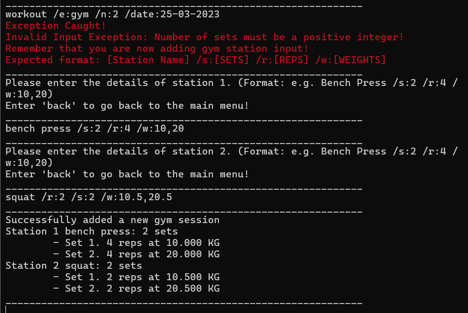
Reason for disagreement: The current exception handling within the application presents a user experience issue that I believe qualifies as a functionality bug. When a user encounters an error, the messaging sequence is critical for them to understand and rectify the issue. At present, the initial error message incorrectly states that "Number of sets must be a positive integer," which is misleading and does not pertain to the actual problem at hand.
The true error is revealed only after this initial, incorrect message, informing the user that the person is already in the gym session phase of the product. This accurate error message is unfortunately buried beneath three lines of red text, making it difficult for users to quickly identify and comprehend the issue.
The length and ordering of the error messages contribute to confusion and hinder the user's ability to promptly correct their input. This is not just a matter of poor user experience but a functional bug that impacts the effectiveness of the program. Users rely on clear and immediate feedback to navigate the application, and when error messages are convoluted or incorrect, it prevents them from doing so efficiently.
To address this bug, the error messages should be concise and ordered by relevance, ensuring that the most pertinent information is presented first. This will enable users to understand the nature of the error without sifting through unnecessary or incorrect information, thereby improving the overall functionality of the application.
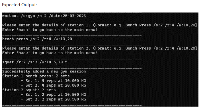
Expected behavior from UG
Actual behavior
While adding details of a gym session to the application, there is a extra error message being displayed which is confusing. The application does work as desired after this, but there is an extra error message throwing off the user.