Team's Response
Same issue as #296 about complexity and size of diagram
The 'Original' Bug
[The team marked this bug as a duplicate of the following bug]
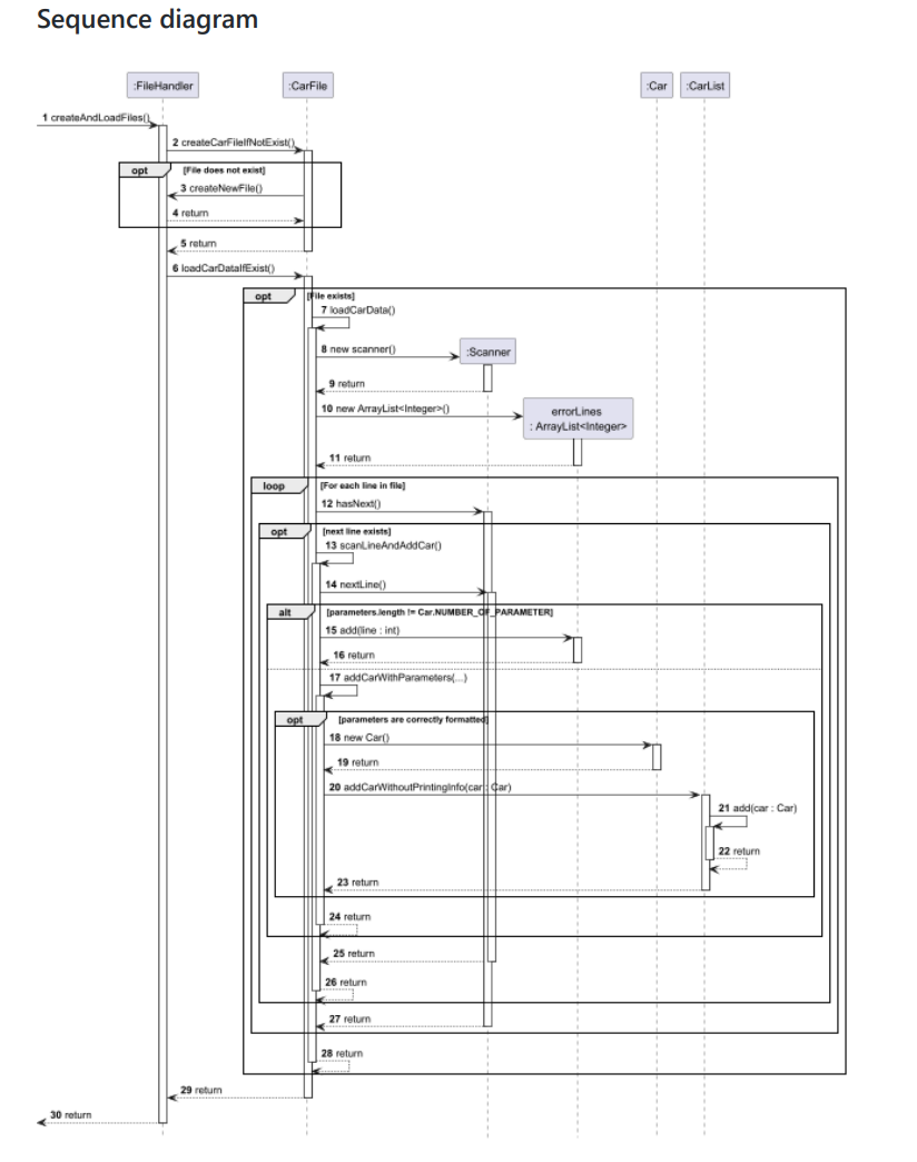
Sequence diagram is too complicated.
Description Sequence diagram is too complicated. Maybe it would be better to simplify it a bit?
[original: nus-cs2113-AY2425S1/pe-interim#495] [original labels: severity.Medium type.DocumentationBug]
Their Response to the 'Original' Bug
[This is the team's response to the above 'original' bug]
Thank you for hightlighting. The diagram was intended by the dev to give low level details and present it in a single diagram as shown. Since the bulk of this diagram is from the loop , opt , alt boxes which shows the corresponding conditions , simplifying it into a note or seperate it into two diagrams would have caused more inconvience to the reader instead e.g. having to scroll up and down on two seperate pages. Furthermore, the low-level details are laid out without much simplification due to the complexity and layers involved in the code and omitting details would definitely lower the understanding of the code for future developers.
While we agree the diagram could cause inconvience to the reader reading it due to its size, it does not cause major inconvience to readers reading the diagram since the diagram is correct. Thus, we feel it should be categorized as a cosmetic issue which is brought as a consequence of the size of the diagram alone thus a "very low" severity is more fitting compared to "Medium" since the reader could do things like zooming in if words are too small.
Items for the Tester to Verify
:question: Issue duplicate status
Team chose to mark this issue as a duplicate of another issue (as explained in the Team's response above)
- [ ] I disagree
Reason for disagreement: [replace this with your explanation]
## :question: Issue severity Team chose [`severity.VeryLow`] Originally [`severity.Low`] - [x] I disagree **Reason for disagreement:** The explanation for VeryLow flaw:A flaw that is purely cosmetic and does not affect usage e.g., a typo/spacing/layout/color/font issues in the docs or the UI that doesn't affect usage. Only cosmetic problems should have this label.

The DG has too much info (almost one page) in the sequence diagram of "Adding a customer" and "Creating file and loading file at the start of the program", which makes it hard read. Perhaps eliminating some detailed information will be better.