Team's Response
- Since it is a cosmetic issue, it should have been a "very low" severity bug.
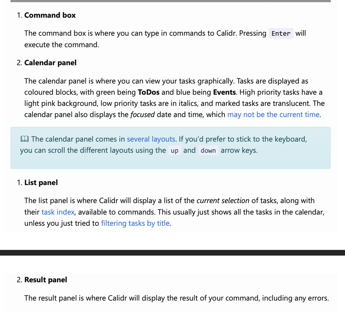
- However, we understand that this can make the diagram a little confusing, so it can be considered as "low" severity at most.
- That being said, the names of the panels and the diagrams are very clear so that any user should be able to differentiate between the list and results panels.
Items for the Tester to Verify
:question: Issue severity
Team chose [severity.Low]
Originally [severity.Medium]
- [ ] I disagree
Reason for disagreement: [replace this with your explanation]
Description: In the UI, under UI Terminology, the diagram follows indexing till 4, whilst the list below only follows indexing until 2 and then repeats again. This makes the diagram confusing.
Screenshot: