Team's Response
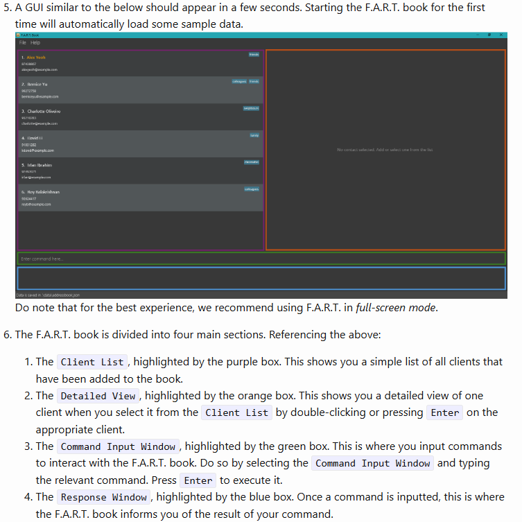
We believe that the purpose of the coloured boxes should be sufficiently highlighted in point 6.

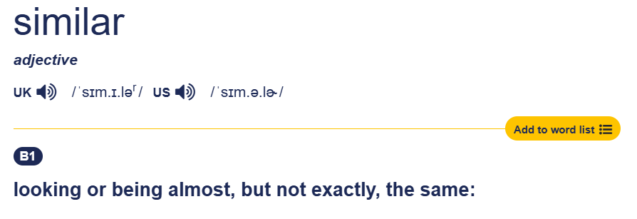
For your convenience, please note the definition of "similar", as per the Cambridge Dictionary:

Items for the Tester to Verify
:question: Issue response
Team chose [response.Rejected]
- [x] I disagree
Reason for disagreement: While I understand that the coloured boxes in the screenshot are intended to highlight the different sections of the GUI, the user guide introduces a significant inconsistency that can confuse users. The guide explicitly states that "A GUI similar to the below should appear in a few seconds," but nowhere does it mention that the coloured borders are added solely for illustrative purposes. This omission leaves users to assume that these borders are part of the actual GUI, creating a false expectation.
The user guide is a critical resource for users, especially first-time users, who rely on it to understand and navigate the application. When the application does not match what is shown in the guide, it creates unnecessary confusion and undermines the user’s trust in the guide. The inclusion of coloured borders in the screenshot without any clarification misleads users into expecting these visual elements, which are completely absent in the actual interface. This inconsistency detracts from the guide's ability to support users effectively.
Although Point 6 attempts to explain the purpose of the coloured boxes, it does not clarify that these boxes are not part of the actual GUI. The lack of such clarification further reinforces the impression that the screenshot accurately reflects what users will see. Referring to the definition of "similar" also does not address the issue. The coloured borders are a prominent visual element in the screenshot, and their absence in the actual application makes the screenshot inaccurate, not merely "similar." This misrepresentation creates a fundamental disconnect between the guide and the application.
For a user guide to be effective, it must align with the actual user experience. Any discrepancies between the guide and the application can create confusion, slow down the learning process, and reduce the overall usability of the app. The absence of clarification regarding the coloured borders makes this a flaw in the guide. Ensuring accuracy and consistency in the user guide is essential for providing a seamless and intuitive user experience.
The user guide states that
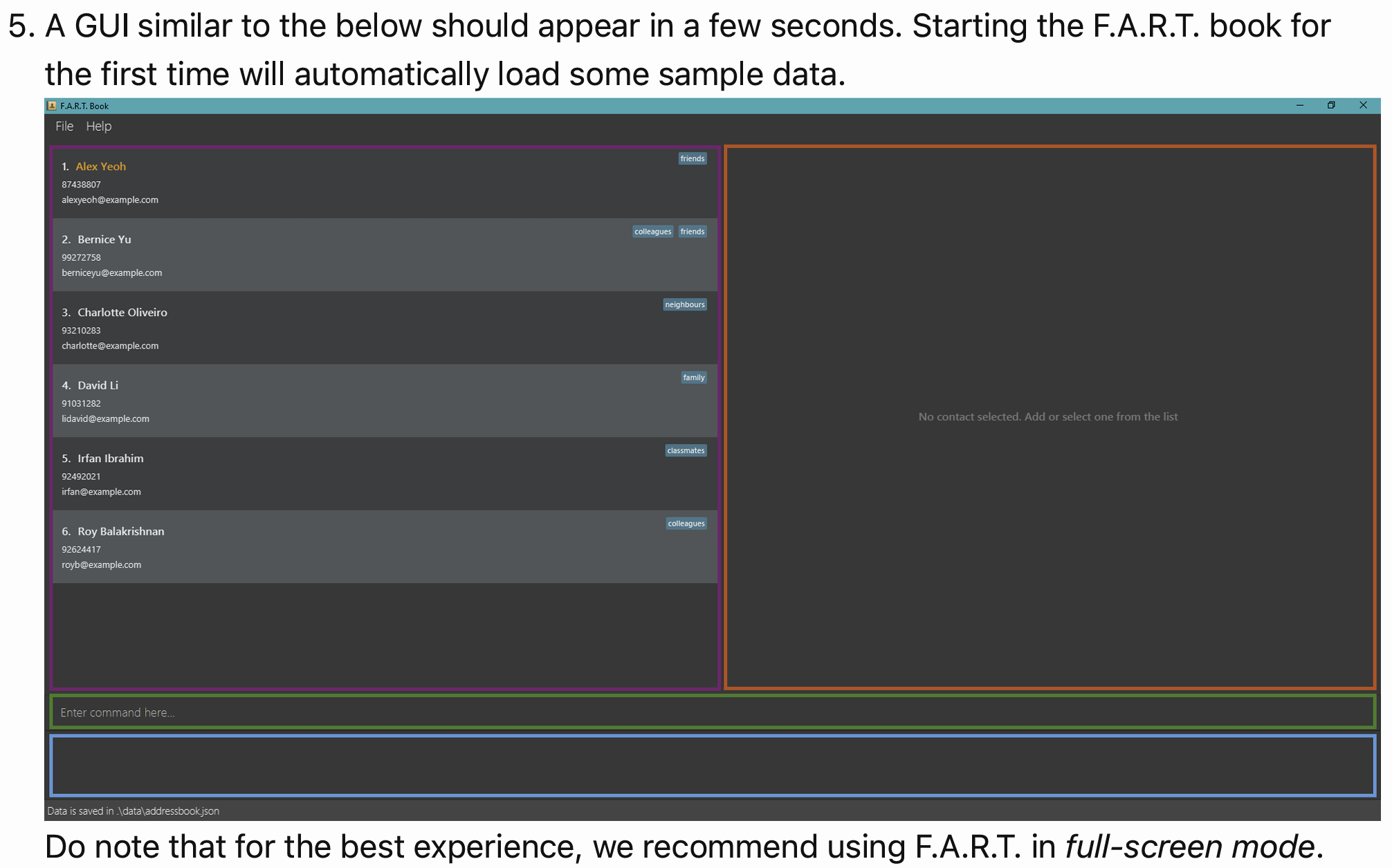
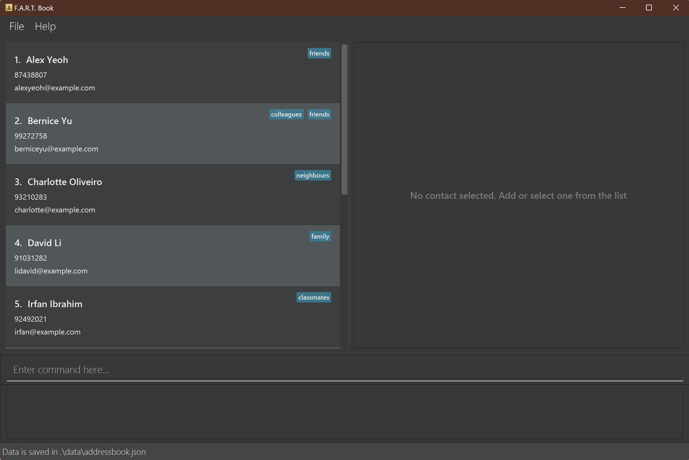
A GUI similar to the below should appear in a few seconds.However, there are no coloured borders present in the UI.Expected:
Actual: