Team's Response
No details provided by team.
The 'Original' Bug
[The team marked this bug as a duplicate of the following bug]
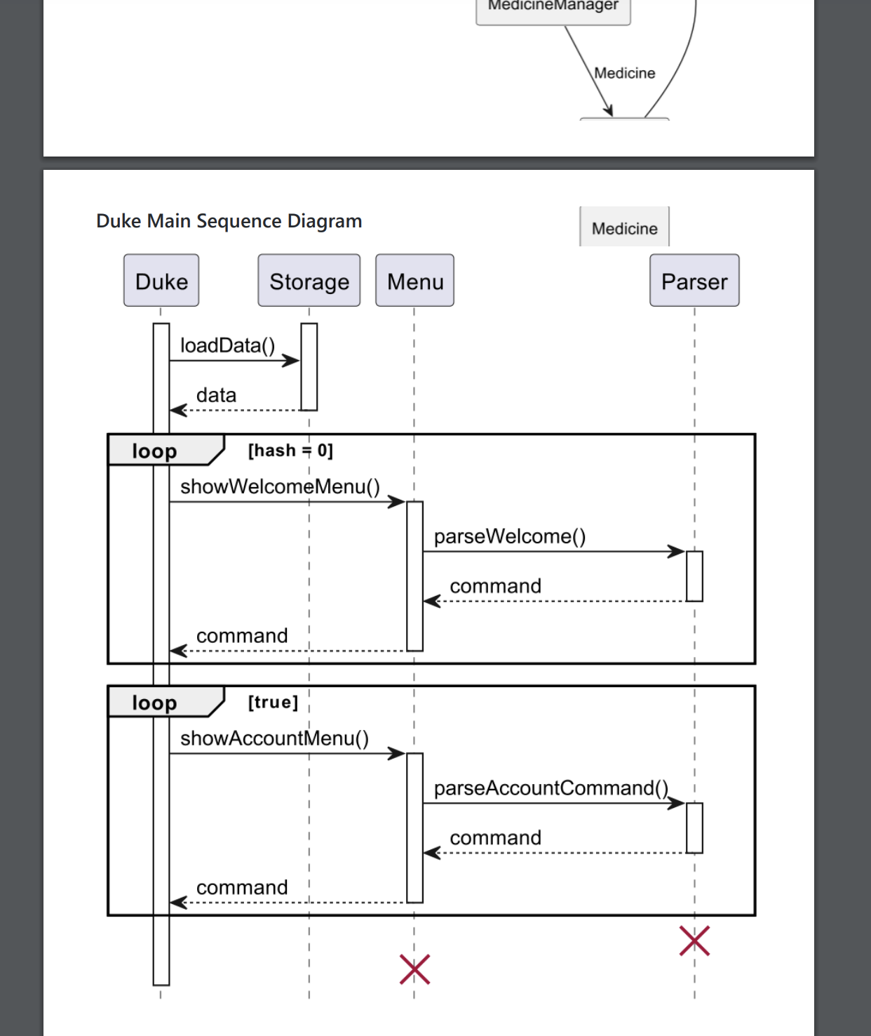
Confusing diagram DG
Note from the teaching team: This bug was reported during the Part II (Evaluating Documents) stage of the PE. You may reject this bug if it is not related to the quality of documentation.
One of the diagram is cropped, and there is no space between the other diagram. Are they (those two diagram) are related/the same diagram? or they are completely different? It leads confusion when developer read the DG
[original: nus-cs2113-AY2223S2/pe-interim#2553] [original labels: severity.Low type.DocumentationBug]
Their Response to the 'Original' Bug
[This is the team's response to the above 'original' bug]
This is a cosmetic issue and will accept if severity is very low as stated on module website.
Items for the Tester to Verify
:question: Issue duplicate status
Team chose to mark this issue as a duplicate of another issue (as explained in the Team's response above)
- [ ] I disagree
Reason for disagreement: [replace this with your explanation]
## :question: Issue severity Team chose [`severity.VeryLow`] Originally [`severity.Low`] - [ ] I disagree **Reason for disagreement:** [replace this with your explanation]


The first 2 diagrams provided in the developer guide have quite a confusing formatting with the bottom element of medicine from the first diagram cutting into the second diagram. Would it be better if there were more margins/borders around them?