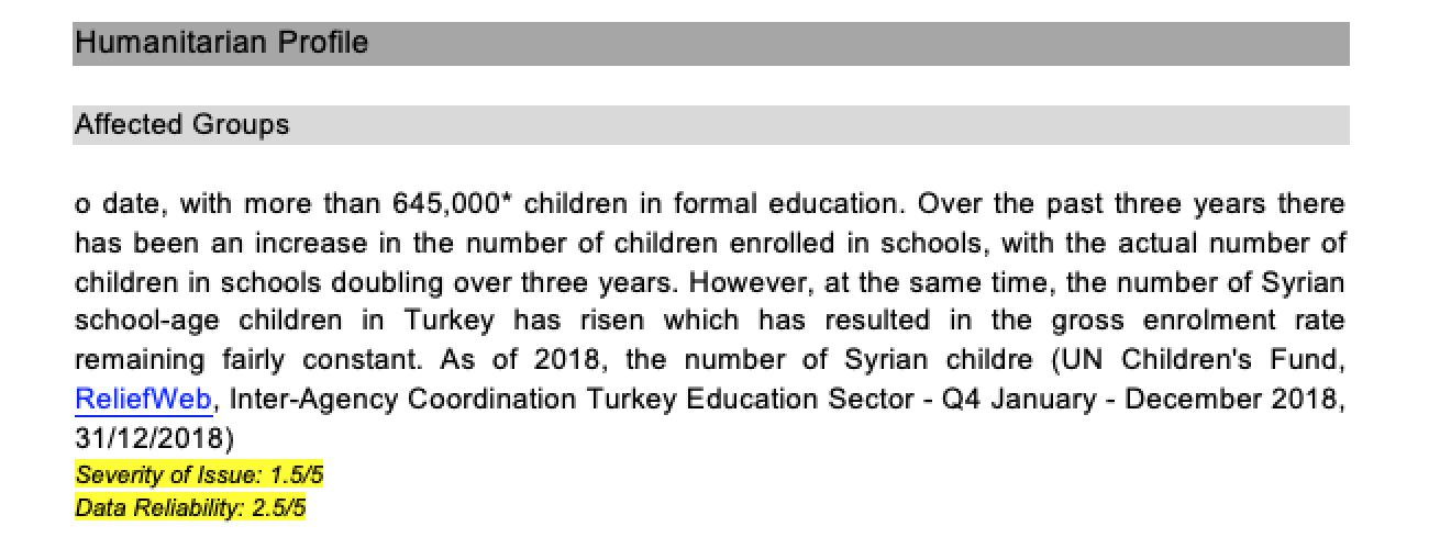
@eoglethorpe Some thoughts on the word doc legends. Hope addressing what you actually needed.
Challenge: Showing the legends on the top (unless the users are so used to that scale and what it represents, which I'm sure not all would, just taggers) is not very useful since once you go through the document you have no clue what darkish blue is, and you can't just keep scrolling up to match the color to what those mean.
Suggestion 1: If we want/need to keep the color scheme for the export, proposal to add a description next to each and place below the excerpt. Even if it's repetitive, we can make it small, but just as a reference and it's clearer what it is.

Suggestion 2: What would be even better is to specify what Severity is and what Reliability is and potentially replace the color with a different scale that is more explicit for the user, since they have a point of comparison, i.e. is it in the middle or high, etc. Having one color is not very clear, so may be just a number system or other.

20201006_DEEP_Entries_General_Export_Rw1FWAy.docx