 8bitPit
commented
2 years ago
8bitPit
commented
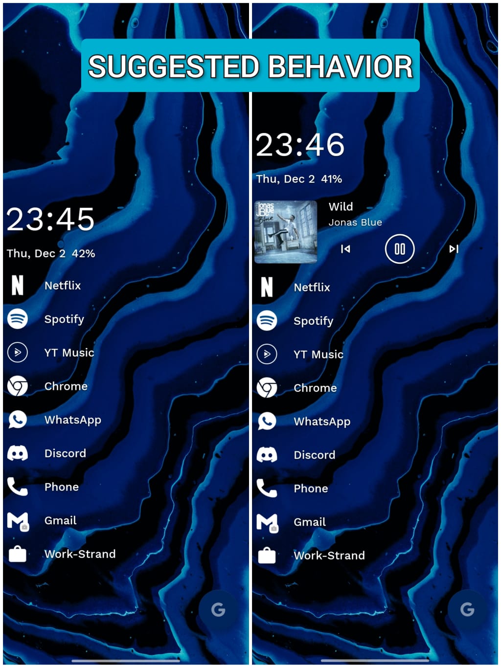
2 years ago As always, thank you very much for your very detailed report @Montell2099. I prefer the widget to move the favorites instead of Niagara's widget to keep all media player buttons easily reachable with one hand:
Why does the media widget push favorites to the bottom?
Instead of occupying the whitespace at the top, Niagara Launcher's media widget pushes down your favorites further down, and here's why: The upper whitespace has the purpose of reaching interactive elements on your home screen easier, including the playback buttons on the media widget. That's why it makes more sense that the widget shows up below the whitespace and doesn't replace it. [https://help.niagaralauncher.app/article/11-media-widget]
 Montell2099
 cjjadeja
 Foxtrot1604
 upnishad09
 JayMehta11
 piyushbz
 Oddward
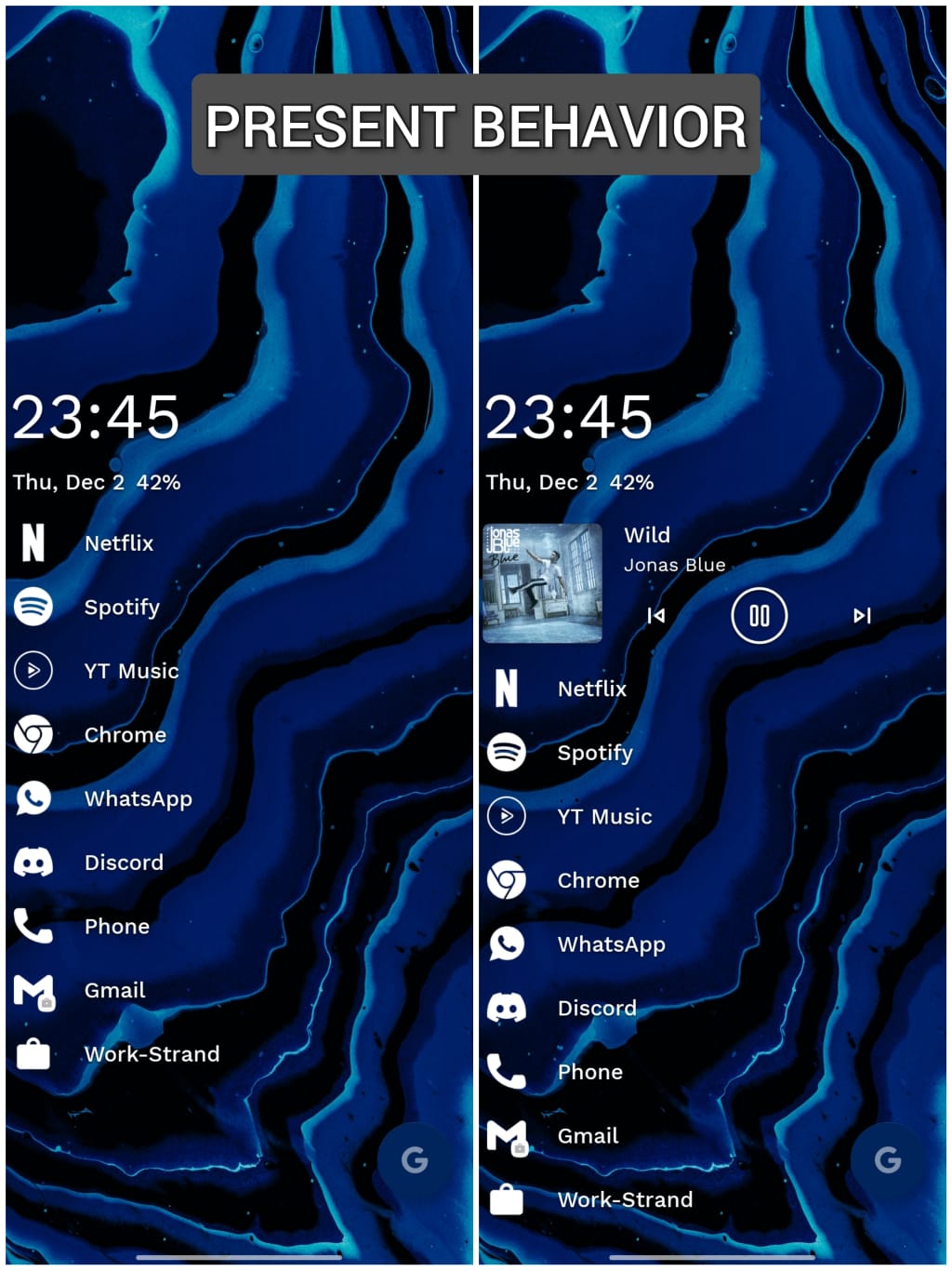
 ayushsharma140
 Amorphous404
I am quite fond of Niagara's media player, especially since the recent addition of the cover images' rounded corners.
However, when ending a media session the media player collapses & the app favourites jumps up a notch. This is problematic following the one-handed usage philosophy of Niagara.
– – – – – – – – – – – – – – – – – – – – Example 1, media player active
– – – – – – – – – – – – – – – – – – – – Example 2, media player dismissed and the favourite apps list is now significantly higher up on my screen real-estate
– – – – – – – – – – – – – – – – – – – – Example 3, how I would prefer the favourites to stay in place, and instead let the Niagara widget slide downwards once the media player is dismissed by the user
Instead of having an absolute positioning of the widget—and the favourites list sliding up once the media player is dismissed—I would love to see the opposite. For example, having the favourites stay static (parent) and the widget sliding down (child), or maybe somewhat in-between if a compromise is needed.
As of now the favourites become harder to reach whilst not having the media player active. This results in me almost never having the media player activated, even though I like all aspects of it in itself.
I am using a Pixel 2 on Android 11. Maybe my rather small display and somewhat low-resolution screen enhances this issue to a higher degree.
Cheers!