-
New base: 16px.
https://css-tricks.com/snippets/css/fluid-typography/
-
## Description
The Material UI Styles are applied to the wrong components on the 2nd render.
### Steps to reproduce
Clone the Repo here: https://github.com/Console32/BrokenCss
run `npm …
-
I noticed on my terminal that the Generating image thumbnails progress was taking too long and the count showing an unusually large number.
That was strange, because I only have 2 images in my proj…
-
I've recently updated our project's Bootstrap version to the latest (4.3.1). I'm importing all of Bootstrap via node_modules. I haven't modified the RFS mixin in any way. I'm using the version that sh…
-
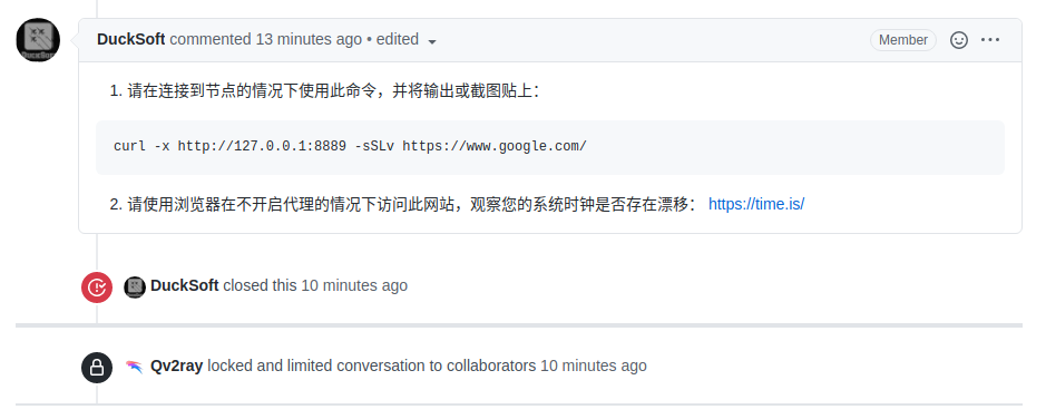
[原issue链接](https://github.com/Qv2ray/Qv2ray/issues/1450)
@DuckSoft

感谢及时答复!!
- 1
…
-
#8413 Description
I am trying to use `{data.allFile.edges.map(({ node })` to render multiple (local) images to a page, but I can't run `gatsby develop` successfully.
### Steps to reproduce
M…
-
Implement font-sizes which depend on the size of the viewport.
This provides a more fluid approach to responsive font-sizes/typography.
-
Enhance the [npm page](https://www.npmjs.com/package/bullframe.css) with keywords

…
-
## Description
In a Gatsby site with the `pathPrefix` option set, fluid images generated by `gatsby-remark-images` with WebP don't show (or show only the blur layer) in Chrome and Firefox.
For a…
-
- [ ] Viewport-based font sizing
For the initial rough version, I didn't create responsive, fluid typography. Find notes from Jason Pamental or Jen Simmons to adapt a method of viewport-based font …