Team's Response
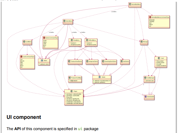
Hi, thank you for your advice. Since we would like to give a general insight of all classes, the diagram is small and hard to read. Sorry for that.
The 'Original' Bug
[The team marked this bug as a duplicate of the following bug]
UML diagram too small
Note from the teaching team: This bug was reported during the Part II (Evaluating Documents) stage of the PE. You may reject this bug if it is not related to the quality of documentation.
Text in image is much smaller than normal text in DG. Text is readable but pixelated.
[original: nus-cs2113-AY2122S1/pe-interim#1410] [original labels: severity.VeryLow type.DocumentationBug]
Their Response to the 'Original' Bug
[This is the team's response to the above 'original' bug]
Thank you for your advice!
Items for the Tester to Verify
:question: Issue duplicate status
Team chose to mark this issue as a duplicate of another issue (as explained in the Team's response above)
- [ ] I disagree
Reason for disagreement: [replace this with your explanation]
:question: Issue severity
Team chose [severity.VeryLow]
Originally [severity.Medium]
- [x] I disagree
Reason for disagreement: If potential developers are unable to read/understand such an important section of the document which dictates the skeleton of your entire code base, it may result in them being confused with your explanations in the other sections and may not be able to link well all the disparate components. Hence, I think it is important to increase the size of the diagram and rearrange the arrows much more clearly.

When reading the DG, I found it hard to understand the class diagram as the arrows were very confusing as they were crisscrossing across one another and the font size was really small to read. Possible suggestions would be to increase the font size and reposition each class of the class diagram to prevent arrows from interfering with one another visually for the reader's clarity.