 soc-pe-bot
commented
1 year ago
soc-pe-bot
commented
1 year ago Team's Response
No details provided by team.
The 'Original' Bug
[The team marked this bug as a duplicate of the following bug]
Font size of DG diagrams inconsistent
Note from the teaching team: This bug was reported during the Part II (Evaluating Documents) stage of the PE. You may reject this bug if it is not related to the quality of documentation.
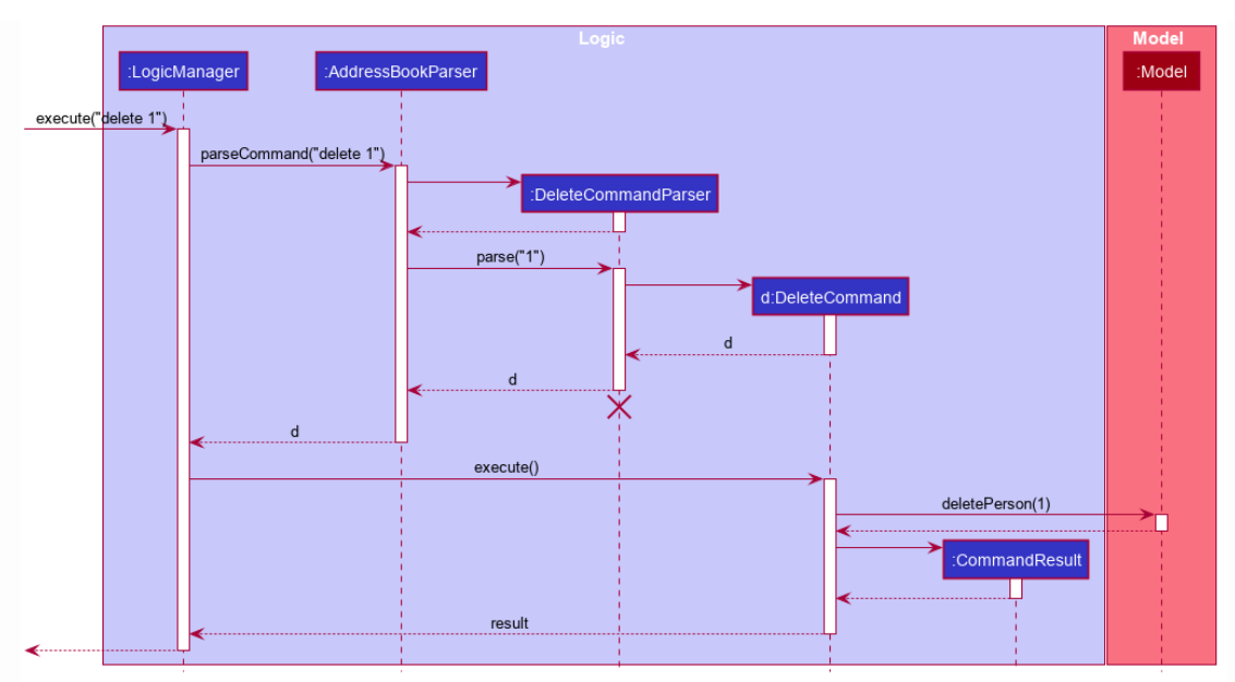
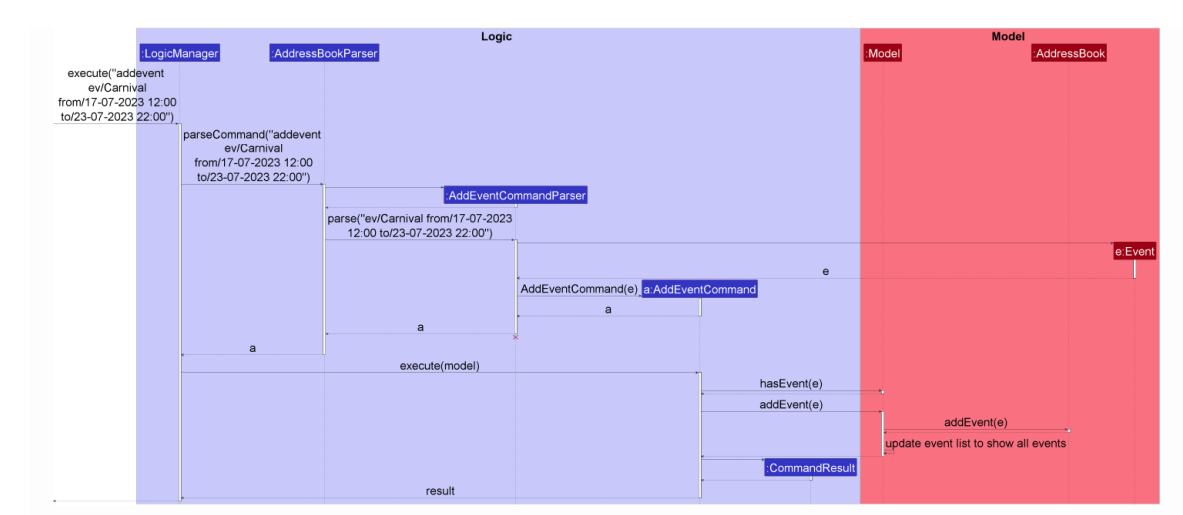
Some diagrams' font sizes are too small to read and are inconsistent with other diagrams.The following sequence diagrams have different font sizes.
Note: due to the size of the screenshots, the size of the 2nd sequence diagram appears bigger in the issue preview
[original: nus-cs2103-AY2223S2/pe-interim#1546] [original labels: severity.Low type.DocumentationBug]
Their Response to the 'Original' Bug
[This is the team's response to the above 'original' bug]
Thanks for the suggestion. We actually tried to make the fonts of the same size, however, on some of the sequence diagram, the image size becomes too big in the DeveloperGuide and gets cut off. We tried scaling the image size down as well but the activation bar becomes too small to see.
Items for the Tester to Verify
:question: Issue duplicate status
Team chose to mark this issue as a duplicate of another issue (as explained in the Team's response above)
- [x] I disagree
Reason for disagreement: In PlantUML, font size can be declared separately from the size of the activation bars, so these issues are similar but not duplicate.
## :question: Issue severity Team chose [`severity.VeryLow`] Originally [`severity.Medium`] - [ ] I disagree **Reason for disagreement:** [replace this with your explanation]
In the below diagram, the termination "x", the activation bars, the lines between the bars and the arrowheads are too small, making it impossible to read.
In the above diagram, it is hard to tell the directions of the arrows without a closer look. Since the arrows are so zoomed out, dotted lines appear like solid lines. In comparison with the diagram given by AB3, the termination "x" is tiny and hard to notice.
Due to this, it is challenging to understand the sequence diagram.