 emmggi
commented
6 months ago
emmggi
commented
6 months ago I tried making a theme of my own but was confused with tintX, bgX and shaderX properties. Trial and error is very time consuming.
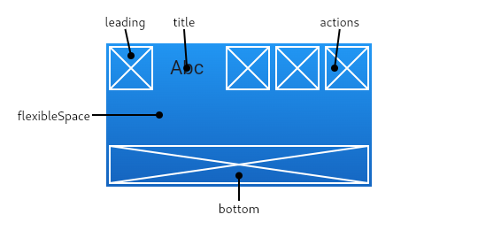
Knowing what each color represents will definitely help people contribute to custom themes. If one could get a picture like this to show what part of the UI each property controls, that would make it even easier.
https://flutter.github.io/assets-for-api-docs/assets/material/app_bar.png
Description
Our current color and theme implementation for AppFlowy colors is, a bit messy in the code.
For example we have things such as
darkShader1 ... 7. It would be much more easy to navigate in the future, especially for custom themes, if our color palette got completed with meaningful associations.The current ColorScheme in the Material Theme that we do use, although somewhat arbitrarily, does contain somewhat good naming conventions.
We mix usage of
Theme.of(context).colorScheme.someColorwithAFThemeExtension.of(context).someColordue to not having properly mapped our colors and their usage to the Material Color Scheme.Although we might need some form of "AFTheme" despite being able to completely remove reliance on AFThemeExetension, it would primarily be related to parsing custom themes.
Having this clearly defined in Figma and our Documentation (Where to use which colors, how they are used, their meaning, etcetera.) will be really helpful in the future.
When we see "new" or "unknown" color codes in designs, we shouldn't "try to fit that color in somewhere in our theming", we should question the usage of said color and try to see if we don't already have an existing fitting color. Otherwise our color repository will keep increasing and become too cluttered.
Impact
Additional Context
This is the way custom themes look when building them, I would have simply no clue, and would have through trial and error find out where which option is used, and it honestly makes no sense.
Note: I'm even sure that some of the colors aren't being used, or is only used in very few places, where another color that is used a lot could easily replace it.