 chris-liddell
commented
6 years ago
chris-liddell
commented
6 years ago We can pass this onto URW++ and see what they come back with. With things like this, we are dependent on URW++.
Open rtollert opened 6 years ago
chris-liddell
commented
6 years ago We can pass this onto URW++ and see what they come back with. With things like this, we are dependent on URW++.
 StefanBruens
commented
6 years ago
StefanBruens
commented
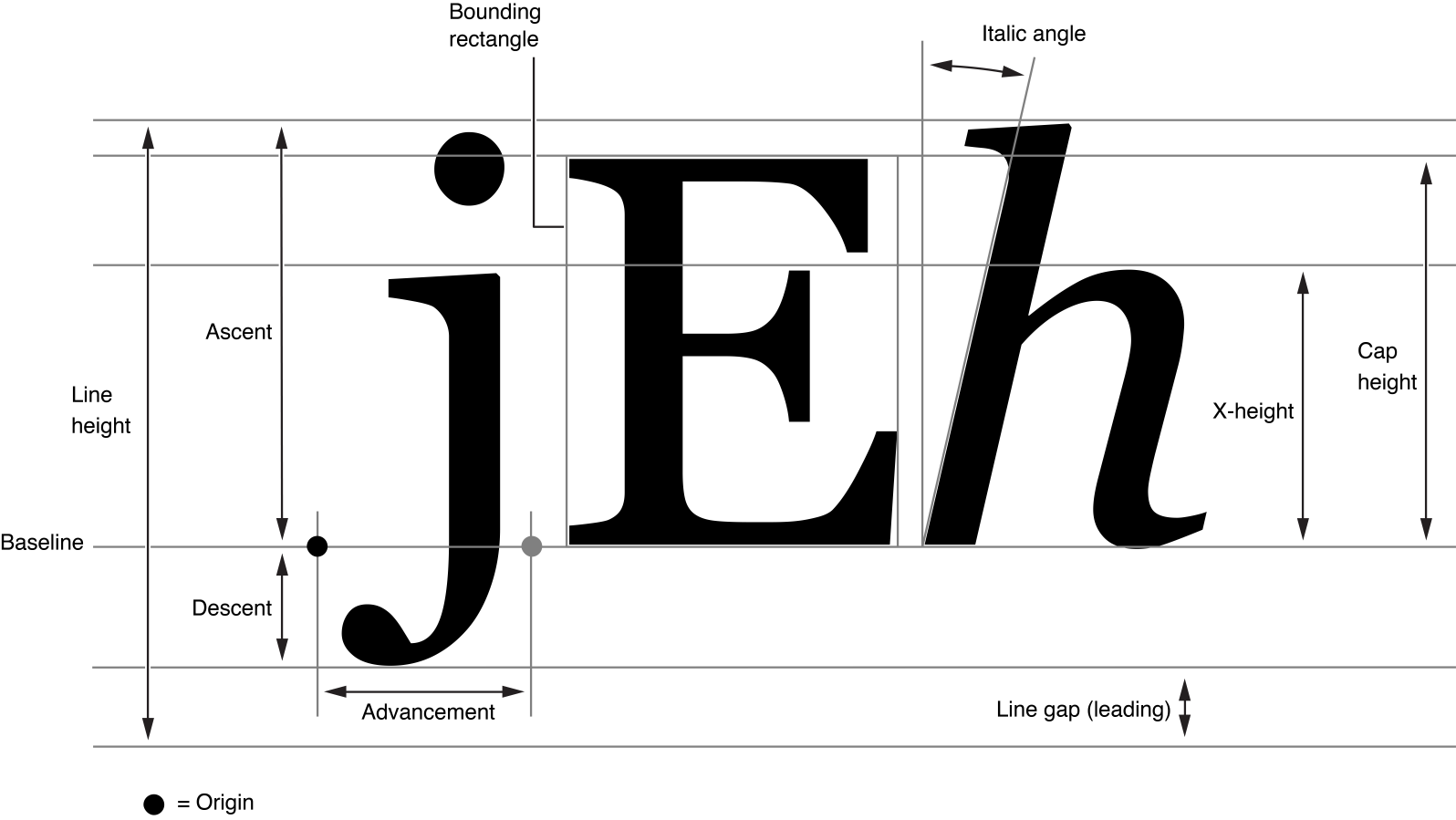
6 years ago This is just a lack of understanding on the reporters side how font/glyph metrics work. Fonts don't have one height.
See e.g. https://developer.apple.com/library/archive/documentation/TextFonts/Conceptual/CocoaTextArchitecture/Art/glyph_metrics_2x.png https://www.freetype.org/freetype2/docs/glyphs/glyphs-3.html
If you want fontforge to show glyphs 'unclipped', select "View" -> "Fit to font bounding box".
The font designer can decide how much internal leading and external leading a font face should have.
 rtollert
commented
6 years ago
rtollert
commented
6 years ago This is just a lack of understanding on the reporters side how font/glyph metrics work.
Guilty as charged! Thank you for the links (and the newbie tip on FontForge).
Fonts don't have one height... The font designer can decide how much internal leading and external leading a font face should have.
That is certainly true, and I apologize if my issue submission could be interpreted differently.
Digging into this a little deeper, for Nimbus Sans, the cap height is aligned to the ascent, while for TeX Gyre Heros, the ascent is higher -- it roughly hits the bottom of most accents on capital letters. For most other fonts, the ascent roughtly hits the midpoint of accents. This mostly explains everything I'm seeing, although Myriad Pro also seems to be exhibiting this behavior, yet its ascent is hitting the accent midpoint like everything else... I'm willing to call that a fluke though.
One additional wrinkle is that I'm using these fonts in a GUI that recently acquired Xft support, and the XLFD versions of these fonts did not exhibit this behavior, even though its accents also remained well above the ascent. I will chalk this up to vagaries in layout between raster and outline fonts.
chris-liddell
commented
6 years ago I am still concerned: the height isn't the problem, but the fact that the entire glyph appears higher in the application screen shot is concerning - unless the application is ignoring the baseline....
rtollert
commented
6 years ago Oh, fascinating: I just replaced gsfonts with gsfonts-type1, and the issue has disappeared. I guess I should reopen this.
 madig
commented
5 years ago
madig
commented
5 years ago I haven't looked closely at this, but it looks like a OS/2 table "Use Typo Metrics" bit issue. When it is set, applications may use the typo metrics in the OS/2 table, which usually come without the extra "headroom" the other metrics come with for legacy reasons. They are meant for typographically savvy applications, of which I only know browsers on Unix-platforms.
 fabiangreffrath
commented
5 years ago
fabiangreffrath
commented
5 years ago @madig Is it possible to change this behaviour for a ready OTF file, e.g. through a script or by means of a fontconfig rule?
madig
commented
5 years ago Through a script that uses fontTools to flip it. As said, I'd have to look at the binaries to check this is actually the case, haven't had time yet.
You can see the metrics and fsSelection bits by doing ttx -o - -t hhea -t OS/2 font1.ttf font2.ttf | grep -iE "(asc|desc|linegap|sel)". The "Use Typo Metrics" bit (fsSelection bit 7) is set if fsSelection looks like <fsSelection value="00000000 10000000"/>.
fabiangreffrath
commented
5 years ago I only ship the T1/AFM pairs in the Debian package, but nevertheless we should try to fix the OTF variants if possible.
 notaflyingpig
commented
4 years ago
notaflyingpig
commented
4 years ago Here is the output from running the command given above by @madig on my machine (for Nimbus Sans Regular):
$ ttx -o - -t hhea -t OS/2 /usr/share/fonts/gsfonts/NimbusSans-Regular.otf \
> | grep -iE '(asc|desc|linegap|sel)'
Dumping "/usr/share/fonts/gsfonts/NimbusSans-Regular.otf" to "-"...
Dumping 'hhea' table...
Dumping 'OS/2' table...
    <ascent value="729"/>
    <descent value="-271"/>
    <lineGap value="200"/>
    <fsSelection value="00000000 01000000"/>
    <sTypoAscender value="729"/>T
    <sTypoDescender value="-271"/>
    <sTypoLineGap value="200"/>
    <usWinAscent value="1075"/>
    <usWinDescent value="299"/>
The (7th) bit for USE_TYPO_METRICS is set in this case.
Google's noto-fonts don't seem to have the extra gap that appears with URW OTF fonts. Not sure if this helps, but here are the dump snippets for Noto Sans Regular:
$ ttx -o - -t hhea -t OS/2 /usr/share/fonts/noto/NotoSans-Regular.ttf \
> | grep -iE '(asc|desc|linegap|sel)'
Dumping "/usr/share/fonts/noto/NotoSans-Regular.ttf" to "-"...
Dumping 'hhea' table...
Dumping 'OS/2' table...
    <ascent value="1069"/>
    <descent value="-293"/>
    <lineGap value="0"/>
    <fsSelection value="00000001 01000000"/>
    <sTypoAscender value="1069"/>
    <sTypoDescender value="-293"/>
    <sTypoLineGap value="0"/>
    <usWinAscent value="1069"/>
    <usWinDescent value="293"/>
Here is another dump snippet from Cantarell Regular:
$ ttx -o - -t hhea -t OS/2 /usr/share/fonts/cantarell/Cantarell-Regular.ttf \
> | grep -iE '(asc|desc|linegap|sel)'
Dumping "/usr/share/fonts/cantarell/Cantarell-Regular.otf" to "-"...
Dumping 'hhea' table...
Dumping 'OS/2' table...
    <ascent value="983"/>
    <descent value="-217"/>
    <lineGap value="0"/>
    <fsSelection value="00000000 01000000"/>
    <sTypoAscender value="739"/>
    <sTypoDescender value="-217"/>
    <sTypoLineGap value="244"/>
    <usWinAscent value="983"/>
    <usWinDescent value="217"/>
I'm very much a noob when it comes to fonts, but I have noticed that in both the Cantarell and Noto fonts, sTypoAscender - sTypoDescender + sTypoLineGap == usWinAscent + usWinDescent, but for Nimbus Sans Regular, sTypoAscender - sTypoDescender + sTypoLineGap != usWinAscent + usWinDescent. Is this something to worry about?
madig
commented
4 years ago I think that may be a left-over from making Nimbus metrics-compatible with Helvetica. Not sure what the impact is, but setting metrics for fonts that work everywhere is a lost cause, so people settled on some scheme to match the three value sets you can have (hhea, typo, win) for newer fonts. BTW, the seventh bit is not set in any of those fonts, that would be 10000000. Count from the right and from zero :)
notaflyingpig
commented
4 years ago Ah, right, thanks.
 probonopd
commented
3 years ago
probonopd
commented
3 years ago It seems that I am having the same or a very similar issue with the Nimbus Sans ttf fonts in https://github.com/ArtifexSoftware/urw-base35-fonts/archive/20200910.zip on FreeBSD. I would like to use Nimbus Sans as the UI font, but using it results in all text being set too high, which is especially visible when it appears inside menus, buttons, or next to icons. Example:

Nimbus Sans ttf:

For comparison TeX Gyre Heros otf:

probonopd
commented
3 years ago @rtollert I think this is a valid concern and hence the ticket should be reopened.
@chris-liddell do you think this is a valid bug that should be reported to URW?
chris-liddell
commented
3 years ago I certainly think it warrants some closer investigation, but I'm just too busy to look properly just now.
Should anyone want to do some extra legwork, what I would need is, at least, some example metrics values, or similar, that show why the problem is happening. And I would probably give decent size, rendered examples comparing the TTF and Type 1 (and maybe OTF) versions, to illustrate the issue.
Otherwise, I will get to it when I have a little spare time.
madig
commented
3 years ago @chris-liddell would it be possible to get the actual sources from them?
 ghost
commented
3 years ago
ghost
commented
3 years ago Problem is in wrong 'Ascent' and 'Descent' sizing. I have no idea where it comes from, but I got it fixed in fontforge. Things to keep in mind:
ghost
commented
3 years ago Problem is more interesting than I expected, otf files and ttfs in the repo differ in term of ascent and descent values. Even more, I can't generate correct values from sfds from my previous post. Type1 fonts work fine...
probonopd
commented
3 years ago I have no idea if anyone has actual sources for the fonts.
My guess would be that URW should have them, no?
madig
commented
3 years ago @timur-davletshin if you want to do a surgical change, use ttx from fontTools to dump the fonts, make the change in the dump and then ttx it again. Both the hhea and the OS/2 table need to be changed.
ghost
commented
3 years ago @madig yeah, I just figured that out regarding OS2.
ghost
commented
3 years ago I believe OS/2 params are all wrong in Nimbus fonts. There is hardly any correlation between Nimbus Sans/Serif and Helvetica/Times from Mac OS. Deleting it, start it from scratch and change only if needed. There is no need to manipulate Ascent/Descent in OS/2 if it is already set in General. Not sure where original values for Ascent/Descent came from, but they differ from original fonts, OS/2 values are way off and it is a reason for described problem.
madig
commented
3 years ago For giggles, can you try changing the OS/2 format version from 4 to 3 while leaving the rest as is? I faintly remember this being an issue in a similar case for whatever reason.
ghost
commented
3 years ago For giggles, can you try changing the OS/2 format version from 4 to 3 while leaving the rest as is? I faintly remember this being an issue in a similar case for whatever reason.
Visually it changed nothing. Problem remained.
 JanisE
commented
3 years ago
JanisE
commented
3 years ago I don't know what this repository is about (I hadn't heard about Artifex before :) ), but I found this issue when searching for Nimbus Sans problems. The diacritics are sometimes lost on some sizes in a web browser (I'm using Firefox; Chrome seems to handle this much better). Helvetica seems to not have this problem to such an extent, although "Š" in size 18px is terrible.


chris-liddell
commented
3 years ago If you look closely, you can see that the features are, in fact, there, but being rendered in a very light shade. Since these fonts are uncolored, I'm rather baffled how the font can be causing that effect - that's not to say I'm denying (nor confirming!) that it's the font at fault, I just don't see how.
In truth, I'm not sure what, if anything, we can do about this. With weird, edge cases: reproducing this kind of edge case in a useful way is extremely hit and miss, and we (Artifex) don't maintain these fonts (we host them here as the Type1 variants are part of Ghostscript and, generally, our interest is in how they behave in that capacity), it's URW++ that maintains the fonts. And exchanging information third or fourth hand in a case like this feels like it could descend into madness.
I'll have to make some enquiries where things stand with URW++. But, to be frank, in previous situations Artifex has paid for the fonts to be updated/fixed, but I have doubts that will happen in this case. We'll have to see...
rtollert
commented
3 years ago @chris-liddell out of morbid curiosity, how much money are we talking about?
chris-liddell
commented
3 years ago @rtollert Honestly, I do not know. I'm just a humble developer, and try hard not to get involved in the business side. Also, even if "head office" were willing to disclose the amount, it probably comes with a non-disclosure clause. It also probably wouldn't be meaningful for anyone other than Artifex.
The biggest stumbling block at the moment for reporting this is how to demonstrate it to URW++. We ideally need a way to show URW the problem in relative isolation (i.e. not in a UI menu or a web browser) - previously, I've created a PDF demonstrating the problems, but that isn't really an option in this case.
rtollert
commented
3 years ago ... I mean, I guess we could articulate a meaningful decision tree?
madig
commented
3 years ago @JanisE Can you try editing one of the fonts to have fsSelection bit 7 set? Install the Python libarary fontTools somewhere, ttx the font, look for fsSelection, set the 7th bit (count from right and from zero) and ttx the dump again? Then see if the fonts behave correctly.
 louies0623
commented
1 year ago
louies0623
commented
1 year ago This issue has been going on for four years, how is it going?
 apodtele
commented
1 year ago
apodtele
commented
1 year ago Curiously, the AFM files all contain:
Descender 0
Ascender 0
which is apparently legal way to omit these optional values. I have just fixed FreeType to ignore such zeros in AFM.
louies0623
commented
10 months ago So has anyone started to fix it? Because some people want to use this font to make system UI fonts.
I apologize for posting what is probably the dumbest font bug title ever. But it's true! Nimbus Regular at 10-12pt is like 1px too high in every application, and judging from FontForge, it looks like the rest of the URW OTF fonts are too high as well.
Here is Nimbus Regular (installed on archlinux from stock gsfonts, version 20170829-1), Tex Gyre Heros (another metric-compatible for Helvetica), and Source Sans Pro at 13px size displaying the Wikipedia page for the Higgs Boson in Firefox (Linux). Compared to the other two fonts, Nimbus Regular is just too.. high.
Here's a screenshot of FontForge showing some glyphs from /usr/share/fonts/gsfonts/NimbusSans-Regular.otf. All of the URW fonts I've tried to open in FontForge have their accents clipped off; none of the other fonts I've tried are doing this.