 nus-se-bot
commented
3 years ago
nus-se-bot
commented
3 years ago Team's Response
Firstly, this is not in scope as the design or how the help window looks like is largely inherited from AB3, there were no changes in the styling of helpwindow as compared.
As mentioned above that the help window is a contrast to the colorful main window, this is actually a design consideration by our team. During the project, we did consider if we want to restyle the help window. However, we feel that the help window should just be clean and simple so as to present the summary easily.
Furthermore, the help window should not be in sync with the main window so as to differentiate it from the main window, if not users might thought it is an extended page or feature in MyMods.
Items for the Tester to Verify
:question: Issue response
Team chose [response.NotInScope]
- [x] I disagree
Reason for disagreement: Thank you for your response.
Firstly, this is not in scope as the design or how the help window looks like is largely inherited from AB3, there were no changes in the styling of helpwindow as compared.
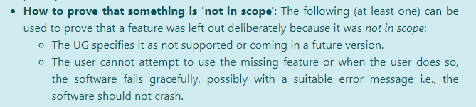
You cannot say this is not in scope as in order to state that it is not in scope, you have to say in UG it is not supported or coming in future verions (which is not the case) or the user cannot attempt to use the feature (which is not the case also). Refer to the screenshot below:
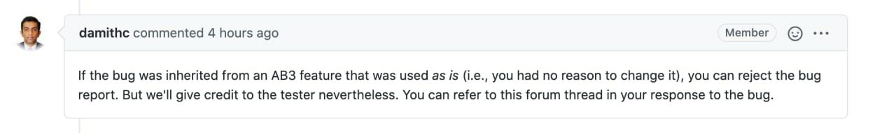
And also, following Prof Damith's response on the forum, if this is indeed a bug inherited from AB3, it should be labeled as response.Rejected instead
As mentioned above that the help window is a contrast to the colorful main window, this is actually a design consideration by our team. During the project, we did consider if we want to restyle the help window. However, we feel that the help window should just be clean and simple so as to present the summary easily.
I feel this design consideration to be quite bad as I had a hard time reading the help window during the PE due to the bad layouting and small font size.
Furthermore, the help window should not be in sync with the main window so as to differentiate it from the main window, if not users might thought it is an extended page or feature in MyMods.
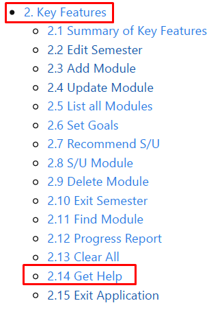
This statement is contradicting what is stated on the User Guide. In the User Guide, the help window is indeed a feature in MyMods. Refer to the screenshot below:
:question: Issue severity
Team chose [severity.VeryLow]
Originally [severity.Low]
- [x] I disagree
Reason for disagreement: This flaw is not purely cosmetic as the design choice of the Help Window causes minor inconvenience for users who want to read the help window. Moreover, help is a key feature and might be often needed especially for new users. Hence, this should be of at least severity.Low.
In contrast to the main window which is stylized with colorful color scheme and good layouting. However, the help window is mostly just plain text, with no color, and bad overall layout.
Steps to reproduce:
helpcommand.