Closed jameskoster closed 6 years ago
I feels its very similar to the existing Share icon:
I'm not sure thats a huge problem, but I do notice that your icon has a thicker line, which almost makes the nodes feel more like bulges than dots.
Here's a few random ideas:
I kind of like the node-less line.
I believe for the share icon, we used a 0.5 thick line, or maybe we enlarged the dots to 1.5? Check out the share icon to be consistent.
I don't have a strong opinion on the dots.
I found some icons that I really like. The additional vector point that these lines have make the icons more distinguishable and bit more visually appealing. (in other words, one more line segment in the graph — "up, down, up" instead of just "down, up")
Good idea for an 'alt' icon with a box! :
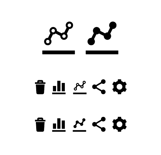
Making the stroke a bit thinner (to match sharing) gave me enough space to add an extra point. Here's a couple of options;
I like the empty points, personally. What do y'all think?
That looks much better to me. I like the open dots, but I have a feeling when viewed at 100% they'll be too small. Also, the filled dots match the rest of the icon set.
Good point. I'm happy to go with either. Final comparison at 100%;
I really dig the open dots, but at 100% size they distract from the overall shape of the icon. I'd go with the filled nodes 👍
Updated. Happy for me to merge?
Looks like you still need to generate the other files
https://github.com/Automattic/gridicons#add-a-proposed-icon-to-gridicons-admins-only
This node doesn't appear to be on the grid
Woah good catch. Looks like something went awry when I minified.
Fixed now and everything built / ready to go.
LGTM
Cheers. One more review and I'll merge :)
Good for me, go ahead with the merge steps. 👍
I just noticed this merge had 200+ files merged. This should have raised a warning flag as the only files that should have been changed should have been the ones impacted by the addition, not all the PDFs.
I noticed this because now I've the same ~200 changes in a different PR (#295).
I'm not sure what happened, as now the merge is done, but in the past it was due to an outdated PDF generator version. It seems the case again, so I'd suggest @jameskoster to try to remove node_modules
folder and re-do a npm install
the next time.
In general, if you ever get another massive changelog of files, ping so we can review before merging, maybe the issue is somewhere else.
Sorry about that, I assumed it was part of the build process.
I'd suggest @jameskoster to try to remove node_modules folder and re-do a npm install the next time.
I'll do that now.
No worries at all! It's a problem with the current build system that appeared already a couple of times... I hope just removing node_modules
works, but I'm not sure anymore :D
In wc-admin we have a toggle to switch between line/bar graphs. So we need a line-graph icon :)
Here's my first take on that;
And in context alongside other Gridicons;
What do y'all think?