 zmaglica
commented
7 months ago
zmaglica
commented
7 months ago This issue impacts checkout UI, so assigning to Heisenberg (based on team responsibilities Pc2DNy-3z-p2) @FangedParakeet. Assigning as part of Gamma Triage process PcreKM-yM-p2.
 pierorocca
 elizaan36
 FangedParakeet
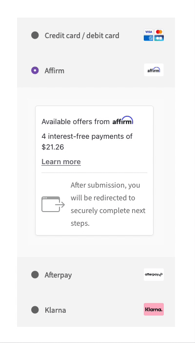 Affirm, Afterpay, & Klarna payment elements with dUPE
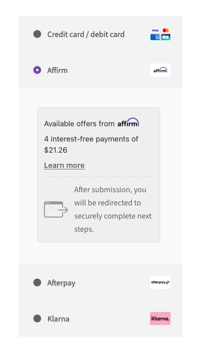 Check the Affirm Block element looks slightly more consistent with the rest of the checkout
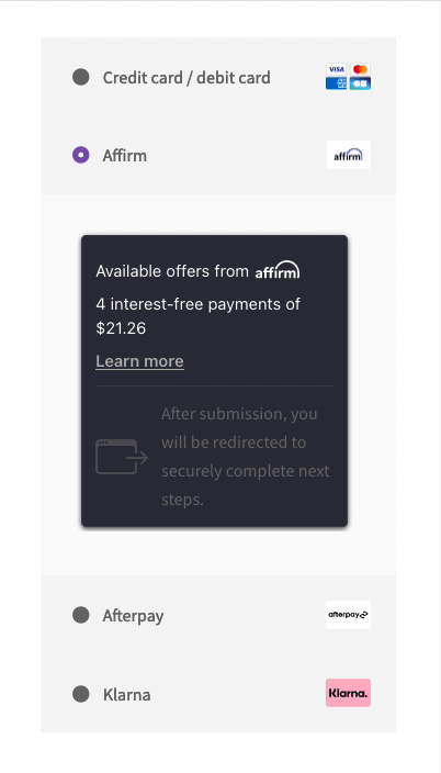 Affirm, Afterpay, & Klarna with
 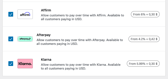 BNPL settings with mint green magic
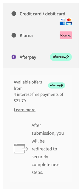 Shortcode checkout with mint green mojo
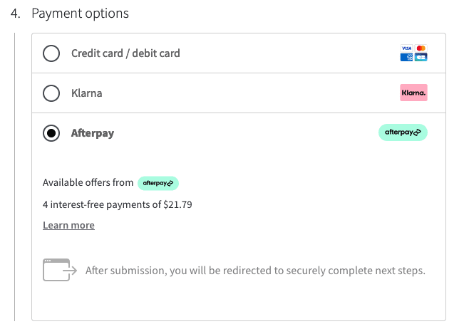 Blocks checkout with mint green marvel
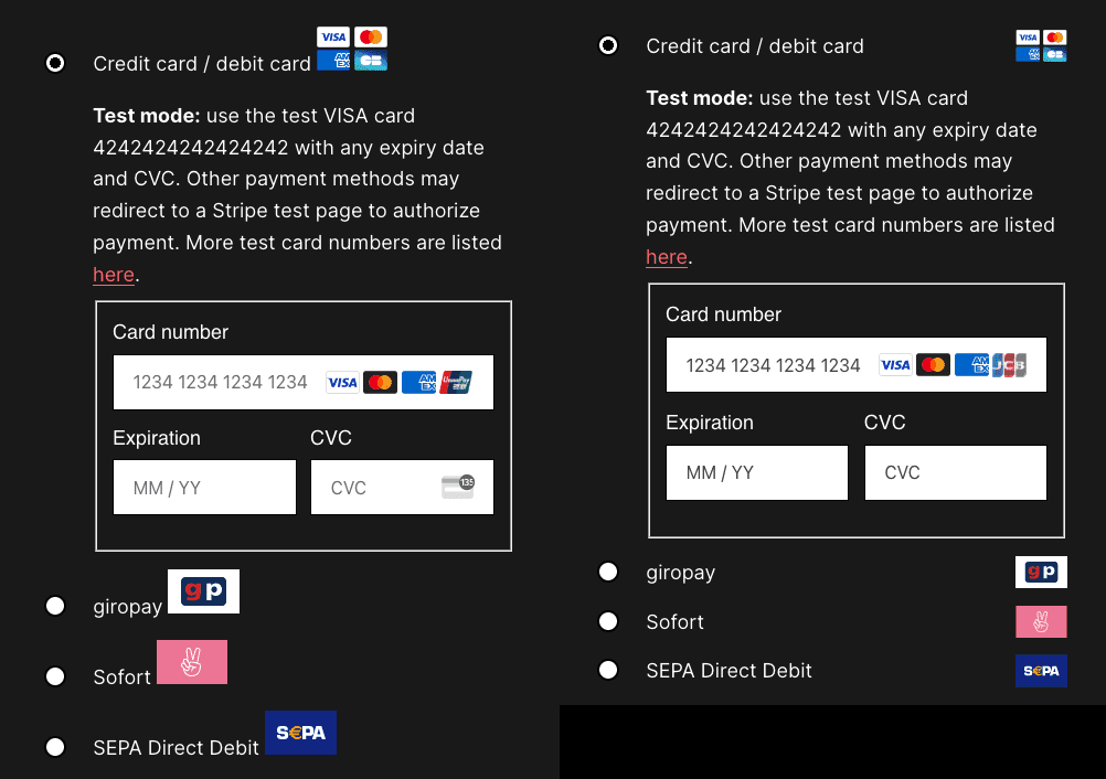 Looks mostly the same, nicer icons though
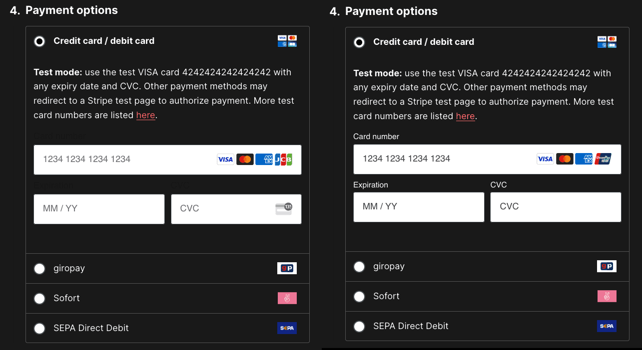 Input labels now visible
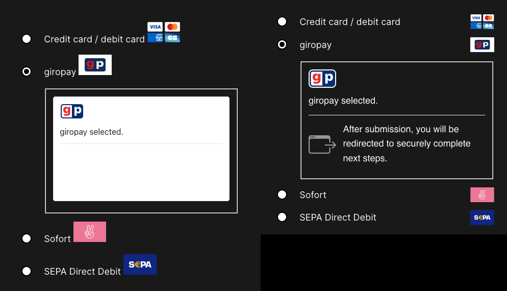 Fonts fixed, text legible, background fixed
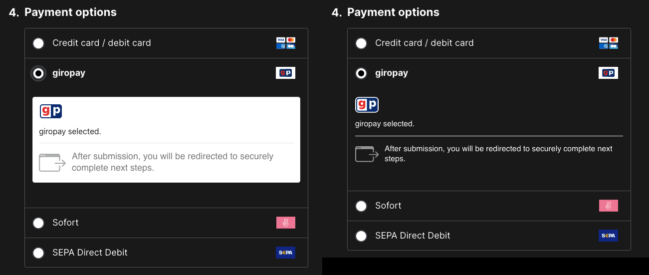 Font styles fixed, background fixed, text colour matches other labels
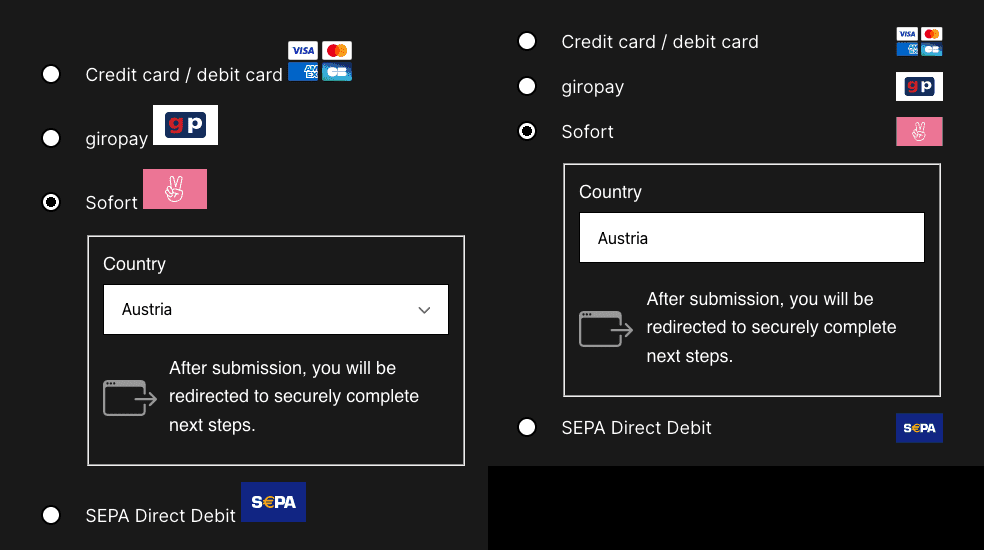 Looks mostly the same
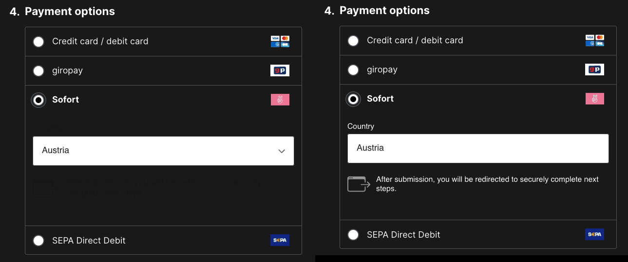 Text is now legible
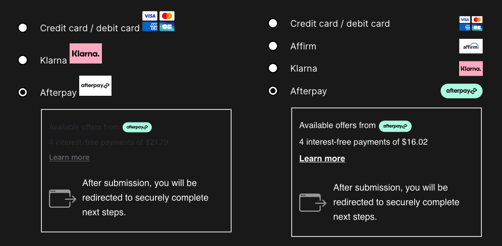 New mint pill icon, legible text
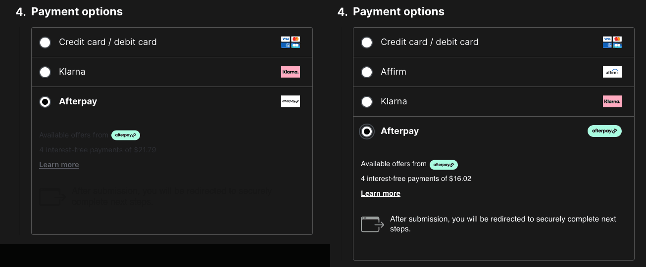 New mint pill icon, legible text again, consistent fonts too
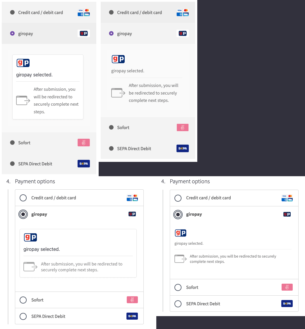 Fonts fixed, background fixed
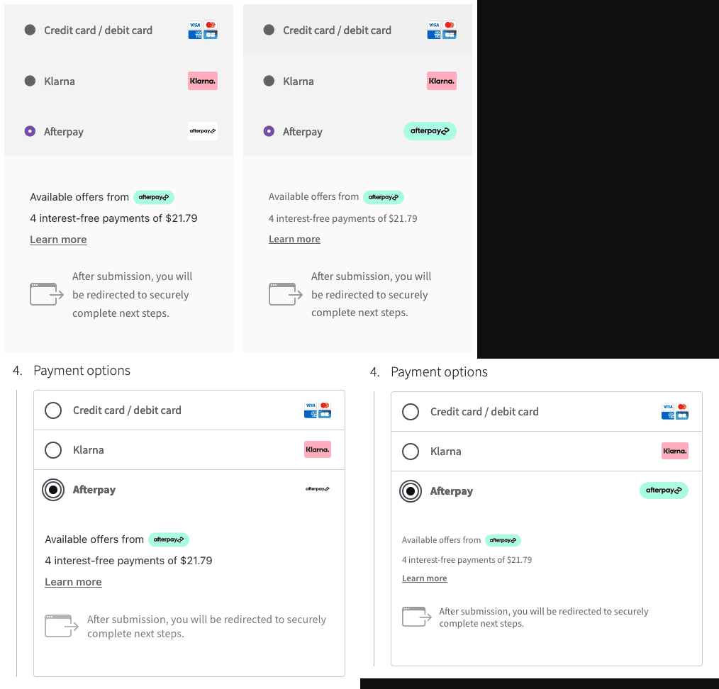 New mint pills & fonts, font-sizes, and spacing fixed
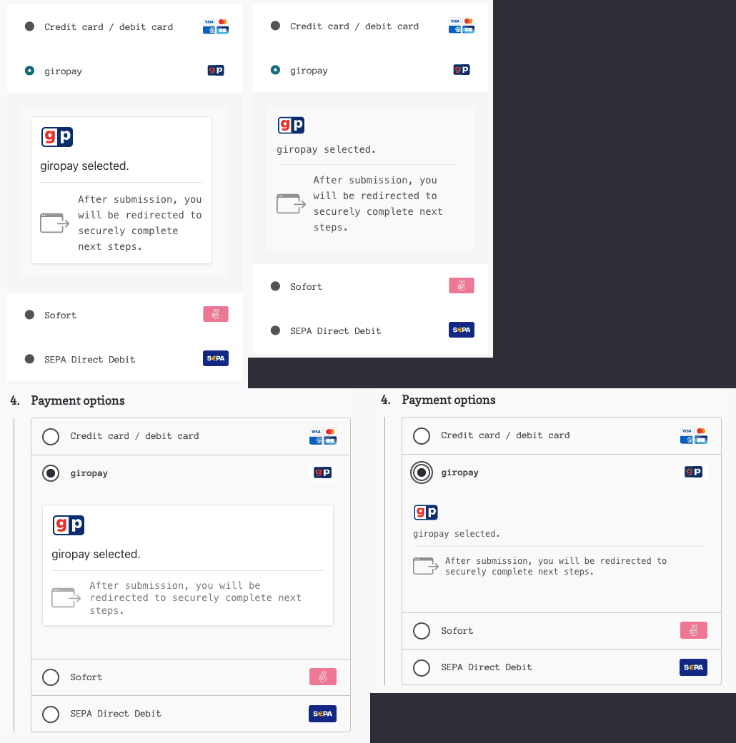 Fonts, spacing, and background fixed
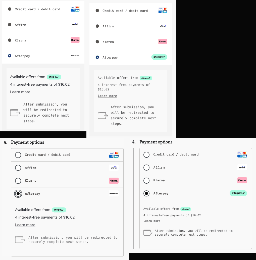 Fonts and spacing fixed
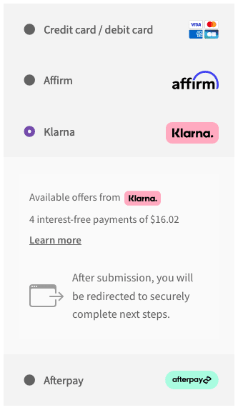 Shortcode checkout icons
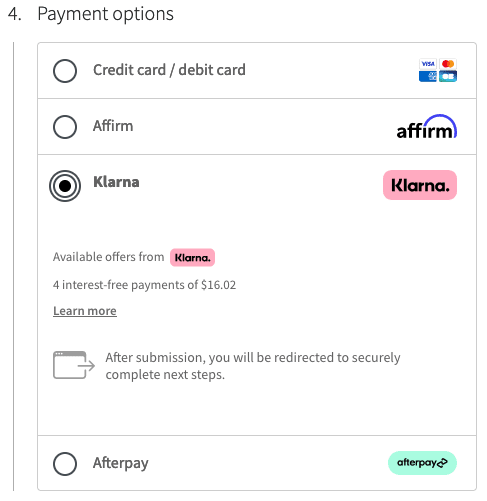 Blocks checkout icons
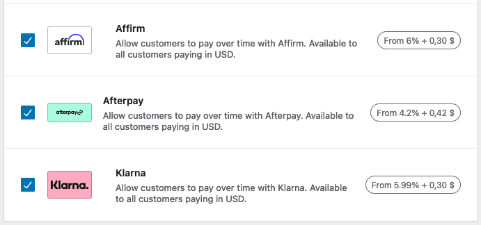 Payments settings icons
 Taller Afterpay logo
 Afterpay payment icon
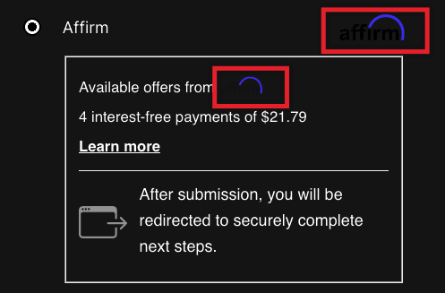 Affirm logo hiding in the shadows
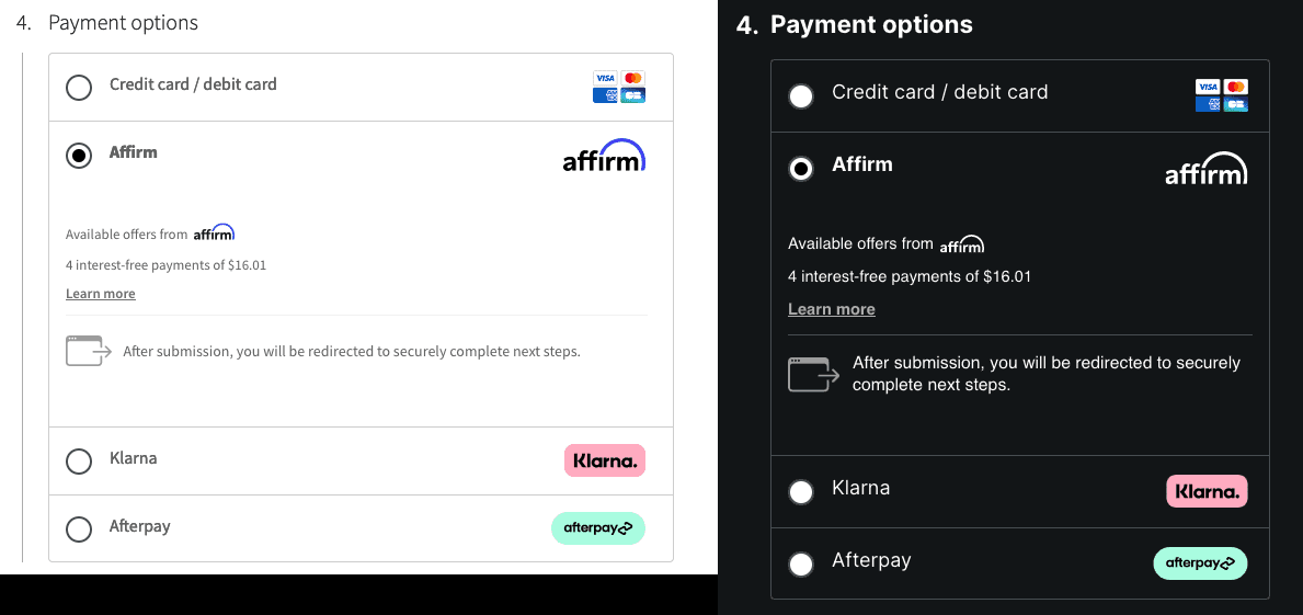 Dynamic Affirm light and dark logos
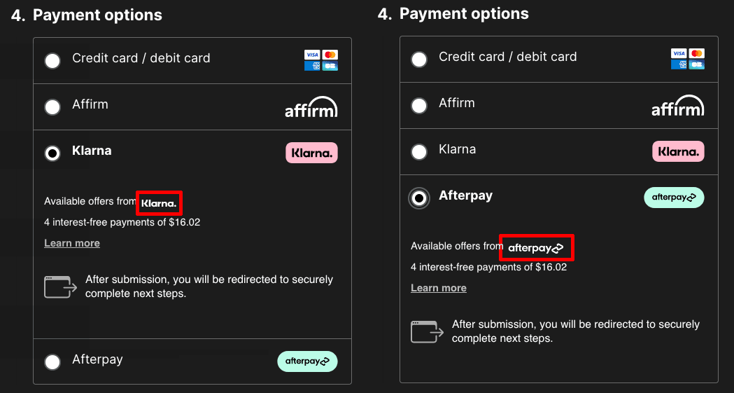 Solid white Klarna and Afterpay logos in night mode
Describe the bug
When using WooPayments and additonal payment methods, such as Afterpay, there is no way to update the text that is visble on product pages, as well as the cart. These are embedded via an iframe element, thus cannot be changed via CSS.
Element:
#payment-method-message.StripeElementTo Reproduce
Actual behavior
Screenshots
Product page:
Checkout page:
Expected behavior
A neat element within WooPayments settings where the colour of the text can be selected, such as you can do with Express Payment options, in each having a setting for the them to be Dark, Light or Outline.
Desktop (please complete the following information):
Additional context
Related ticket(s)