 frosso
commented
3 months ago
frosso
commented
3 months ago Targets only existing merchants[...] live in production
@pierorocca does this mean that we should not target test mode? Asking because it's a bit easier to test/work on while in test mode. But we could work around it.
 pierorocca
 FangedParakeet
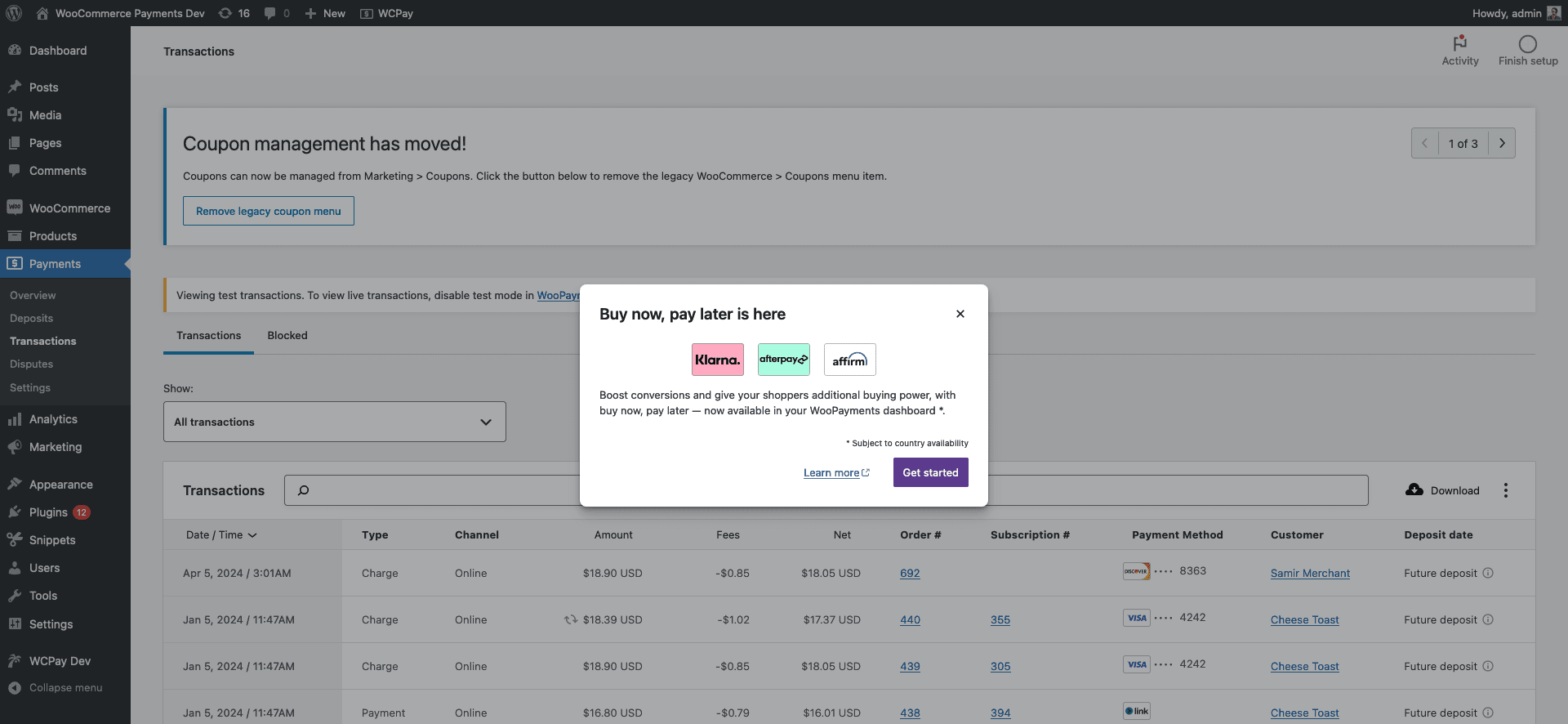 Unmodified, but no horizontal rule
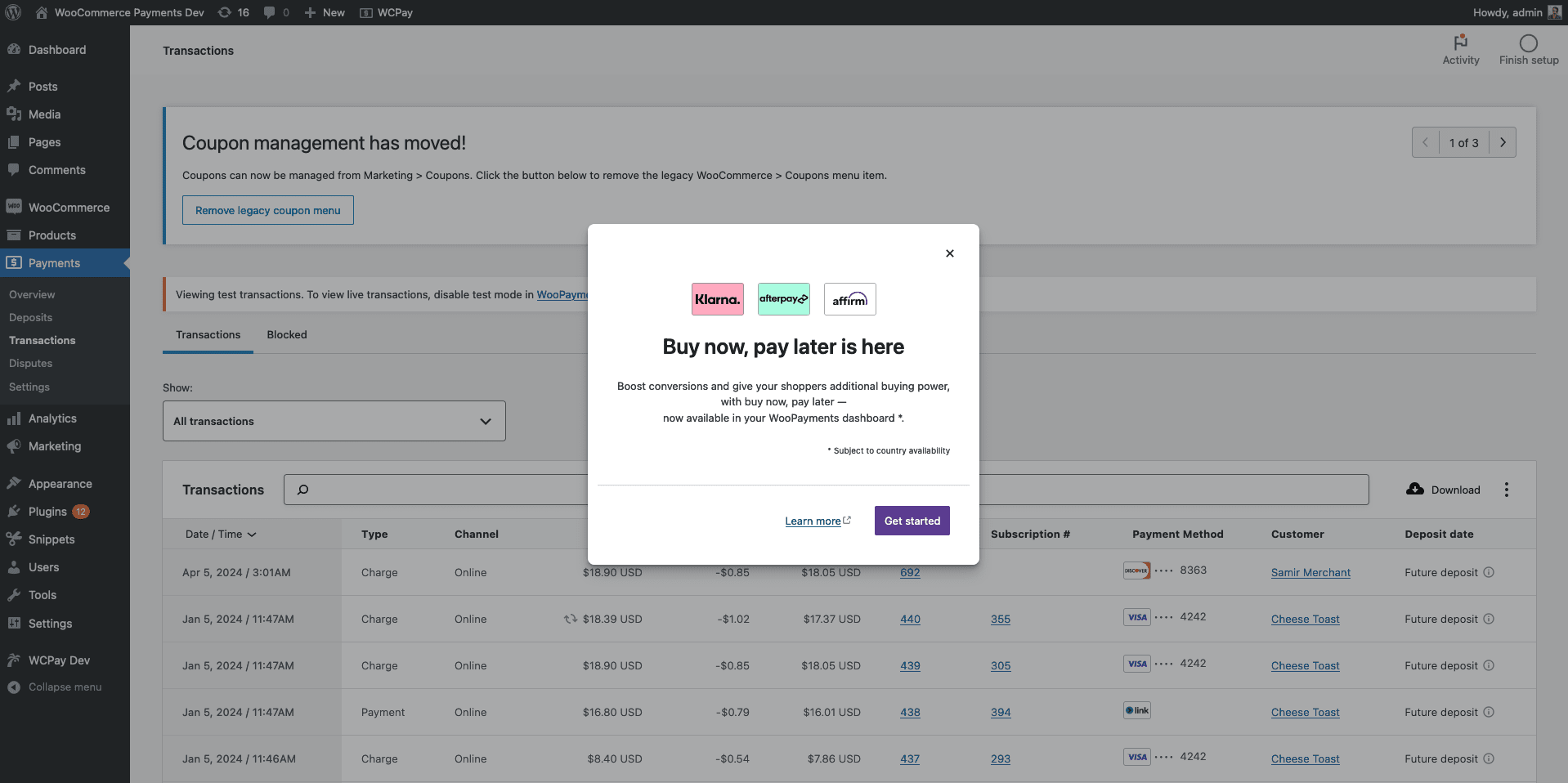 Logos on top, three-line text, everything centre-aligned
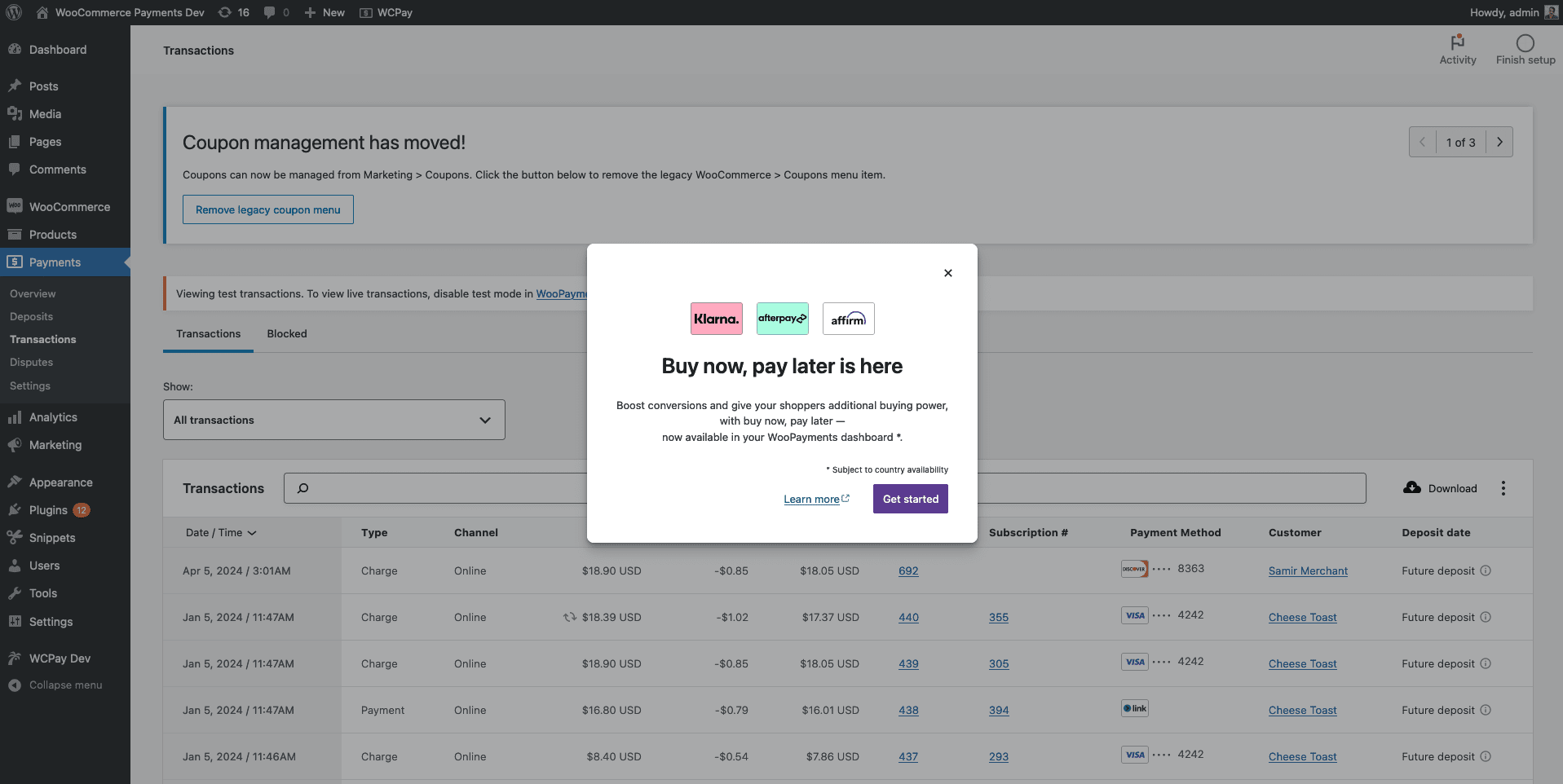 Same as above, without the horizontal rule
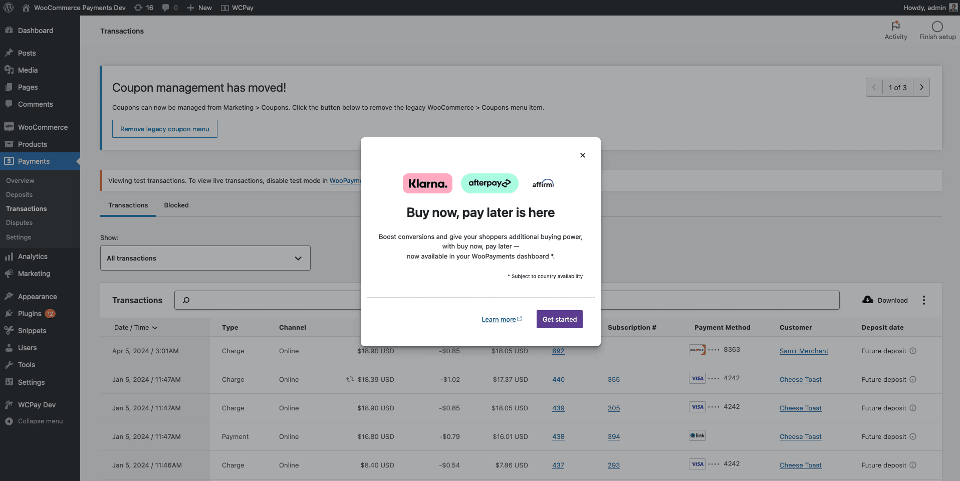 Pill logos on top, three-line text, everything centre-aligned
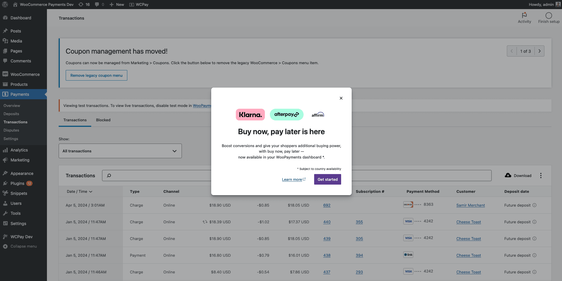 Same as above, without the horizontal rule
 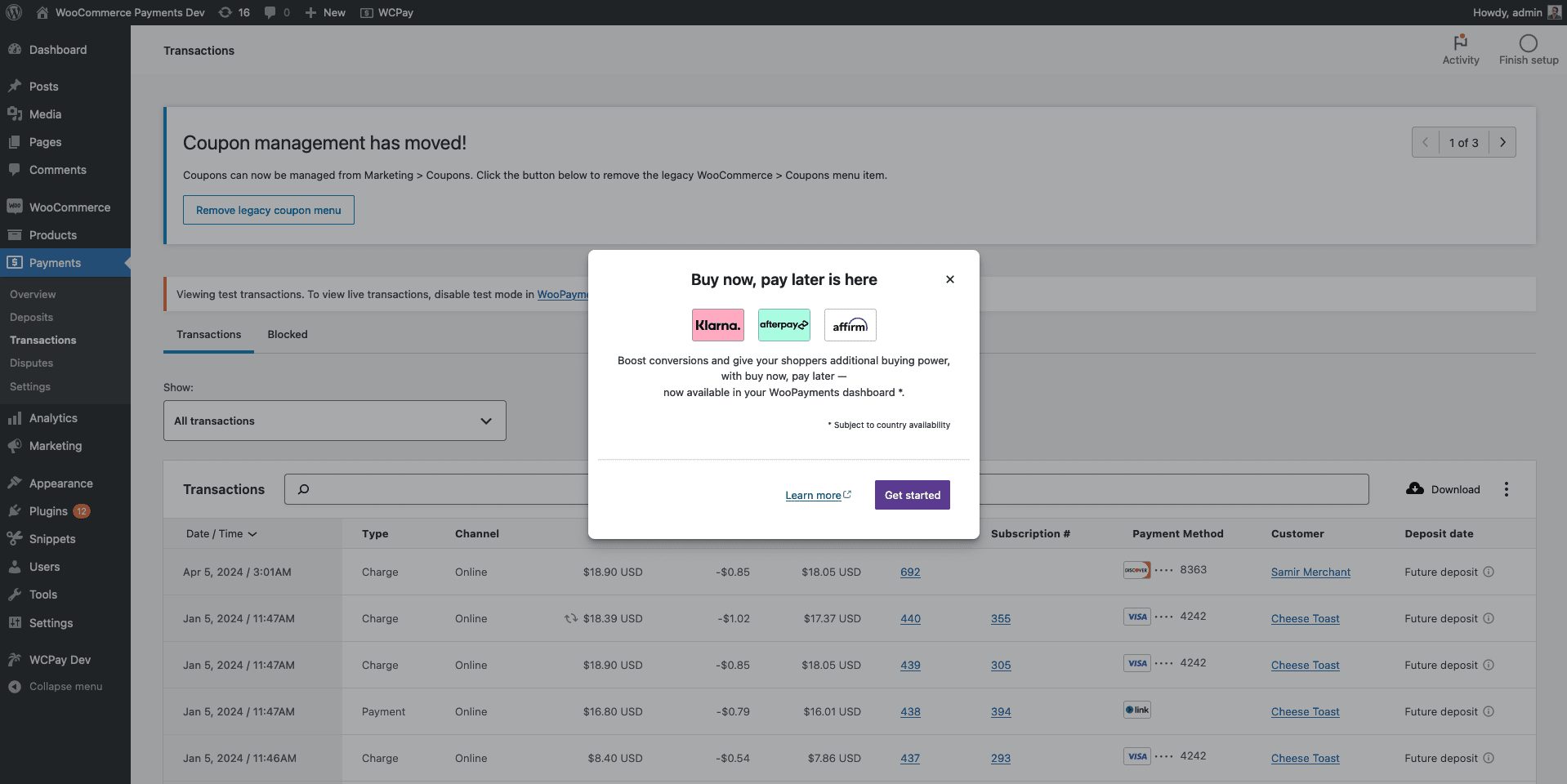 Centre-aligned with three-line text
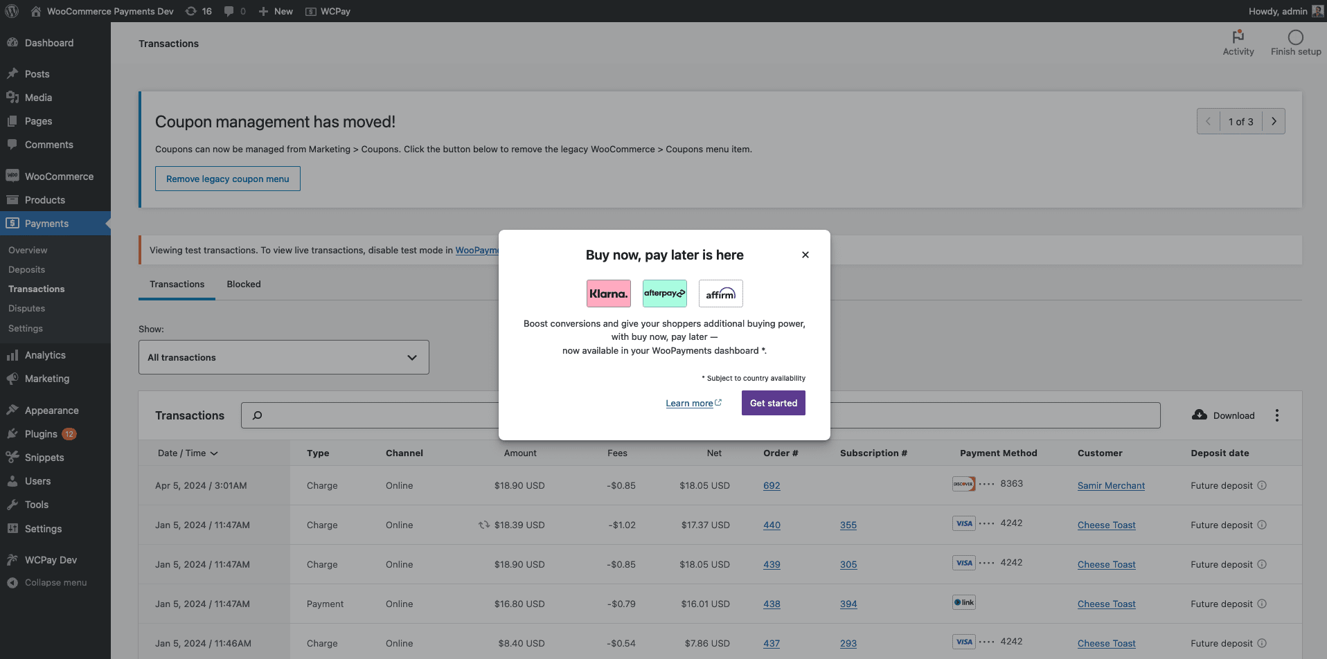 Same as above, no horizontal rule
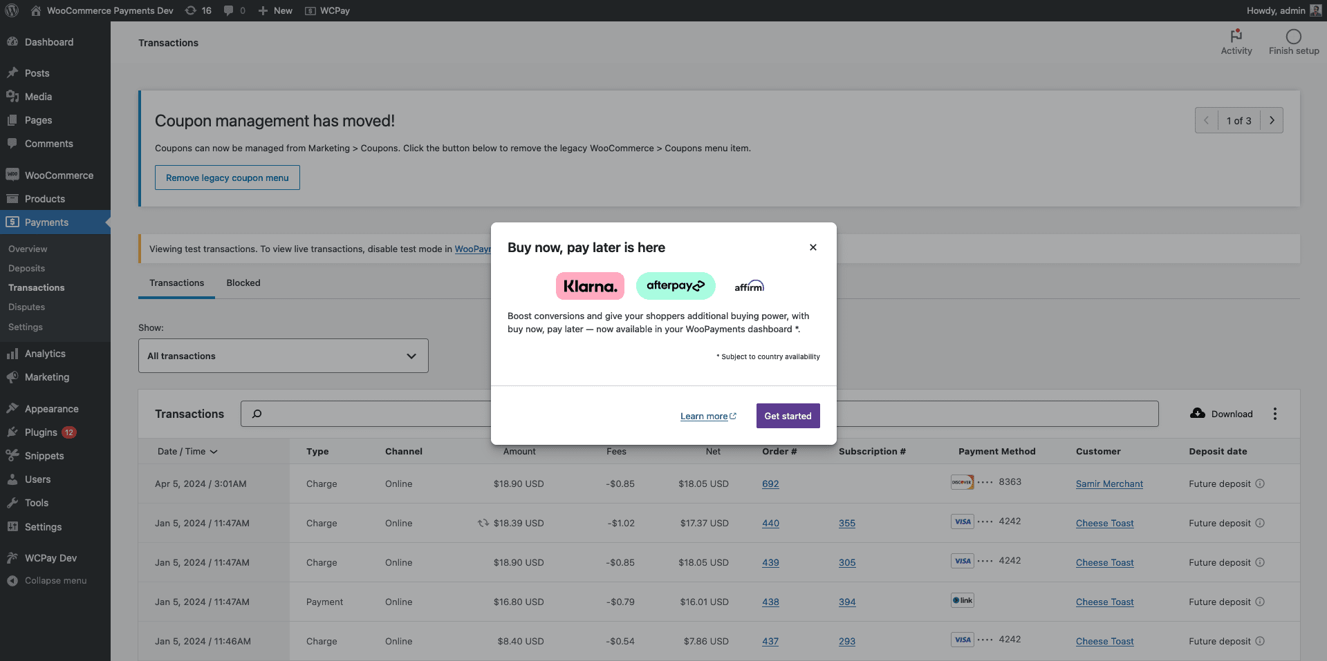 Original modal with pill icons
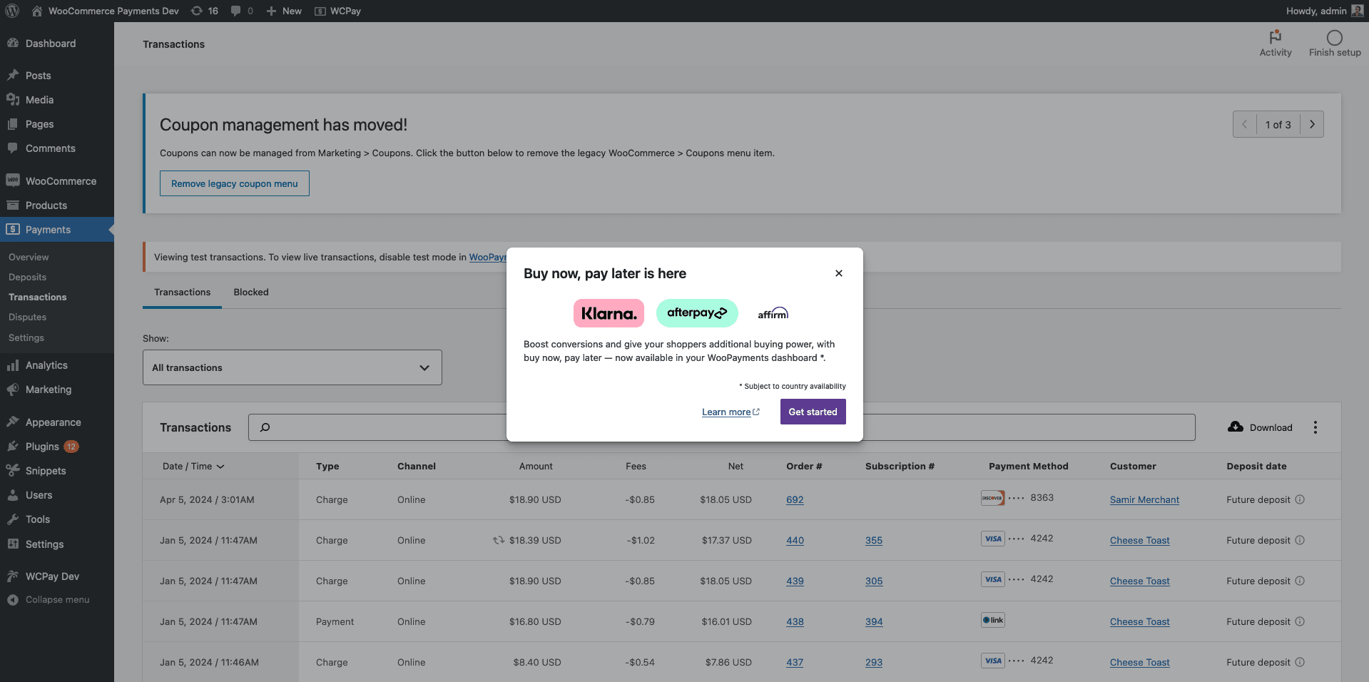 Same as above, no horizontal rule
 Variation 2, but with pill icons
 Same as above, no horizontal rule
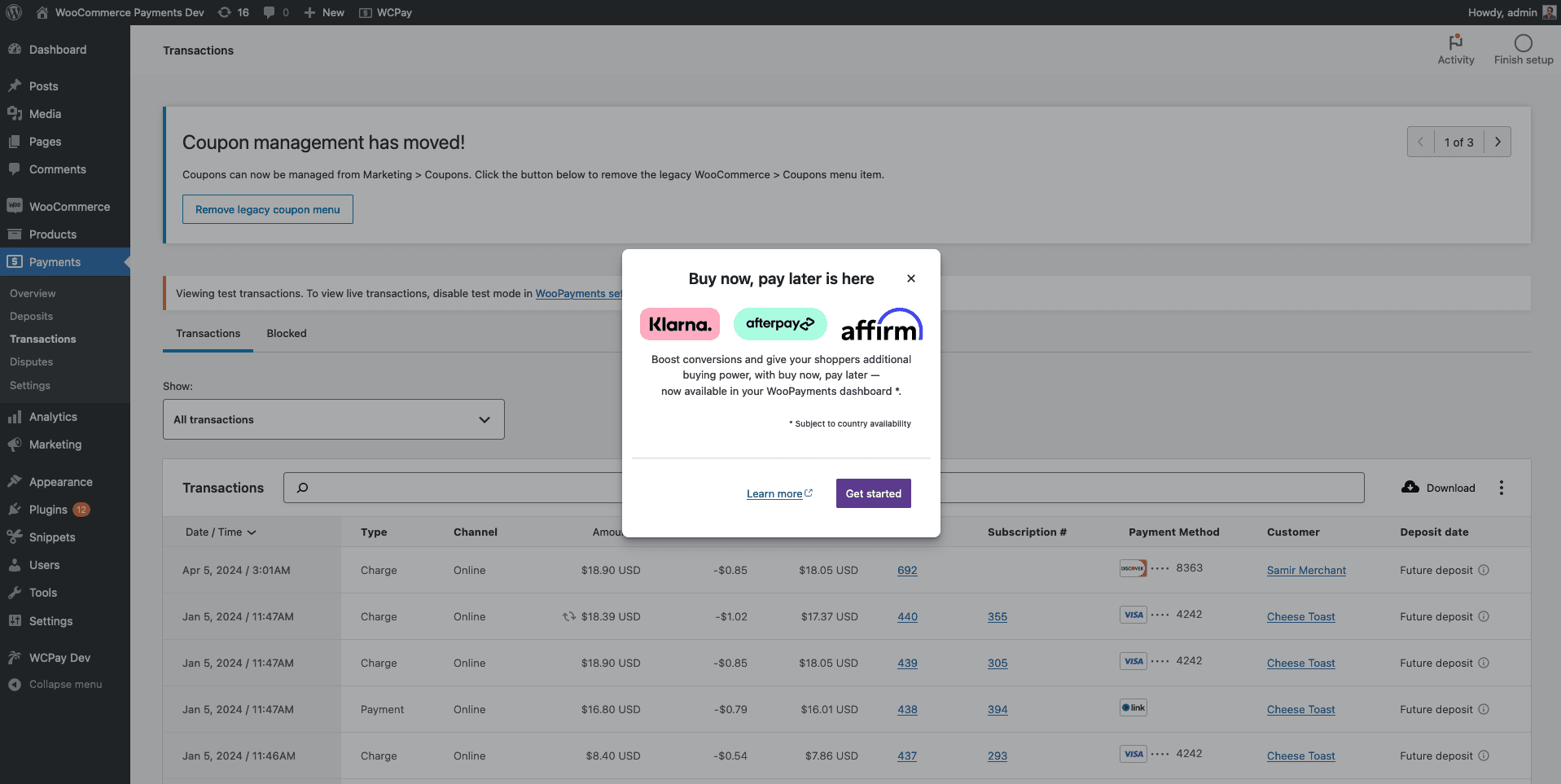 Header above logos, icons fixed
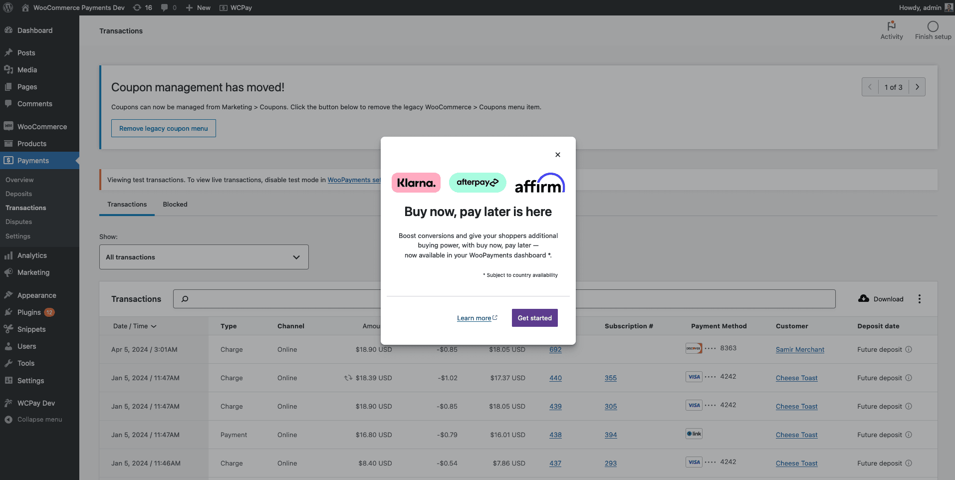 Logos above header, icons fixed
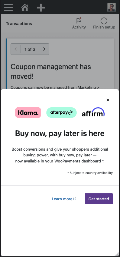 Modal as it appears on an iPhone 12
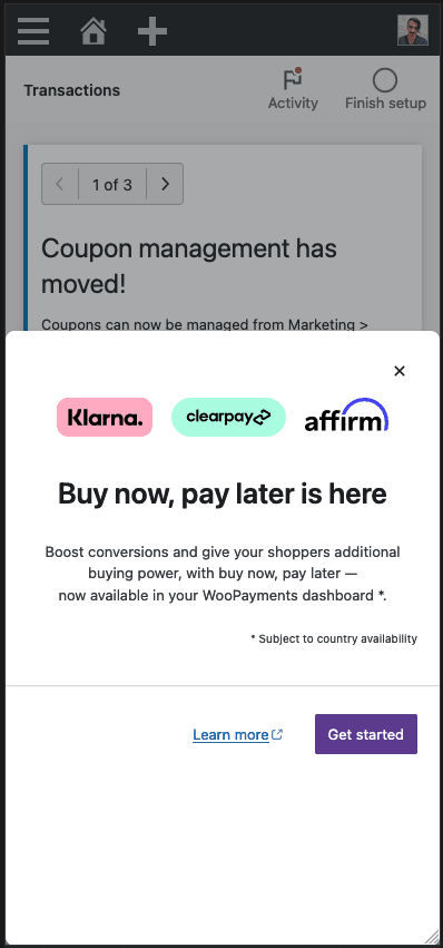 Same as above, but with the Clearpay logo
Description
BNPL payment methods are a recent addition to WooPayments. Limited channels were used to communicate their availability to merchants including in the What's New in Woo newsletter. Later this year, targeted merchants will receive the notification via email.
An effective feature launch is communicated through a well coordinated, multi-channel campaign that targets existing, churned, and prospective merchants. While there's ongoing work to map out this comprehensive merchant notification journey for various personas, we'll launch an in-product feature announcement experiment to existing merchants.
Acceptance criteria
wcpay_wcadmin_bnpl_april15_feature_announcement_view,wcpay_wcadmin_bnpl_april15_feature_announcement_enable_click,wcpay_wcadmin_bnpl_april15_feature_announcement_learn_click.Do we have any existing telemetry on the BNPL payment methods in the settings screen?
Confirmed - wcpay_payment_method_enabled, wcpay_payment_method_disabled are implemented and I'm seeing event data.
on focus. OK to drop the on user action trigger if it allow us to meet the 7.5.0 release.Designs
Sizes Desktop - 357 x 500 Mobile - viewport width and 3/4 height from bottom up.
Rough Layout (center aligned)
Buy now, pay later is here
Klarna logo Afterpay logo Affirm Logo
Boost conversions and give your shoppers additional buying power, with buy now, pay later — now available in your WooPayments dashboard*.
[Get started] (wide button) Learn more
*Subject to country availability (fine print, smaller font)
Additional context / assets
Klarna Badge Afterpay Badge Affirm logo Clearpay Badge