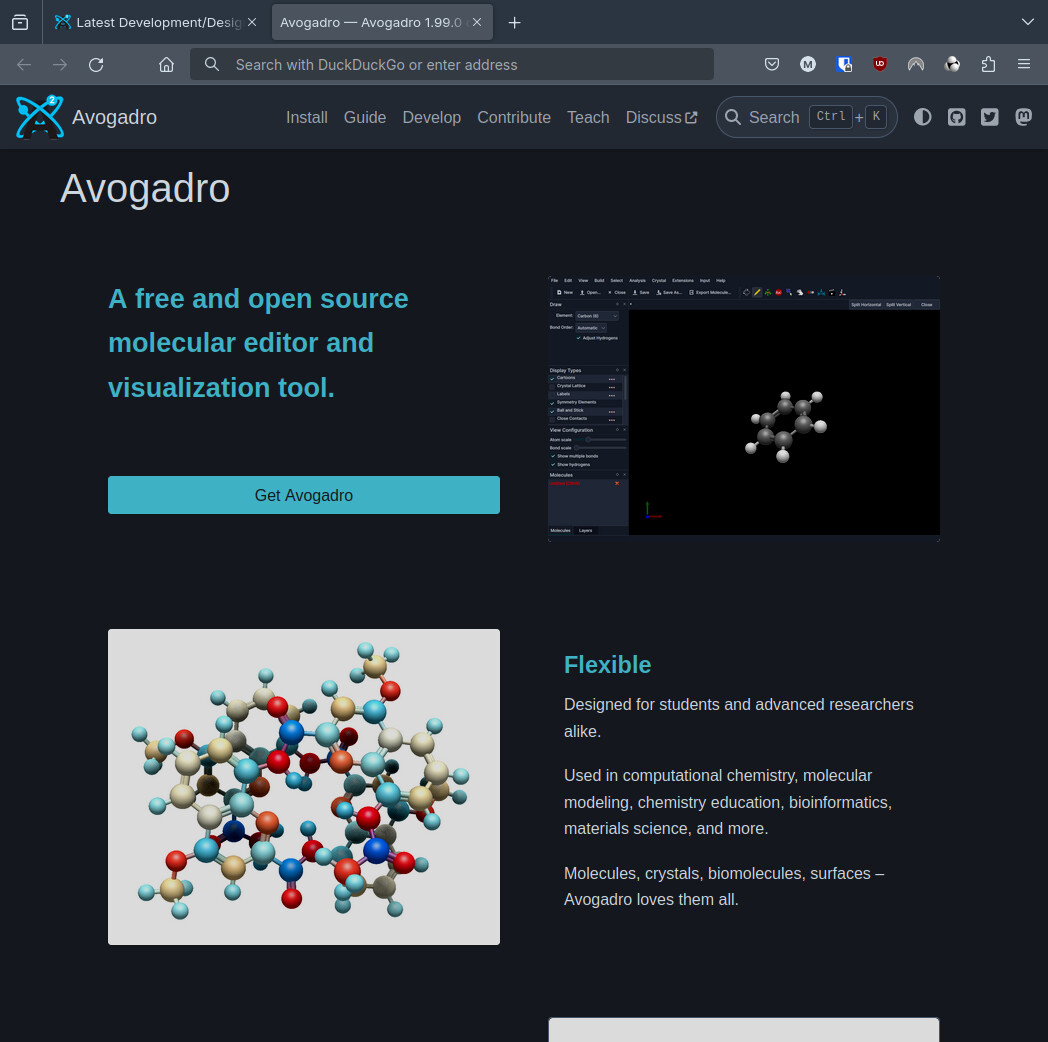
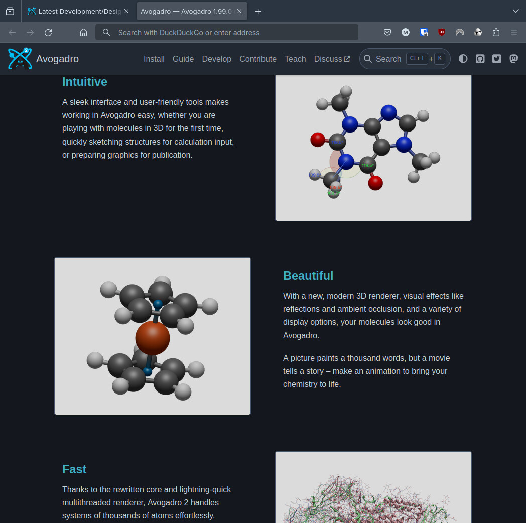
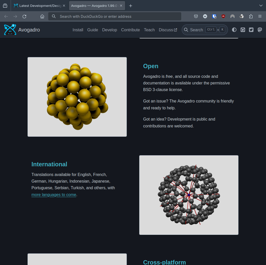
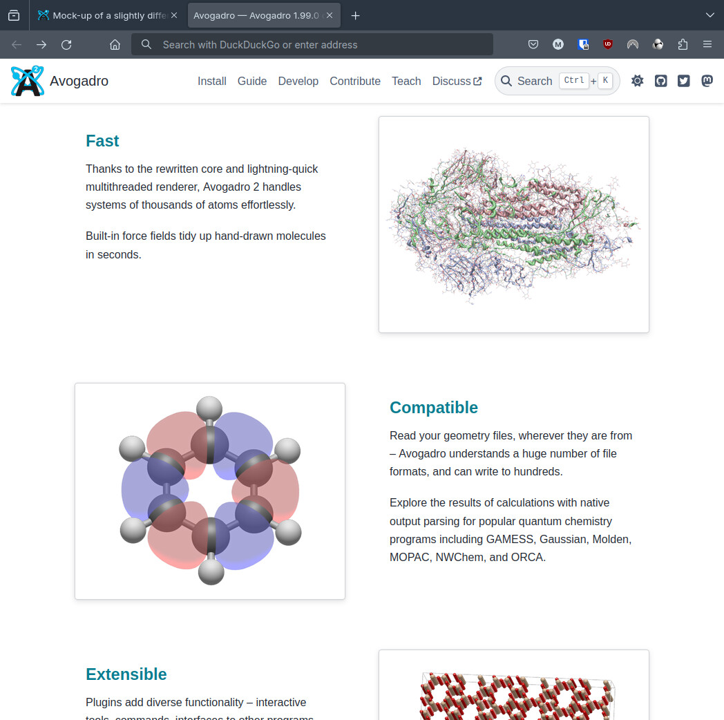
Thanks! Could you upload a screenshot of the new version? This would help a bit understand the redesign, but it looks reasonable to me.
Closed matterhorn103 closed 1 month ago
Thanks! Could you upload a screenshot of the new version? This would help a bit understand the redesign, but it looks reasonable to me.
Sure :)


We could maybe do with a screenshot of the interface that's more zoomed in I think, something that shows things off a bit better, but I don't think it's a bad idea to lead with an actual screenshot of the program
Let's give it a shot. Seems like it's a little "long" but hey, I know my views on web development date back to 1997. 😄
We could maybe do with a screenshot of the interface that's more zoomed in I think, something that shows things off a bit better, but I don't think it's a bad idea to lead with an actual screenshot of the program
The challenge is that the interface is "big." The Blender homepage, for example, just leaves the interace as-is for what it's worth.
Let's give it a shot. Seems like it's a little "long" but hey, I know my views on web development date back to 1997. 😄
That's definitely not an unfair criticism. I was originally just attempting to preserve all the information that was on the page before, and all the images that were in the carousel.
Blender has 6 of those little image + text pairs, whereas we have 9. Though they take up more space there, so I don't think the scrolling distance is dissimilar, but still, I wouldn't be averse to dropping one or two.
I would suggest that the "Open" section doesn't add a lot of actual information (that Avo is open source is stated at the very top of the page) and could be readily dropped, for example.
Work I did on redesigning the home page with a modern look inspired by the Blender and KDE home pages.