nus-pe-bot
commented
3 years ago
nus-pe-bot
commented
3 years ago Team's Response
Thank you for your feedback. The team has reviewed this report and decided that this is not an issue.
Reason
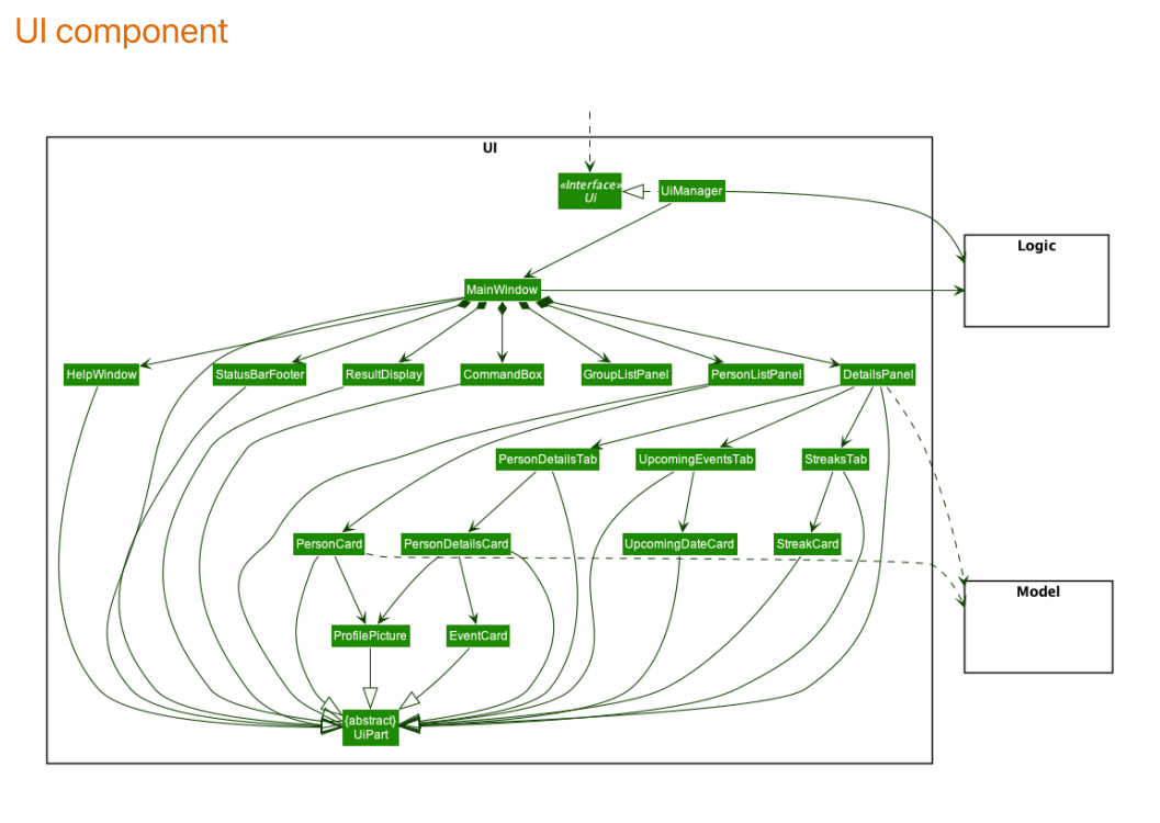
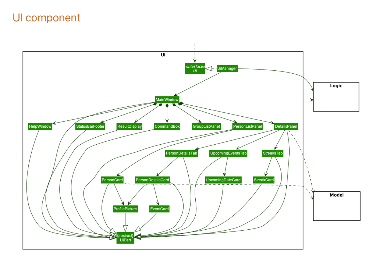
The diagram allowing developers to view at a glance all UI components used in the app.
Elaboration
Splitting it up into multiple parts makes it harder for developers to follow, as some smaller components are used by multiple components. For example, ProfilePicture is used by PersonListPanel as well as DetailsPanel.
We do agree that perhaps the neatness of the lines leaves much to be desired, however, this is a limitation of plantuml and is beyond our scope.
The 'Original' Bug
[The team marked this bug as a duplicate of the following bug]
Class diagram for Ui component can be neater
Note from the teaching team: This bug was reported during the Part II (Evaluating Documents) stage of the PE. You may reject this bug if it is not related to the quality of documentation.
Perhaps break the component up into multiple parts? It's less readable when everything's included.
[original: nus-cs2103-AY2021S2/pe-interim#29] [original labels: severity.Low type.DocumentationBug]
Their Response to the 'Original' Bug
[This is the team's response to the above 'original' bug]
Thank you for your feedback. The team has reviewed this report and decided that this is not an issue.
Reason
The diagram allowing developers to view at a glance all UI components used in the app.
Elaboration
Splitting it up into multiple parts makes it harder for developers to follow, as some smaller components are used by multiple components. For example,
ProfilePictureis used byPersonListPanelas well asDetailsPanel.We do agree that perhaps the neatness of the lines leaves much to be desired, however, this is a limitation of plantuml and is beyond our scope.
Items for the Tester to Verify
:question: Issue duplicate status
Team chose to mark this issue as a duplicate of another issue (as explained in the Team's response above)
- [ ] I disagree
Reason for disagreement: [replace this with your explanation]
:question: Issue response
Team chose [response.Rejected]
- [x] I disagree
Reason for disagreement: This is the UML from tutorial 10 that is considered too complicated.
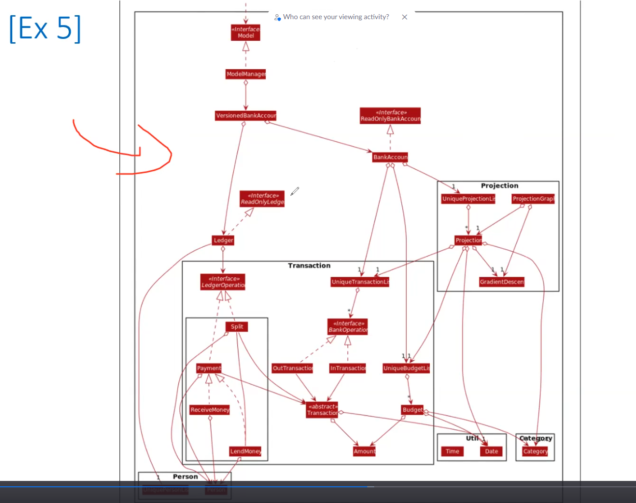 I believe that their UML is similar where some lines are overlapping and cutting across multiple lines.
Furthermore, it is overly cluttered with arrows and can be partitioned to smaller UML diagrams that is easier to understand.
I believe that their UML is similar where some lines are overlapping and cutting across multiple lines.
Furthermore, it is overly cluttered with arrows and can be partitioned to smaller UML diagrams that is easier to understand.
:question: Issue severity
Team chose [severity.Low]
Originally [severity.High]
- [x] I disagree
Reason for disagreement: This borderline makes the UML unreadable, there is no focus and readers cannot tell what is related when they are working on a subset of the UML. For example, working on the GroupListPanel I only need to look at MainWindow and UiManager that are dependent on it. Not sure why I have to sieve through so many arrows and classes to find that out, makes it difficult to read and comprehend.
The lines overlap, there is so much lines that it is difficult to read