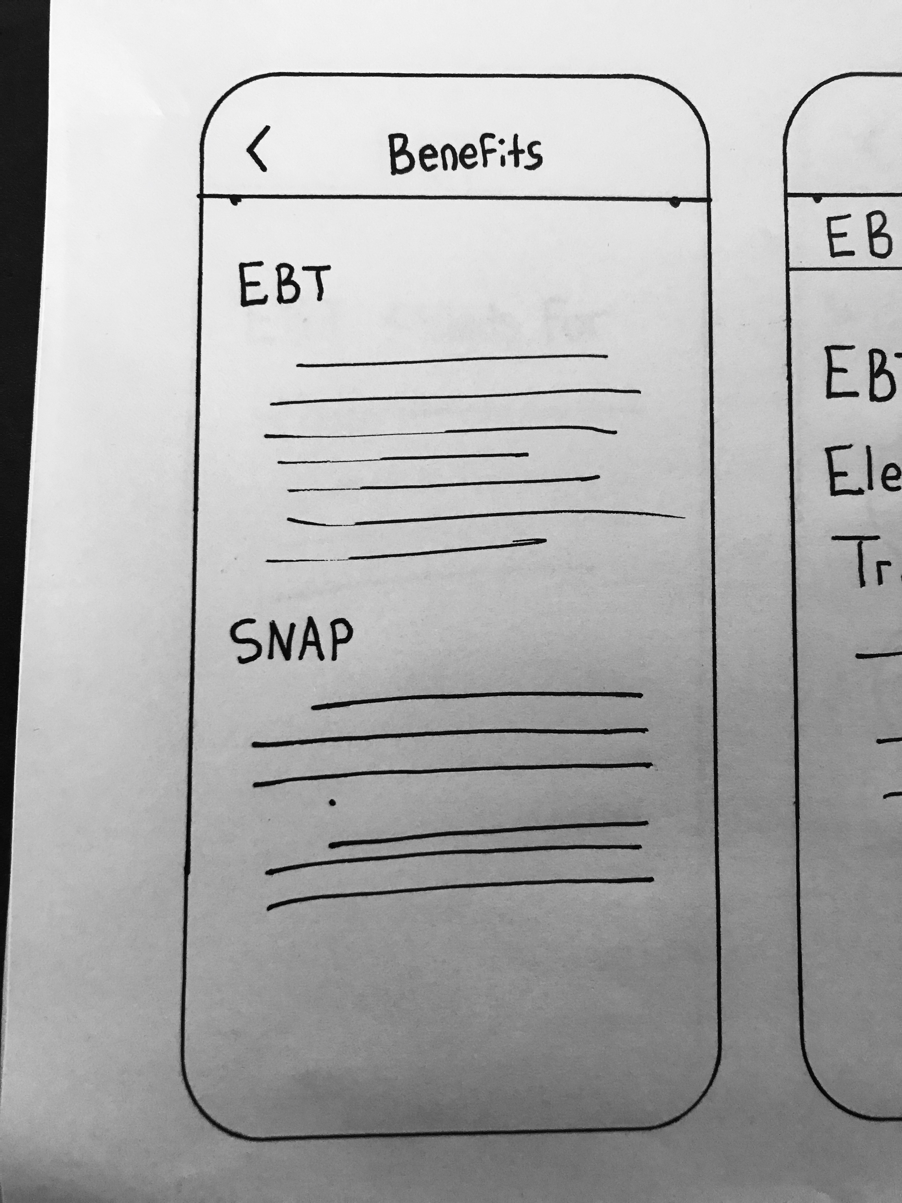
Option 1
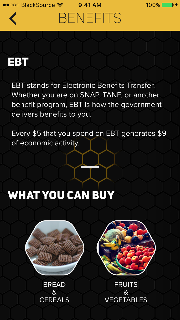
This option is the simplest. All of the information is displayed on one page. Like this, all the user has to do is scroll vertically.
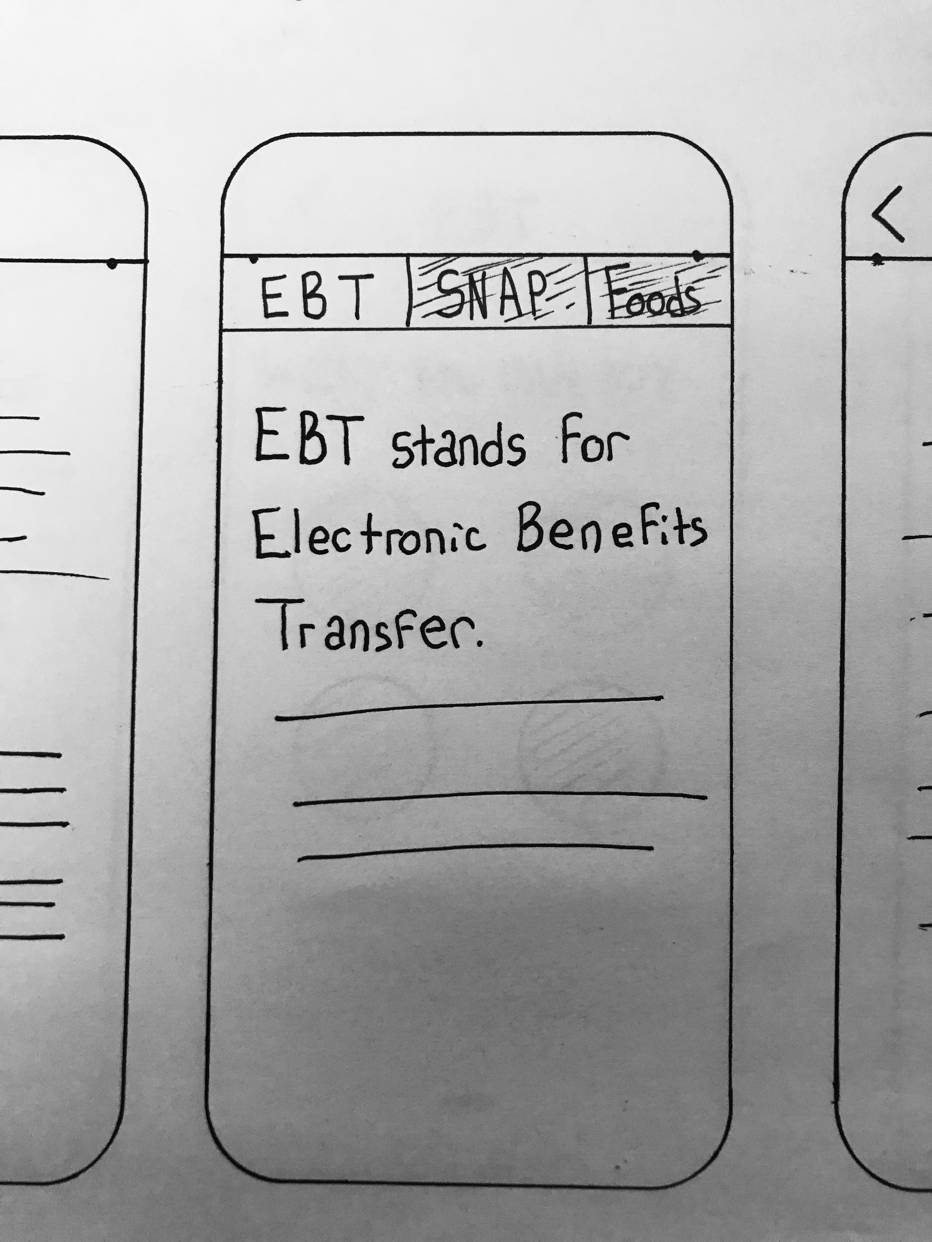
Option 2
This option is similar to the Page View style, except that it has clearer indicators for direction and placement. However, this is not a pattern that we use anywhere else in the app. For that reason is not preferable. It also does not scale very well: What if we need to add additional items?
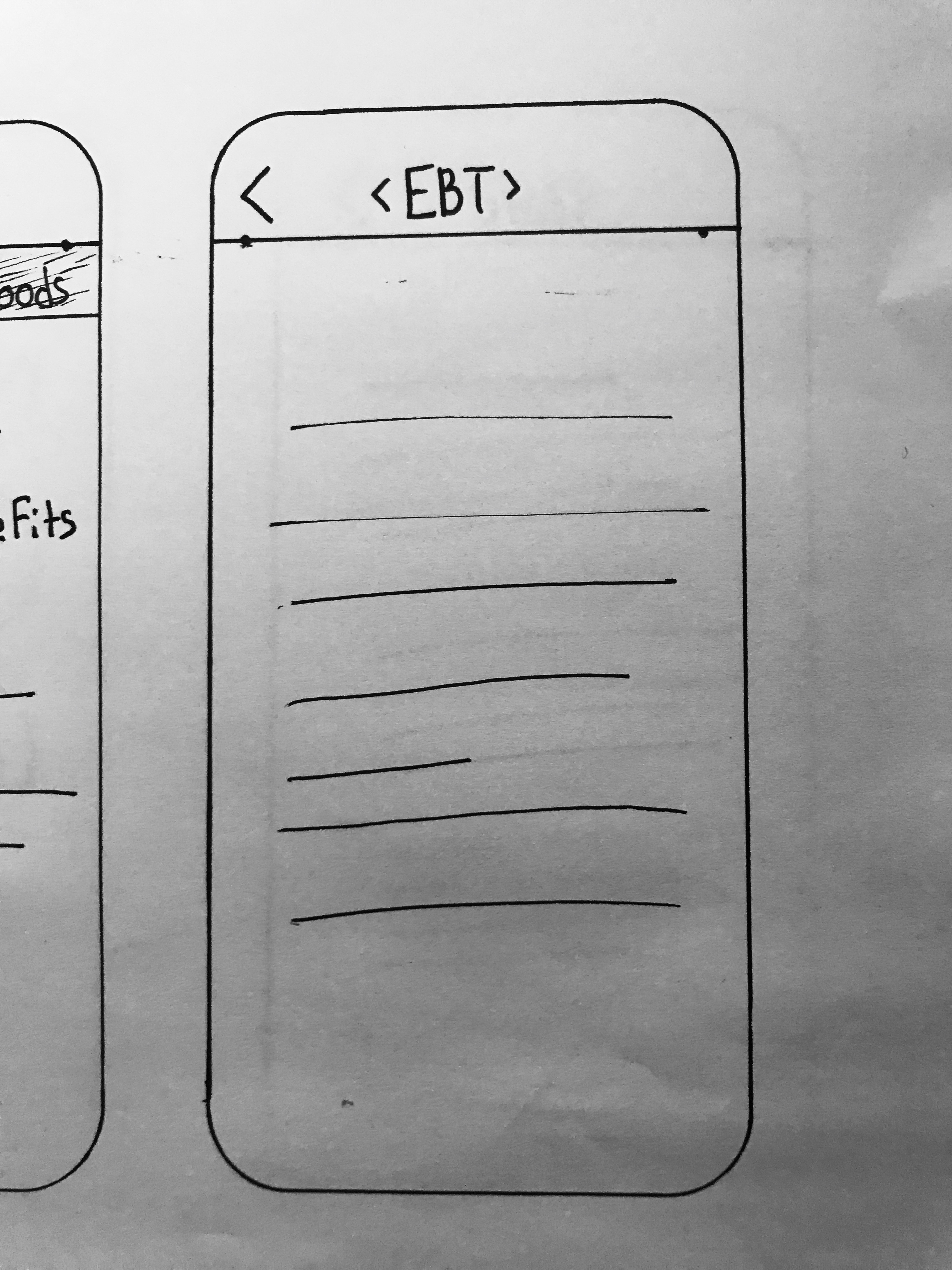
Option 3
This option is not preferable because it the additional right-left arrows on the title bar conflict with the navigational arrow already present in the navigation bar.
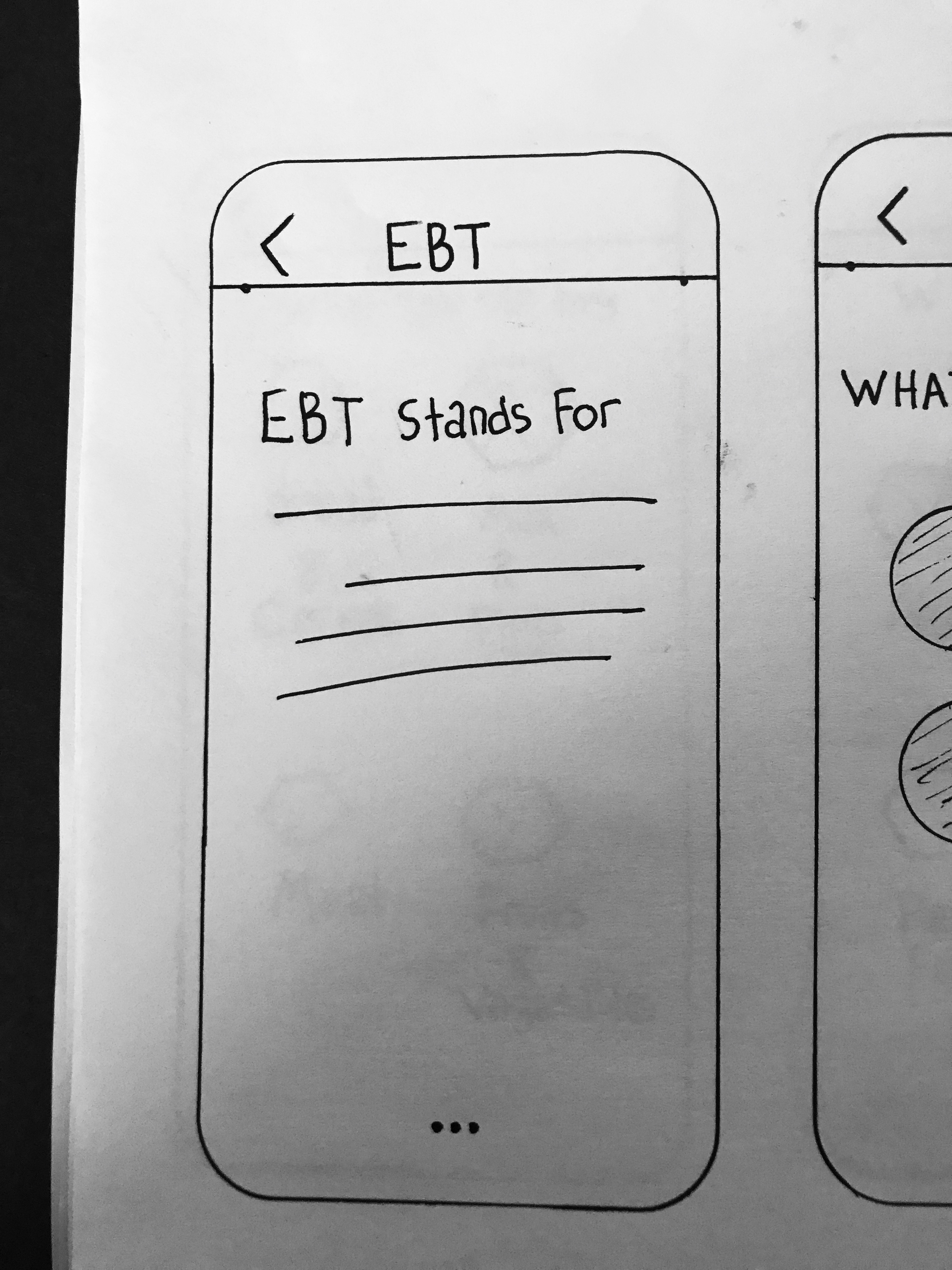
Option 4
Info
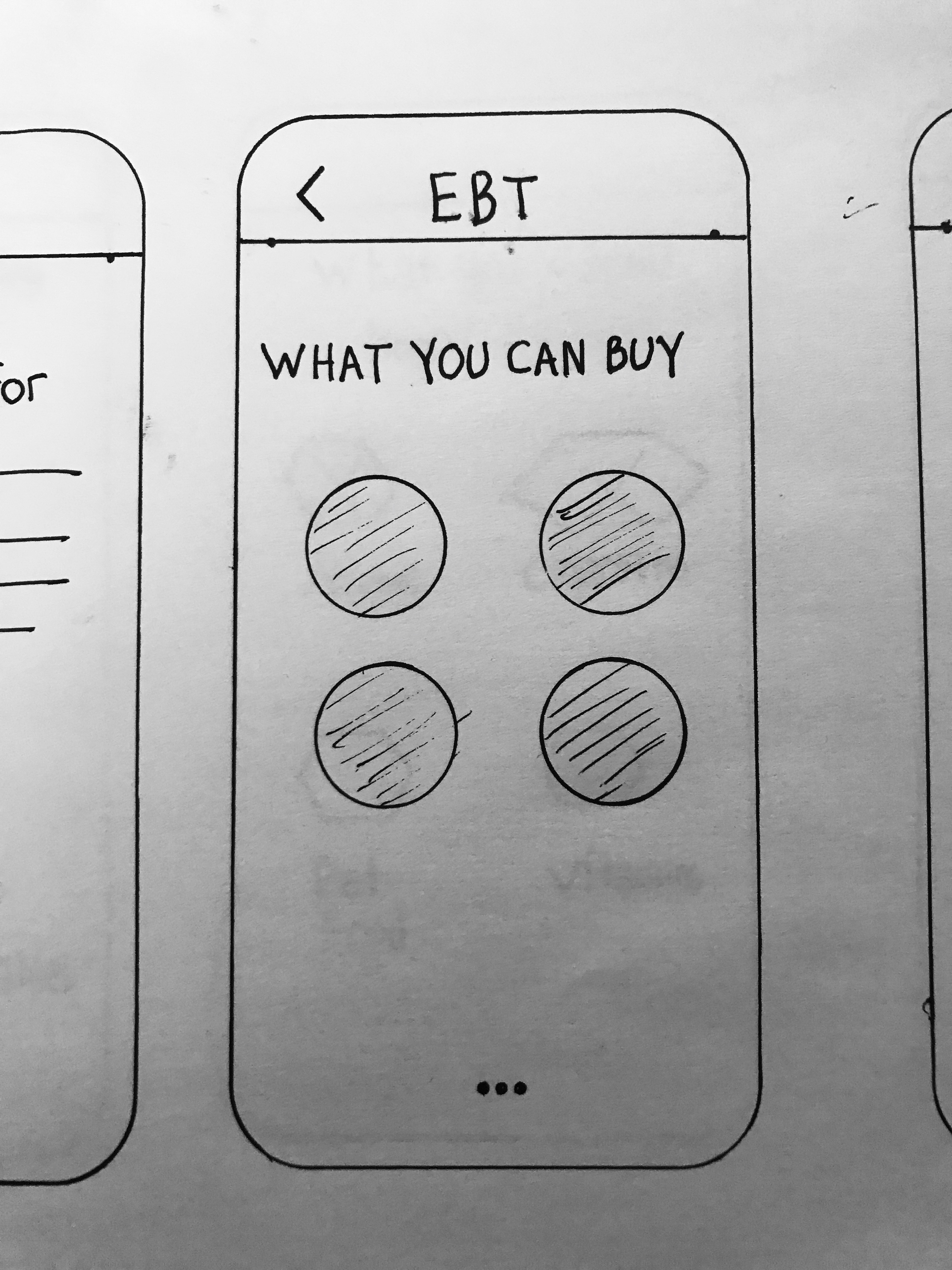
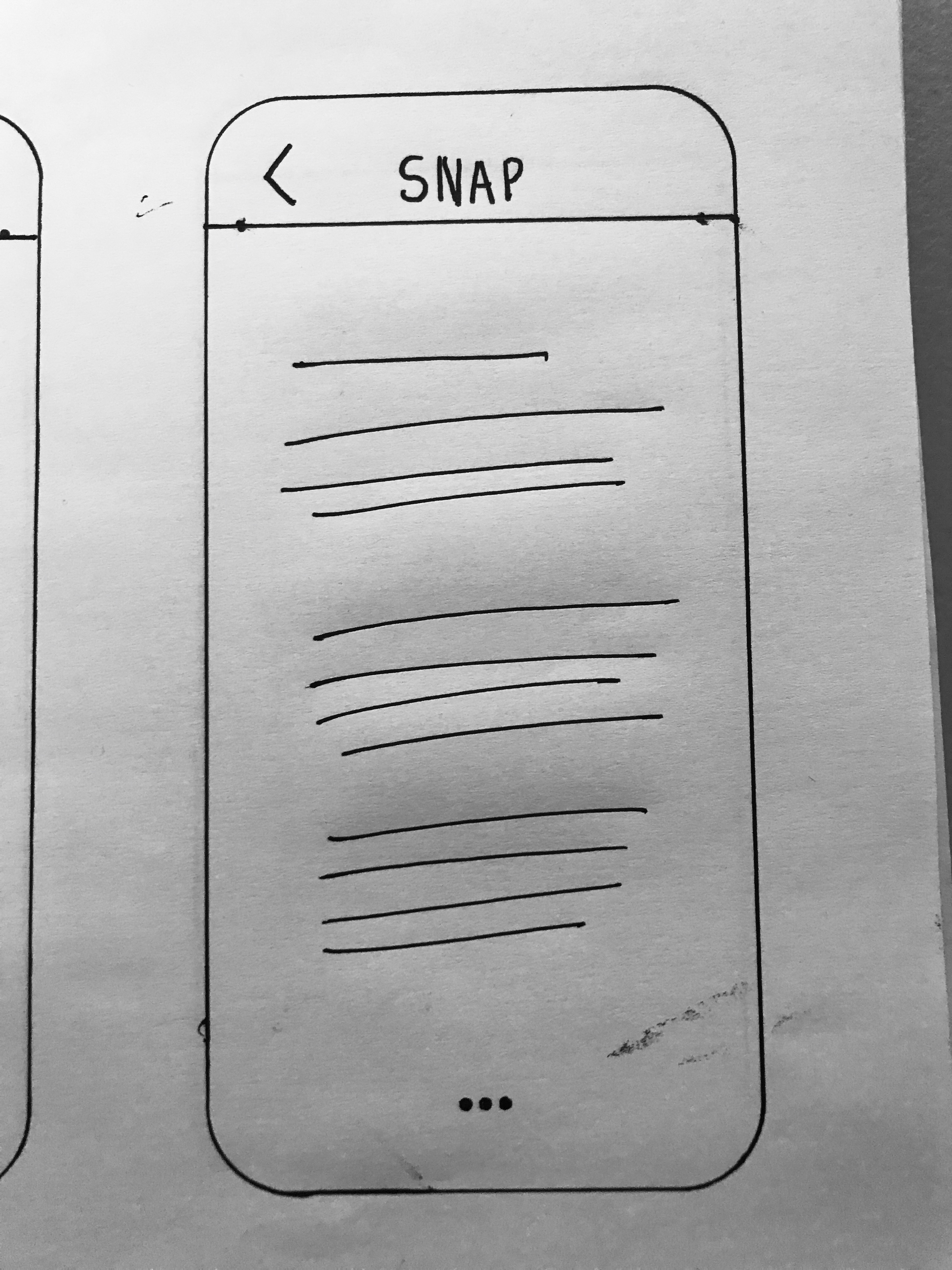
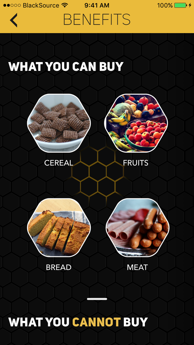
This option represents the page view.
What I like about this option is that it gives each item its own screen, keeping it tight and focused.
What I don't like about it is that the Page View pattern can be easily missed, even with the little dots that you see on there.
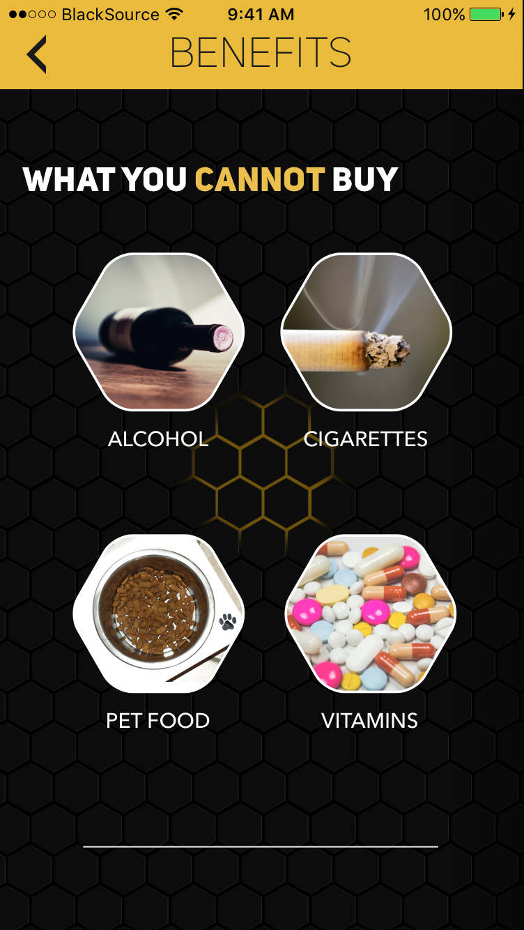
Requirements
Design the page when the user clicks on
Benefitsfrom theABOUTpage.Why
The user wants to know about Benefits and how to use them.