 soc-pe-bot
commented
2 years ago
soc-pe-bot
commented
2 years ago Team's Response
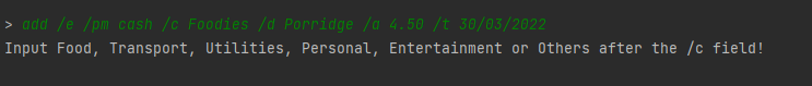
Thank you for pointing this out! As a team we decided to put details of fields under its relevant sections. In this case, categories is placed in the add an expenditure field as it is relevant to it. As a user,. if the user did not enter the category correctly, they will be first prompted by the image below to enter the correct fields.
If they are still unclear, they can easily search for "add an expenditure" in the content page and see the format for the details. Having many minor details stated in the early part of the UG may cluter the document and confuse the reader.
Items for the Tester to Verify
:question: Issue response
Team chose [response.Rejected]
- [x] I disagree
Reason for disagreement: Referring to this line:
Having many minor details stated in the early part of the UG may cluter the document and confuse the reader.
I would argue that the product (finance manager) is straightforward enough, such that the user would very likely have a rough preconception of what it is and what it can do. So it is important to first dispel any uncertainties that the user may have, rather than leave it to later. I was personally confused that's why I raised this issue.
Nevertheless, this issue is very minor so it is under severity.VeryLow.
Although it was stated in the "format" section of "adding expenditure", it could have been stated higher up in the UG because the user (like myself) might not know that there are only a fixed number of categories.
In the same vein, "cash payment" could also be stated to be editable and not fixed, so that users earlier on know that they can add in other forms of payment (e.g. credit cards) earlier on.