CPSSD / LUCAS

The repository for the LUCAS/Lucify project
MIT License
11 stars 4 forks source link

Evaluate existing model experiments on why they perform how they do. #145

Closed StefanKennedy closed 5 years ago

StefanKennedy commented 5 years ago

ACs:

StefanKennedy commented 
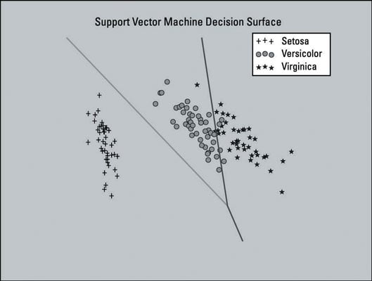
5 years ago

Found a resource that explains how to plot useful graphs, it certainly helps with explaining why logistic regression / SVMs can divide the samples: https://www.dummies.com/programming/big-data/data-science/how-to-visualize-the-classifier-in-an-svm-supervised-learning-model/

For example:

StefanKennedy commented 5 years ago

Logistic regression can be visualized using something like this:

https://stackoverflow.com/questions/46085762/sklearn-logistic-regression-plotting-probability-curve-graph

StefanKennedy commented 5 years ago

First visualization of how LinearSVC divides the data:

screenshot from 2019-03-07 12-39-25

StefanKennedy commented 5 years ago

Evaluations:

StefanKennedy commented 5 years ago

These graphs were created by performing a lot of dimensionality reduction, and you can see that a linear divide is not going to be able to separate the samples at this dimensionality.

Screenshot from 2019-03-08 21-32-03

StefanKennedy commented 5 years ago

Assessing features with logistic regression curves:

Screenshot from 2019-03-09 15-44-27

From these basic visualisations we can see the following:

StefanKennedy commented 5 years ago

Bayesian graphs: https://dataconomy.com/2015/02/introduction-to-bayes-theorem-with-python/

StefanKennedy commented 5 years ago

Naive bayes classification, on a subset of the samples:

Screenshot from 2019-03-12 21-53-15

StefanKennedy commented 5 years ago

Naive bayes feature selection :fireworks:

Screenshot from 2019-03-13 17-02-14