Open jawz101 opened 4 years ago
Interesting that most of these are built with Arcgis.
Here's mine, built with Vue.js and some PHP. https://trackthevirus.info/
Features a fully interactive map, Country/State/Province drill downs. Charts are fully interactive and reactive based region selected
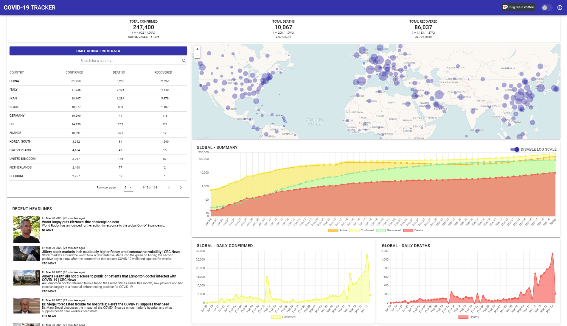
update: I've added a tool that allows you to compare the growth between countries/states. Can customize the graphs, view by confirmed/deaths, by numbers, or per capita. Starting from X case(s)
I would like to add https://interaktiv.morgenpost.de/corona-virus-karte-infektionen-deutschland-weltweit/?fbclid=IwAR04HlqzakGaNssQzbz4d8o8R3gz0C910U8tvfYlBT6P0lVJJvHfk9uS2rc to Germany as that one is more up to date with its numbers
My dashboard was built on Cognos, which uses Mapbox for the maps. There are a few maps, but I've been focusing more on graphs.
I've also added population numbers, and I've counted the days since the first reported case in each country to make a cohort analysis.
Thank you for the list, I thought about creating a sample-issue like that today. So you were faster. I will close my issue to make the issues-list smaller.
I would like to add https://interaktiv.morgenpost.de/corona-virus-karte-infektionen-deutschland-weltweit/?fbclid=IwAR04HlqzakGaNssQzbz4d8o8R3gz0C910U8tvfYlBT6P0lVJJvHfk9uS2rc to Germany as that one is more up to date with its numbers
Thats a media article, not an official dashboard. I crerated a seperate issue for collecting such stuffi here: https://github.com/CSSEGISandData/COVID-19/issues/578 Feel free to remove your comment ;-)
@nguyandy it looks great, and like the fact it is optimized. It loads very fast.
Mine, similar to the JHU one with a few more breakdowns
@gena I love the color-coded circle idea denoting active, survived, deaths. That's a good way to visualize the overall affect on an area. If we were fancy, taking populations and then using transparency to show % of population affected or per 100k or something would be interesting. I'm not suggesting that but just thinking out loud.
@analyzewithpower @joetynan11 PowerBI. Nice. I've been playing with choropleths in QGIS - not for this. local health data.
I don't know why more business intelligence companies don't offer their software to orgs or make big visualizations like this. You would think someone like Teradata would show some civic duty to lend their services and show off the competency of their products. I read of a company called TigerGraph that offered their software to China
Here is open source dashboard project.
https://corona-board.soaple.endpoint.ainize.ai/statistics/dashboard https://github.com/soaple/corona-board
@jawz101 Tableau, major BI company, offers Tableau Public: https://public.tableau.com/s/ Includes both a scaled-down version of Tableau Desktop/Creator and also free hosting of published dashboards. I agree with you that more BI companies should do this.
Here is my dashboard, developed by a combination of Alteryx and Tableau, and published to Tableau Public: https://tabsoft.co/2Q9BAoD
One more here , https://www.aydan.info/
Being built while training students on javascript, open layer and node.js. Does not use any specific tool or software.
More updates to follow.
Here is my little side project over the weekend:
https://virus-corona.herokuapp.com
I was particularly interested in seeing the cumulative number of cases for each country over time, as well as new cases emerging by day. So I decided to develop a web-app/dashboard that gives me all this information in one place.
Hover over data and/or play with dropdowns on top for all 3 pages.
My contribution.
Have a look at the "Currently infected" graphs - especially for China and for South Korea.
This one is made with our custom business intelligence tool: https://datoris.com/gallery/report/92 Data source is made public, you can interactively explore it: https://datoris.com/explore/source/62
Here's mine, based on this repo's data, with focus on growth patterns in specific countries: https://mackuba.eu/corona/
@ODrying is there a way to make that tiniest font a little bigger or something I can't barely read the numbers and it's pretty persistent as I can't change it with zoom or stylish. 1920x1080. Also United States isn't visible in the country list (edit: Clicking on the US works to filter). Other than that great display.
@jay Yeah, United States is 'US' (as per the data from CSSE). Each object has a hover toolbox with a maximize button. Probably not doing much to the font size though - I will look into that. From a smartphone, you can actually zoom. You can't on a PC, unfortunately. Thanks.
My take on this, at https://covid.sdelmont.com/ focusing on deaths per day per country, but with lots of other features.
... and my contribution ... https://covid19.epi-net.info ... with time-scale, dynamic clustering, heat-map and epi-curves ... built on OpenLayers and GoogleCharts.
This is an app I made for iOS & macOS. It shows a map with two levels of details & multiple charts. https://github.com/MhdHejazi/CoronaTracker
Let me share my own on youtube, is a live dashboard. Written in Processing, data is from worldometer.info (imported through google sheet). Still working on adding the time-series data from this repo. Designed for the public who needs a quick brief of covid-19 spread in simple numbers and intuitive color map. thanx for any feedback and support.
@piccolbo NIce. How did you angle your ggplot line labels?
Here‘s my dashboard app: https://covid19.cwerner.ai Source: https://github.com/cwerner/covid19
Python/ Streamlit...
Simple numbers dashboard: (USA centric) https://tinyurl.com/COVID19-Dashboards
@DavidGeeraerts Succinct & really nice! Would be fun to see there some movement as on https://www.usdebtclock.org/ That might scare the s*** out of some folks I guess, but yeah... :)
And please make it worldwide... you know what I mean, c'mon.
See also http://yyahn.com/covid19/ from #740
Here is mine using R's Shiny https://benas001.shinyapps.io/covid-19-dash/ Creating it just for fun, still in early development stage but we in Lithuania will be in quarantine from monday, so there will be plenty of time to improve it if I don't lose interest (or do not catch corona...) :).
Just found this post on the interweb. I started listing them but there really are a bunch
https://storymaps.arcgis.com/stories/a1746ada9bff48c09ef76e5a788b5910
United Nations aviation agency built the 3DFX Dispersion map https://icao.maps.arcgis.com/apps/webappviewer3d/index.html?id=d9d3f8fa9a23425c8f0889baab626186 University of Virginia http://nssac.bii.virginia.edu/covid-19/dashboard/ WHO https://experience.arcgis.com/experience/685d0ace521648f8a5beeeee1b9125cd https://who.maps.arcgis.com/apps/opsdashboard/index.html#/c88e37cfc43b4ed3baf977d77e4a0667
Too many to list here https://coronavirus-disasterresponse.hub.arcgis.com/
earlyAlert (Oklahoma Early Alert Dashboard includes airport suspensions, travel health notices with options to sort by country) https://www.arcgis.com/apps/opsdashboard/index.html#/20bfbf89c8e74c0494c90b1ae0fa7b78
unknown (maybe in Lithuanian) https://www.arcgis.com/apps/opsdashboard/index.html#/3a68dac5ebb94b6a8db221c954bcc90e
Germany https://experience.arcgis.com/experience/478220a4c454480e823b17327b2bf1d4 Indonesia (Geoportal Kebencanaan) http://gis.bnpb.go.id/arcgis/apps/webappviewer/index.html?id=9b8d73c9874a4fda983ddf4f4b2dbac4 Italy: https://www.arcgis.com/apps/opsdashboard/index.html#/4f74fc222b7041cd9cc3c52e62af1b8c Japan (JAG Japan Corp) https://www.arcgis.com/apps/opsdashboard/index.html#/641eba7fef234a47880e1e1dc4de85ce Johns Hopkins World map https://gisanddata.maps.arcgis.com/apps/opsdashboard/index.html#/bda7594740fd40299423467b48e9ecf6 Korea ESRI https://esrikrmkt.maps.arcgis.com/apps/MapSeries/index.html?appid=b379f788425349168d02669285758af0 Philippines Department of Health https://ncovtracker.doh.gov.ph/ Shenzen http://129.204.11.162:8080/sys_yq_shenzhen/ (viewable in China?) Singapore Ministry of Health: https://experience.arcgis.com/experience/7e30edc490a5441a874f9efe67bd8b89 Taiwan: https://viator.maps.arcgis.com/apps/opsdashboard/index.html#/bbd3dfeeec9c494daf178457c7b74c3e Thailand Ministry of Public Health https://mophgis.maps.arcgis.com/apps/opsdashboard/index.html#/210413ebb5ff49bb8914808af6473322 Israel https://systematics.maps.arcgis.com/apps/opsdashboard/index.html#/e1a670aa9493446889760fb22c882066?locale=he
Turkey http://esriturkiye.maps.arcgis.com/apps/opsdashboard/index.html#/cfe8603d7f104fd6b133bc1fed0e90bd
Hong Kong English https://chp-dashboard.geodata.gov.hk/nia/en.html English https://chp-dashboard.geodata.gov.hk/covid-19/en.html includes "predictive ai"? Chinese https://chp-dashboard.geodata.gov.hk/nia/zh.html
http://www.netcraft.com.mo/dashboards.html
http://2019ncov.chinacdc.cn/2019-nCoV/ https://ncov.dxy.cn/ncovh5/view/pneumonia
Please add from Pakistan
My contribution (super basic, started learning NodeJS yesterday)
Adding my contribution as well, daily updated with CSSEGISandData feeds. https://public.tableau.com/profile/salvatore1114#!/vizhome/wdctest/CoronavirusCOVID-19Dashboard-DailyUpdates
My dashboard. Built with nuxt https://corona-data.netlify.com/
Is there a list of all REST APIs which provide corona data ?
@martiL I collect such things in the https://github.com/Bost/corona_cases/blob/master/web-services.sh also See also #492
Grafana dashboard here: https://github.com/gdassori/covid19_data_miner
https://covid19-dash.github.io/ This dashboard shows extrapolation of growth. It is designed for the greater public (simple interface, not much information, and text focused on plain-English explanation.
Using Google Data Studio https://datastudio.google.com/reporting/b1689869-0c59-442c-951d-2991c0fc611d/
Dashboard in Spanish with Chilean specific data + global data pulled from this repo.
A concise 3D visualization using Three.js: https://www.ladybug.tools/spider-covid-19-viz-3d/
Here is mine. Pretty simple, only using Power BI.
South Africa has https://datastudio.google.com/u/0/reporting/1b60bdc7-bec7-44c9-ba29-be0e043d8534/page/hrUIB maintained by Data Science for Social Impact Research Group @ University of Pretoria - repo at https://github.com/dsfsi/covid19za
Yet another dashboard developed under confinement using PowerBI with R: https://github.com/calindamian/coronavirus_dashboard
latest Dashboard for Switzerland: http://covid19.ddrobotec.com/
I've created this interactive dashboard https://covid19-dash.herokuapp.com
The difference with this one is that it is built from scratch in python using open source Plotly Dash. Any python developer or data scientist could grok it, and it is free & lightweight to host, eg. on Heroku. Read the ‘about the dashboard’ bit in the dashboard itself.
It's open source and open for collaboration, please get in contact with me if you’re interested.
I used dash also. Shiny app for R and dash for python are really great and customisable.
Comparative national trend tracker - https://diplodata.shinyapps.io/covid19countrytrends/
Stability not guaranteed as input CSVs from this repo are unpredictable
My effort using Jupyter Notebooks for data cleaning and Tableau Public for visualisation.
Single graph, deaths in countries: https://kiksu.net/covid-19/
Just found this post on the interweb. I started listing them but there really are a bunch
https://storymaps.arcgis.com/stories/a1746ada9bff48c09ef76e5a788b5910
United Nations aviation agency built the 3DFX Dispersion map https://icao.maps.arcgis.com/apps/webappviewer3d/index.html?id=d9d3f8fa9a23425c8f0889baab626186 University of Virginia http://nssac.bii.virginia.edu/covid-19/dashboard/ WHO https://experience.arcgis.com/experience/685d0ace521648f8a5beeeee1b9125cd https://who.maps.arcgis.com/apps/opsdashboard/index.html#/c88e37cfc43b4ed3baf977d77e4a0667
Too many to list here https://coronavirus-disasterresponse.hub.arcgis.com/
earlyAlert (Oklahoma Early Alert Dashboard includes airport suspensions, travel health notices with options to sort by country) https://www.arcgis.com/apps/opsdashboard/index.html#/20bfbf89c8e74c0494c90b1ae0fa7b78
unknown (maybe in Lithuanian) https://www.arcgis.com/apps/opsdashboard/index.html#/3a68dac5ebb94b6a8db221c954bcc90e
Germany https://experience.arcgis.com/experience/478220a4c454480e823b17327b2bf1d4 Indonesia (Geoportal Kebencanaan) http://gis.bnpb.go.id/arcgis/apps/webappviewer/index.html?id=9b8d73c9874a4fda983ddf4f4b2dbac4 Italy: https://www.arcgis.com/apps/opsdashboard/index.html#/4f74fc222b7041cd9cc3c52e62af1b8c Japan (JAG Japan Corp) https://www.arcgis.com/apps/opsdashboard/index.html#/641eba7fef234a47880e1e1dc4de85ce Johns Hopkins World map https://gisanddata.maps.arcgis.com/apps/opsdashboard/index.html#/bda7594740fd40299423467b48e9ecf6 Korea ESRI https://esrikrmkt.maps.arcgis.com/apps/MapSeries/index.html?appid=b379f788425349168d02669285758af0 Philippines Department of Health https://ncovtracker.doh.gov.ph/ Shenzen http://129.204.11.162:8080/sys_yq_shenzhen/ (viewable in China?) Singapore Ministry of Health: https://experience.arcgis.com/experience/7e30edc490a5441a874f9efe67bd8b89 Taiwan: https://viator.maps.arcgis.com/apps/opsdashboard/index.html#/bbd3dfeeec9c494daf178457c7b74c3e Thailand Ministry of Public Health https://mophgis.maps.arcgis.com/apps/opsdashboard/index.html#/210413ebb5ff49bb8914808af6473322 Israel https://systematics.maps.arcgis.com/apps/opsdashboard/index.html#/e1a670aa9493446889760fb22c882066?locale=he
Turkey http://esriturkiye.maps.arcgis.com/apps/opsdashboard/index.html#/cfe8603d7f104fd6b133bc1fed0e90bd
Hong Kong English https://chp-dashboard.geodata.gov.hk/nia/en.html English https://chp-dashboard.geodata.gov.hk/covid-19/en.html includes "predictive ai"? Chinese https://chp-dashboard.geodata.gov.hk/nia/zh.html
http://www.netcraft.com.mo/dashboards.html
http://2019ncov.chinacdc.cn/2019-nCoV/ https://ncov.dxy.cn/ncovh5/view/pneumonia