CatharsisFonts / Ysabeau

Ysabeau: The essence of Garamond in an open-source sans-serif typeface
SIL Open Font License 1.1
500 stars 16 forks source link

Missing Name ID 16/17 for regular/bold/italic/bolditalic #1

Closed be5invis closed 2 years ago

sergeevabc commented 7 years ago

Not sure what this topic means, but the released fonts have different names than listed in readme.md, i.e. EauTest instead of EauDeGaramond. It’s a bit confusing for sure.

CatharsisFonts commented 7 years ago

I haven't «released» any Eau de Garamond fonts yet. The font names show that these are still preliminary test versions.

The Roman should be fully functional by now, though. The Italic is far from finished, though. Latin letters and figures are done in a first version, but e.g. punctuation is not.
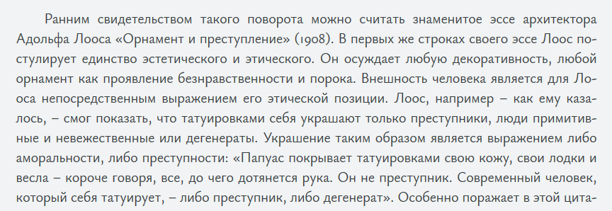
sergeevabc commented 6 years ago

Cannot stress enough what a hidden gem Eau de Garamond is, a rare sans for hours of gratifying reading.

Cyrillic piece of text below is rendered with font-size 20px and line-height 1.4 (28px), click to zoom.

CatharsisFonts commented 6 years ago

That's great to hear! 😬 Thanks for the feedback!

I wish I could import fonts to my Kindle for testing, but it's not possible.

sergeevabc commented 6 years ago

A lot of decent authors (e.g. your countryman Carl Jung) use italic to sharpen reader’s attention or to emphasize polysemy. So lack of EauTest Italic hurts the eyes. Temporary fix is to use another italic:

p em, p i {
    font-family: "Gentium Plus" !important;
}

What’is the current state of affairs, @CatharsisFonts?

CatharsisFonts commented 6 years ago

I‘m currently applying for Google Fonts funding to complete Eau this year. I‘m going to be quite busy with my day job until summer, but establishing basic functionality for Eau Italic will be my first priority.

Sent from my iPhone

CatharsisFonts commented 6 years ago

Aleksandr: While I haven't been sponsored by Google Fonts this year, I have just found some time to fix the basic punctuation and numbers in Eau Italic. Maybe it is now functional enough for your reading purposes? 😬

sergeevabc commented 6 years ago

@CatharsisFonts, it is encouraging to see you improving Eau Italic day by day. Six days ago only a few Cyrillic letters were rendered as expected, and today there are many more. Alas, » moved up (compare).

CatharsisFonts commented 6 years ago

Thanks for the pointer! The Italic Cyrillic should be complete now (at least as far as the glyphs go). I do note that /ge-cy, /te-cy and /pe-cy are badly hinted at the baseline now, though. That wasn’t the case before. I’ll have to look into that.