CentOS-PaaS-SIG / linchpin

ansible based multicloud orchestrator
http://linchpin.readthedocs.io
GNU General Public License v3.0
115 stars 70 forks source link

Logo Proposal for Linchpin #585

Closed area55git closed 5 years ago

area55git commented 6 years ago

Hi, I'm a graphic designer and I like to collaborate with open source projects. Do you know that the graphic image of a project is very important? thinking about it I would like to design a logo for your Project Linchpin.

I will be pleased to collaborate with you.

herlo commented 6 years ago

Hi @area55git this sounds great. Do you have any initial designs you'd like to share? I initially looked into this, but didn't really come up with anything more than an idea. A linchpin usually is an important piece, so maybe using a google images search to start would be helpful? Thanks!
area55git commented 6 years ago

Perfect..! I am very enthusiastic to design a Logo for your project. I'm going to prepare some proposals and send them to you. If you have some ideas, suggestions as to style or colors would be great to be able to start. I also need a brief summary of Linchpin to get a better idea.

herlo commented 6 years ago

https://github.com/CentOS-PaaS-SIG/linchpin/blob/develop/README.rst can be a good resource for a summary. The first few lines should suffice. As for colors, something semi-muted, maybe blue and tan or some such come to mind, but there's not definite bias.

area55git commented 6 years ago

Hi @herlo, this is the logo proposal for LinchPin

LOGO_PROPOSAL_FOR_LINCHPIN.jpg

A simple logotype with multiple version to use in different environtment (profile pict, social media, github readme, website, favicon, etc).

area55git commented 6 years ago

Hi @herlo, What did you think of the proposal?

herlo commented 6 years ago

@area55git I like your work, but I asked for opinions from a few others first. I'm thinking the design might need to change some, but don't know how yet. @samvarankashyap, any thoughts on this logo?

samvarankashyap commented 6 years ago

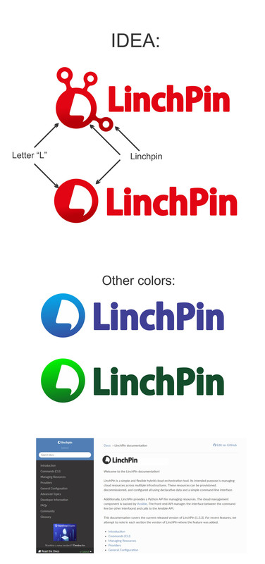
@herlo @area55git : Great work !. It has got a Interesting color gradient. However, the "L" in logo is significant I don't see anything that suggests a "cloud" or just "P" for provisioning tool. Since, Linchpin is more of a cloud orchestration tool you could as well incorporate cloud symbol into it ( It might be a overkill though ). please see:

  1. https://github.com/cloudimmense ( minus gradient color ) Rest said, I like your designs.
area55git commented 6 years ago

Hi @samvarankashyap, You like this?

LOGO_PROPOSAL_FOR_LINCHPIN_b.jpg

area55git commented 6 years ago

LOGO_PROPOSAL_FOR_LINCHPIN_c.jpg

area55git commented 6 years ago

Hi, @herlo, do you like any of the proposals?

herlo commented 6 years ago

@area55git Hi, sorry for the slow response.

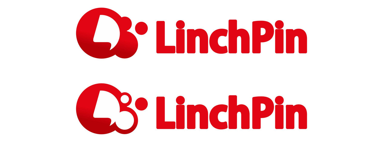
Personally, the tag line doesn't work for me, but I like the cloud component. I'm leaning toward the blue logo, or a combination of blue and red might be nice. The L in the circle seems unnecessary, but the linchpin logo above was nice. Maybe have the linchpin be inside the circle somehow and not have the 'L', maybe with the cloud instead of a circle? Not sure, just looking for more ideas I think.

Either way, I like the progress of this stuff, and I know it's a process to get right, so thanks for contributing! Let's keep going. :+1:

area55git commented 6 years ago

Ok, in 2 or 3 days I will present you another proposal, keep working. 👍

area55git commented 6 years ago

Hi @herlo, What do you think of this proposal?

LOGO_PROPOSAL_FOR_LINCHPIN_c.jpg

area55git commented 6 years ago

LOGO_PROPOSAL_FOR_LINCHPIN_c.jpg

herlo commented 6 years ago

@area55git Thank you for these updated logos. I think having the linchpin bits for the logo were better choices. I'm also not keen on the tagline 'Ansible based multicloud orchestrator' in the logo/wordmark. I do like the blue colors in the right-hand cloud logo and the font in the logo above it. Let's keep going forward with more adjustments, if that's ok

area55git commented 6 years ago

LOGO_PROPOSAL_FOR_LINCHPIN_c.jpg

area55git commented 6 years ago

what do you think?

herlo commented 6 years ago

@area55git I like the logo colors, but don't want a cloud there. Maybe a true linchpin or something closer to that? Maybe a similar to the top one in this link? https://postimg.cc/image/piges181z/ but without the L, and more internal? I like the idea of something like this: http://www.mirageinc.com/content/images/thumbs/0001239_716-linchpin-with-10-lanyard.jpeg

What do you think @samvarankashyap ?

area55git commented 6 years ago

Perfect, I understand, I'm going to present a new proposal

area55git commented 6 years ago

Hi @herlo look at this proposal

LOGO_PROPOSAL_FOR_LINCHPIN.jpg

area55git commented 6 years ago

Hi @herlo

herlo commented 6 years ago

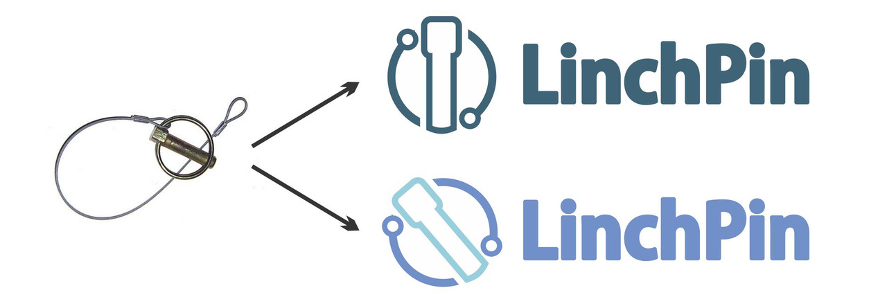
@area55git I think the pin itself should be a bit smaller, maybe make it a cotter-type pin (which could be a lower case 'L'). The circle of the linchpin could be a mostly complete circle. I like the tilted linchpin, and would like a wordmark, image mark, and combined as a logo, as identifiers of linchpin. I think we're getting there.

Thanks!

samvarankashyap commented 6 years ago

@area55git I agree with @herlo we are almost there !

area55git commented 6 years ago

Hi @herlo @samvarankashyap, I'm going to make a new sketch and send it in a few days.

samvarankashyap commented 5 years ago

@area55git any update ?

samvarankashyap commented 5 years ago

Moving issue to the backlog #1240