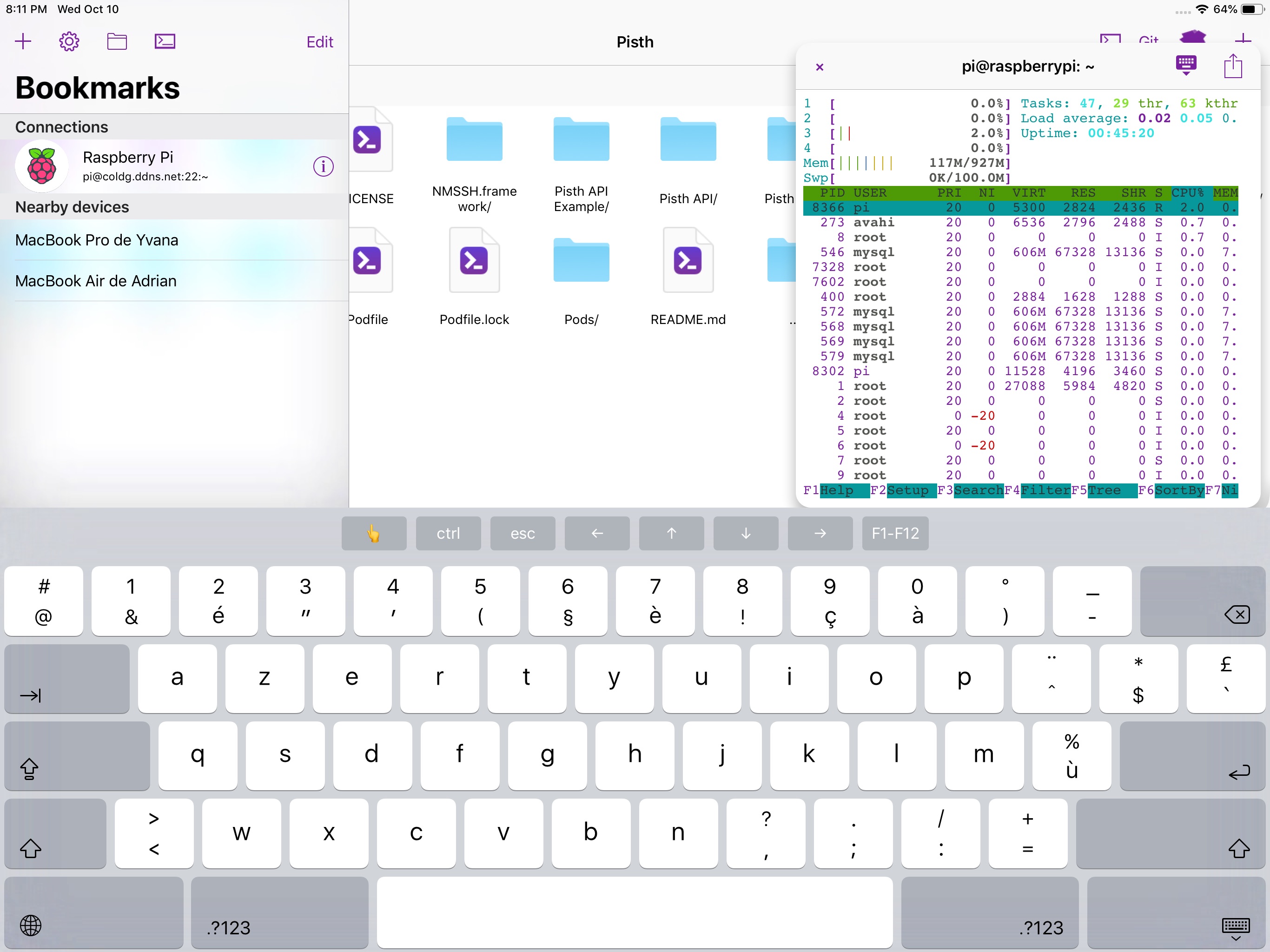
That's expected. The main screen of the app is the "Bookmarks" view. Then when a connection is opened, the screen is replaced by the terminal or the file browser. So, when the "Bookmarks" button is pressed, instead of returning to the bookmarks, the bookmarks are presented on top of the connection with a dark theme on iPhone. On iPad, the app uses a split view so the connection is not completely hidden:

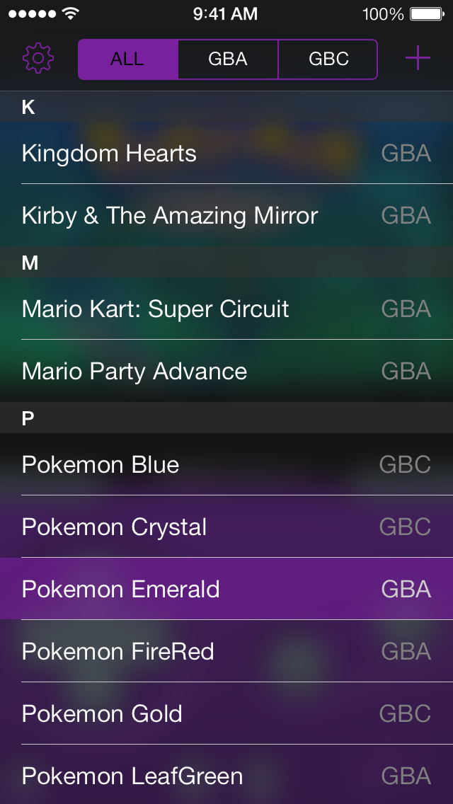
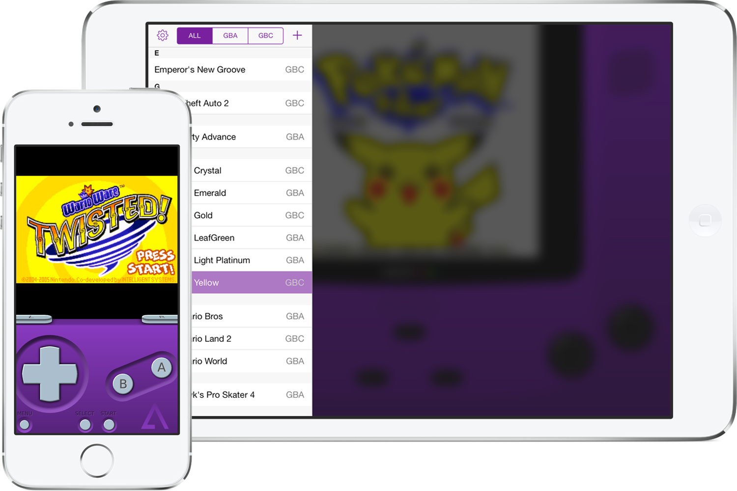
I wanted to do something like GBA4iOS:


And for the terminal dark theme with purple text, I will make the text lighter.

The app unexpectedly switches to the dark theme and remains that way until the app is restarted.
The purple text on the dark theme is also fairly inaccessible as well due to the low contrast and makes it rather hard to make out the icons and text.
Steps to reproduce:
UI will remain in a dark theme state, even though on app launch it is light themed.