Team's Response
This should be a low severity "A flaw that is unlikely to affect normal operations of the product. Appears only in very rare situations and causes a minor inconvenience only." and most definitely not a high severity as it does NOT make the product "almost unusable for most users.".
Even then, on a normal screen, the maximum character limit for names (on my system) before ... appears is slightly higher than 70 characters. This number is higher for fields with smaller text size. It just so happens that the NHS accepts up to only 70 characters.
Same with contacts.
For tags, 99.9% of words are 19 characters or less.
For emails, even with outliers, the maximum character length does not exceed 50.
For addresses, unless the user lives in Taumatawhakatangihangakoauauotamateaturipukakapikimaungahoronukupokaiwhenuakitanatahu, this really isn't an issue.
Even with all these statistics, for tasks titles or descriptions, you may also double-click an individual task to view its full details.
Items for the Tester to Verify
:question: Issue response
Team chose [response.Rejected]
- [x] I disagree
Reason for disagreement: Note that according to the bug report title, this bug report was meant for tasks, not for contacts.
Let's go with the statistic that normal screens have a slightly higher than 70 character limit, which you have provided.
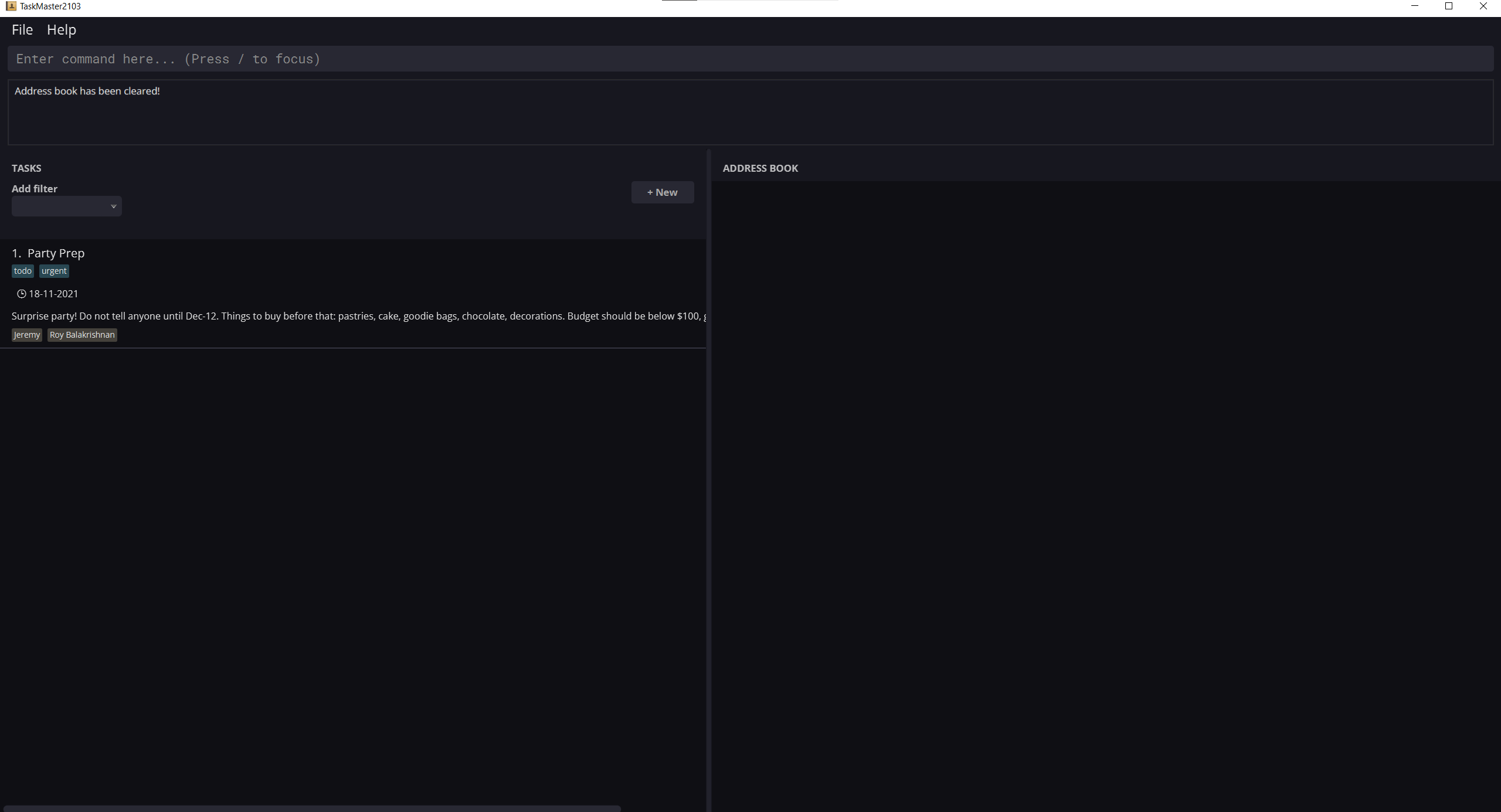
Consider the following description for a task - This is a relatively short description for a task, and can be expected in normal task management usage: Surprise party! Do not tell anyone until Dec-12. Things to buy before that: pastries, cake, goodie bags, chocolate, decorations. Budget should be below $100, get from grandma.
The character count is 175. The image below was obtained from a 27 inch monitor, with the app in full-screen.

If you observe the task at index 1, the description for it gets cut off at the character at index 159. Even with a character limit that is more than double what you have stated, a seemingly short description in text, cannot be captured in the application.
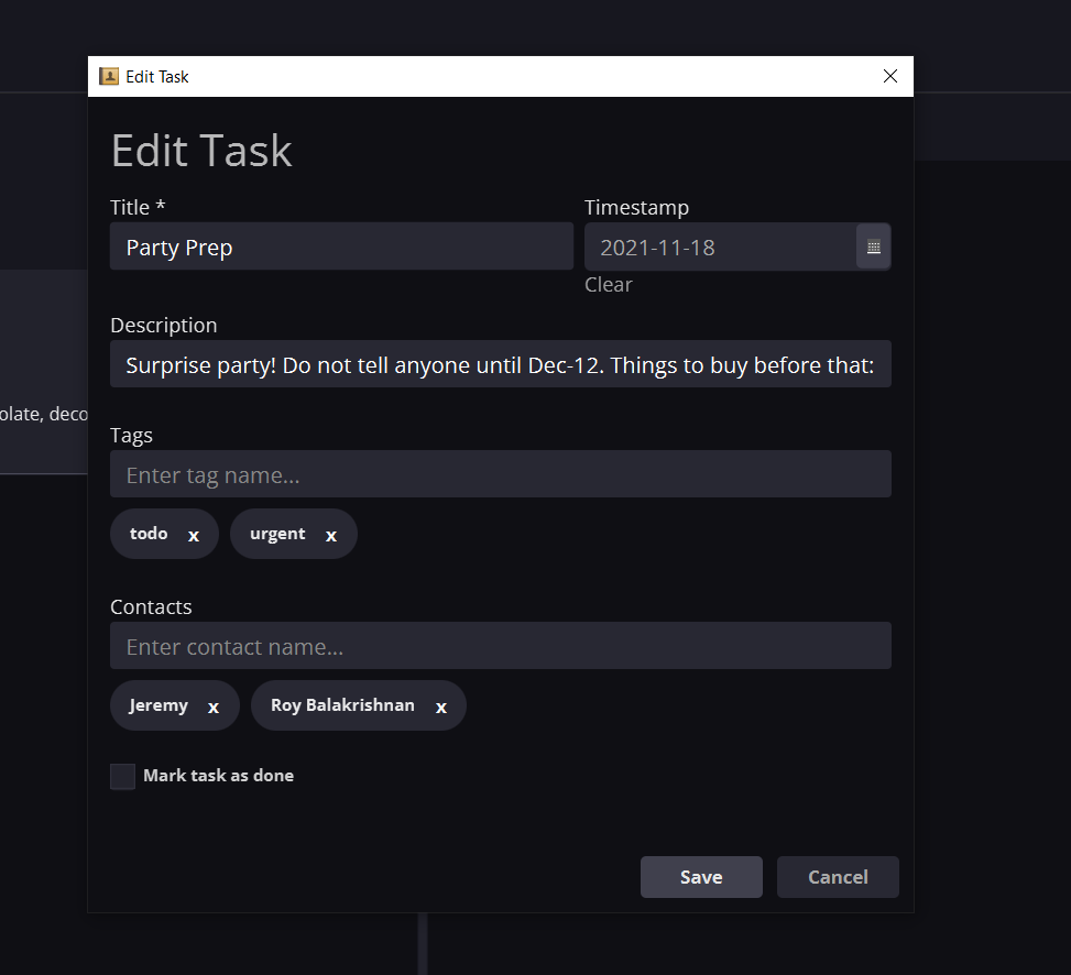
The image below is the "full detail" box that pops up when the user "double-clicks an individual task to view its full details". As you can see, even less details are visible, than what can be seen from the normal view of the task list. This inconvenience and loss of information is why this has been deemed as a feature flaw.

The description is cut off even earlier, at the 75 character count, so the purpose is not served.
Additionally, this option to double click on a task in order to view it's full details is mentioned nowhere in the UG or help command output. As a user, I did not know that such an option was even available to view full details. The UG only mentions double-clicking of tasks is available for editing a task via GUI, but not for viewing full details.
:question: Issue severity
Team chose [severity.Low]
Originally [severity.High]
- [x] I disagree
Reason for disagreement: I agree that this is not a High severity issue. However, it can instead be considered as medium severity - "A flaw that causes occasional inconvenience to some users but they can continue to use the product.".
Long descriptions or titles is not a rare occurrence for tasks, and could cause "occasional inconvenience".
Able to add tasks with very long title/desc/tags. However, there is no way to view their full details, as they get trimmed by
...in the GUI. There could be a way to retrieve this information, otherwise the user loses it entirely. High severity since tasks with long titles/desc are not that uncommon of an occurrence.