 ahmetsait
commented
2 years ago
ahmetsait
commented
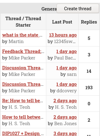
2 years ago And this is how it looks on desktop:

Thoughts?
Closed ahmetsait closed 2 years ago
ahmetsait
commented
2 years ago And this is how it looks on desktop:
Thoughts?
 PetarKirov
commented
2 years ago
PetarKirov
commented
2 years ago Thoughts?
Thanks for taking the initiative to improve the design! I think you will get more feedback if you also post your proposal on the forums.
Some of the things I like about your proposal on mobile:
Things I think need some improvement:
ahmetsait
commented
2 years ago In the current design it's quite clear that the forum title and last post are clickable links, but in the new design it's not clear that the "Last Post" is a link.
I think this is the least of our worries.
While on mobile, having the number of post be in the middle seems fine, I think it looks awkward on desktop.
I understand that the design doesn't look so hot but my main point was to fix this mess:
I thought about copying the discourse design but that hides a lot of information so I don't like that either. I need a bit more actionable feedback to get somewhere with this PR so maybe suggest some adjustments on how it should look? I will be asking for feedback on the forum as well.
 CyberShadow
commented
2 years ago
CyberShadow
commented
2 years ago I guess this is obsoleted by #142.
Redesign: