 DanOvando
commented
1 year ago
DanOvando
commented
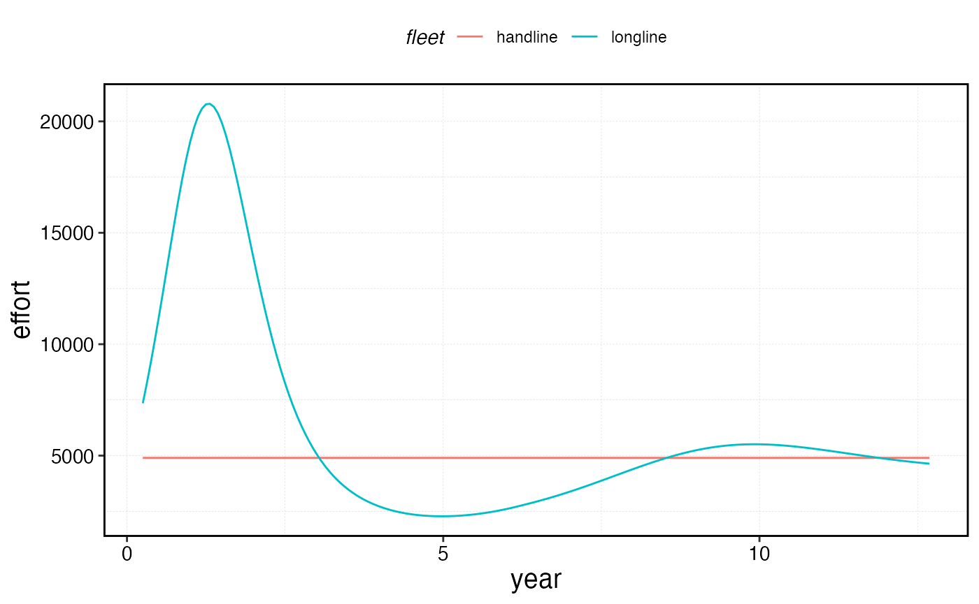
1 year ago Huh are you talking about this figure here? Is the flat line what you're seeing when you run it locally?
https://danovando.github.io/marlin/articles/fleet-management_files/figure-html/unnamed-chunk-4-1.png
There is a result in the Open Access and MPAs section that I feel does not make sense with the commentary in this vignette. In chunk 4:
My plot output looks like below. Is that correct?