Closed kyleshay closed 8 years ago
Good catch. Agreed, definitely should be moved out of weapons section, no idea why I didn't catch that myself...
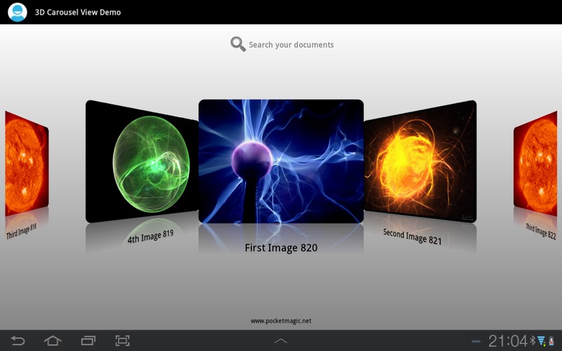
Just throwing this out there, but what if we centered the subclasses under each character block to the effect of a selection carousel (minus the arrows and such):
http://www.pocketmagic.net/wp-content/uploads/2013/06/android_carousel_gallery_view_01.jpg
OR
Otherwise, I say just keep with the current design and stick with the first option to avoid the risk of being "off putting." The carousel effect would be good to implement in the mobile app, however, because you could just use swipe or tap gestures to rotate sub classes.
I'm classifying them out of weapons. I wouldn't resize them or add the carousel pattern. People can click on them to add them to loadouts. On Mon, Oct 12, 2015 at 10:57 AM jflayhart notifications@github.com wrote:
Good catch. Agreed, definitely should be moved out of weapons section, no idea why I didn't catch that myself...
Just throwing this out there, but what if we centered the subclasses under the character block there to the effect of a section carousel:
http://www.pocketmagic.net/wp-content/uploads/2013/06/android_carousel_gallery_view_01.jpg
OR
[image: screen shot 2015-10-12 at 12 47 04 pm] https://cloud.githubusercontent.com/assets/6808172/10434675/adcc4b70-70e0-11e5-855b-9b42984e9663.png
— Reply to this email directly or view it on GitHub https://github.com/DestinyItemManager/DIM/issues/302#issuecomment-147475482 .
true true, ok. so basically image 1?
will just need to adjust the overflow gray area in the vault column
I like this idea. By the way, may I suggest to show progress information in the gray area like below?
That's not a bad idea, something probably should go there, but I am afraid that adds a certain degree of complexity and "busy-ness" to what should be a simple item manager. That's my opinion. Just don't want to over do it is all by going beyond the scope of an item manager. Again, I wonder if we can implement these things in the mobile app because there is more separation of concerns we can get away with there you know? Then info like that can exist without cluttering the real-estate. I personally would love to have a weekly/daily tracker.
It doesn't all belong on one screen. We could/should add a navigation feature. On Tue, Oct 13, 2015 at 1:29 PM jflayhart notifications@github.com wrote:
That's not a bad idea, something probably should go there, but I am afraid that adds a lot of complexity and "business" to what should be a simple item manager. That's my opinion.
— Reply to this email directly or view it on GitHub https://github.com/DestinyItemManager/DIM/issues/302#issuecomment-147804648 .
My vote goes with the simplest solution: Image #1.
Fixed with #308 as we're rendering buckets differently anyway.
Really, no reason for it to be in there. Can't move these things to the vault either.
maybe something like this:
or this?
opens up the possibilities of putting some character specific information there. maybe custom buttons that users can assign? like have a button there that is 'Move heavy ammo to this character' or 'move engrams to vault from this character'. loadouts can move from the dropdown to there? then the dropdown can be how to access things like weekly status/reputation ranks?
the empty vault space doesn't look quite right though. could similarly add account wide information/actions there, if it makes sense.
or we can go the simple route for now, and just go with image no. 1
thoughts?