 gokriznastic
commented
6 years ago
gokriznastic
commented
6 years ago @bbengfort for the third item in the checklist i.e.
Instead of hard fixing the limits of the X-axis from -1.0 to 1.0; be more flexible so that the visualizer has a better display (or give the user the option of setting the limits).
it would be counter-intuitive to provide that flexibility because Silhouette Scores by mathematical definition range from −1 to +1, where a high value indicates that the object is well matched to its own cluster and poorly matched to neighboring clusters.
Please correct me if I did not understand this improvement as you intended.
 rebeccabilbro
 bbengfort
 mgarod
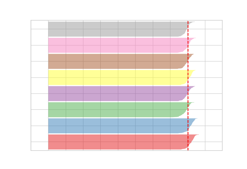

 badri-thinker
The following improvements to the Silhouette Visualizer are left over from #91:
Note to contributors: items in the below checklist don't need to be completed in a single PR; if you see one that catches your eye, feel to pick it off the list!
yellowbrick.datasetsmodule - perhaps this should be a separate issue?).