 martindurant
commented
5 years ago
martindurant
commented
5 years ago Sorry, I'm travelling today, I probably won't be able to comment any more.
Closed rsignell-usgs closed 4 years ago
martindurant
commented
5 years ago Sorry, I'm travelling today, I probably won't be able to comment any more.
 hdsingh
commented
5 years ago
hdsingh
commented
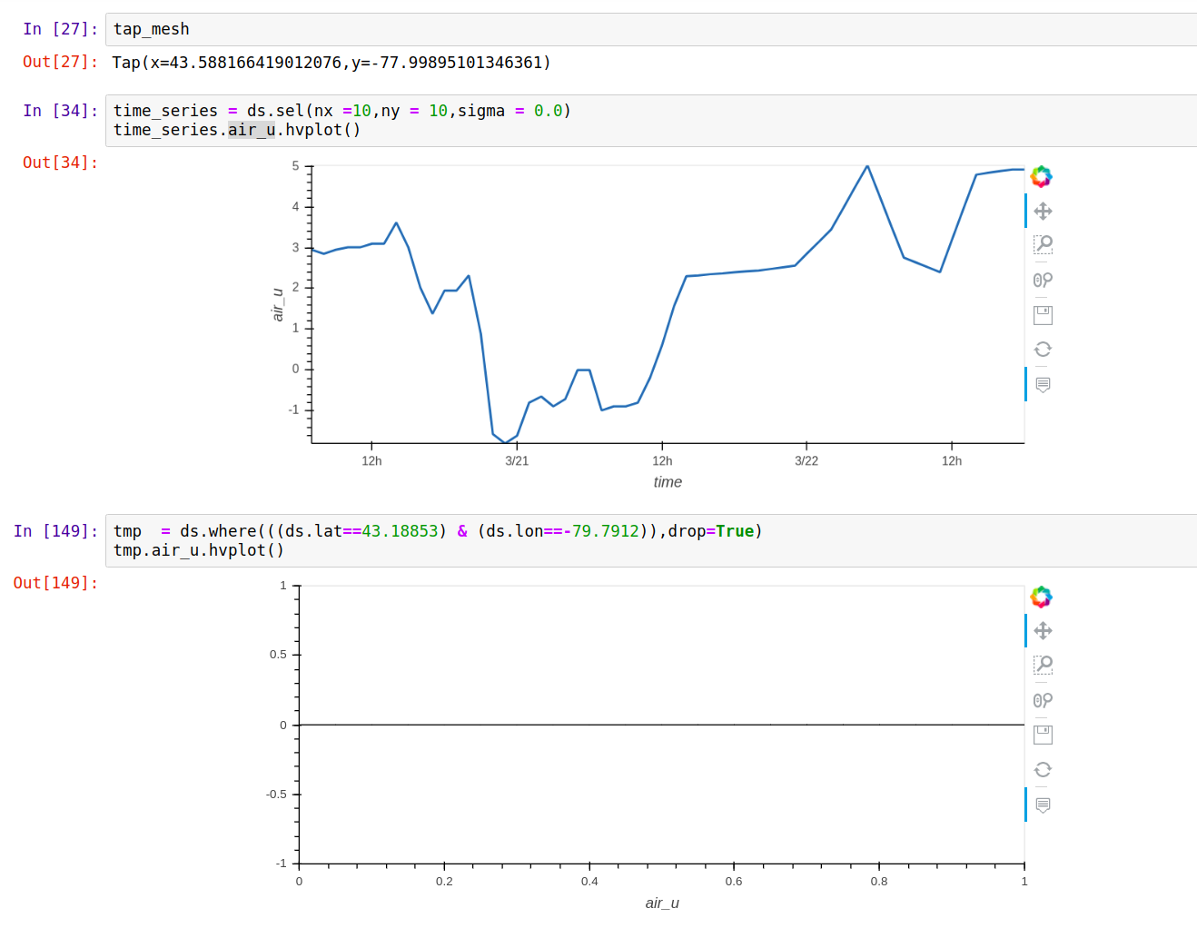
5 years ago @rsignell-usgs I am trying to extract and plot a time series at a location selected on the map using GreatLakes_Dashboard
I extracted the location from map using streams.Tap. The location returned is in lat and lon however dimensions in xarray dataset are nx, ny. The timeseries could be plotted in relation to nx ny by ds.sel(nx =10,ny = 10,sigma = 0.0).air_u.hvplot(). However while passing lat lon values to ds.where(((ds.lat==43.5882) & (ds.lon==-77.9989)) ,drop=True) nothing is returned. I have tested this for multiple values of lat lon.
Can you please give me some more details regarding how to correctly extract time series data w.r.t lat lon?
 rsignell-usgs
commented
5 years ago
rsignell-usgs
commented
5 years ago @hdsingh, while xarray can easily extract a time series at a point when the lat and lon coordinates are one dimensional, when lon and lon coordinates are two dimensional, as in this case, you need to bring in some other tools. A tree approach is probably best, like: https://stackoverflow.com/a/40044540
hdsingh
commented
5 years ago Sincere thanks and gratitude to @rsignell-usgs @martindurant @jsignell for your guidance and support during the proposal preparation phase. I feel that because of this project I have learnt so much interesting data visualization things and I am excited to learn more. I have submitted the proposal. Thanks a lot for listing this project in GSOC!
I am checking out the above approach and let you know soon.
hdsingh
commented
5 years ago I added a feature to extract time series at a particiular location in GreatLakes_Dashboard. I tried np.unravel_index based approach first and it seemed to be working fine.
rsignell-usgs
commented
5 years ago @hdsingh, way to go! I tried it and it works! This is really important functionality!
hdsingh
commented
5 years ago I added a feature to overlay several time series on the same plot in GreatLakes_Dashboard. The idea is to replicate the functionality of ncView.
rsignell-usgs
commented
5 years ago @hdsingh, great! I love that this is already useful for real work, and will just keep getting more and more useful!

hdsingh
commented
5 years ago I added Location Marker feature. As of now all the markers are of same color. I will soon update these to have different colors according to time series.
rsignell-usgs
commented
5 years ago Indeed! Works great for me:
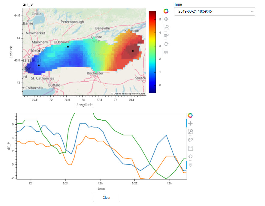 I'm excited you are continuing to make excellent progress on this!
hdsingh
commented
5 years ago I added feature for location markers to have same color as of their respective time series line. Please have a look.
martindurant
commented
5 years ago Thank you @hdsingh !
hdsingh
commented
5 years ago @rsignell-usgs Sir, Thank you for adding me as a member in the reproducible-notebooks !
rsignell-usgs
commented
5 years ago @hdsingh, as an experiment, the pyviz team deployed your current Great Lakes notebook as a web app here: https://roms.aip.anaconda.com/GreatLakes_Dashboard. Very cool!
hdsingh
commented
5 years ago This is really amazing. I am very glad to see that Pyviz team is also as excited as me for this project!! Thanks a lot team Pyviz !
hdsingh
commented
5 years ago @rsignell-usgs @martindurant Sir, Thanks a lot for your guidance! I got selected ! Looking forward to work and learn more from you. Let's make this project successful !
rsignell-usgs
commented
5 years ago Congratulations @hdsingh! I have no doubt that with your enthusiasm, intelligence and drive, this project will be successful! This work should have many benefits, among them:
martindurant
commented
5 years ago Good news - all of the exploratory work has paid off :)
 ZER-0-NE
commented
5 years ago
ZER-0-NE
commented
5 years ago Congratulations @hdsingh :)
ESIP Member Organization Name
US Geological Survey
Mentors
Rich Signell, USGS @rsignell-usgs Martin Durant, Anaconda @martindurant
Project Idea
CF-Compliant ndarray datasets can be visualized in tools that understand the NetCDF Data Model and the geospatial metadata they contain. While stand-alone tools like Panoply are often used on the desktop, the goal here is to develop a tool for visualizing and interacting with these datasets in Jupyter Notebooks using xarray, dask and the pyviz collection of widgets, rendering and layout tools.
Idea Title
A next-generation GUI for visualizing big gridded data in Python
Abstract
There have been several important advances that now make it possible to render big gridded data from many different sources with a common Python-based toolset in the browser. The first is the CF conventions that allow non-ambiguous identification of coordinate and data variables, the second is xarray which represents the CF data model in Python, and the third is the pyviz collection of tools, that allows rendering of massive gridded data, widgets to control data selection, and tools to specify layouts of widgets and data displays in the browser.
Technical Details
The GSoC student would build a dashboard using panel that allows the user to specify an intake catalog containing CF-compliant datasets that can be loaded into xarray. The user would select a dataset, which would then display a list of variables contained in that dataset. The user would then select a variable, which would then trigger reading the variable by xarray and displaying on a map using hvplot. Depending on the variable dimensions, widgets containing time steps and/or vertical levels would be displayed which would allow specification of specific index or coordinate values to plot.
Bells and whistles like colormap selection and different types of visualization techniques could be added as time permits.
The work will be coordinated with the overarching "Next-Generation GUI" effort of @martindurant.
The development can be done on a Pangeo environment running on the Amazon cloud, which means the student will not have run anything or install any software locally -- they will only need their browser and a github account.
Helpful Experience
Experience with Python is required, experience with
xarray,pyvizandgithuba big plus.First steps
Video:
Getting Started: