Team's Response
This is purely a cosmetic issue as the horizontal scrollbar should be used to display the 'hidden' check box. Unfortunately, I am unable to reproduce the slow effect.
Items for the Tester to Verify
:question: Issue response
Team chose [response.CannotReproduce]
- [x] I disagree
Reason for disagreement: If the team considers this a cosmetic issue only, I'd be ok with going down to severity.VeryLow. However, it still is a bug in your product, video attached. (Sorry for phone quality, I don't have an easy way to screen record)
Description
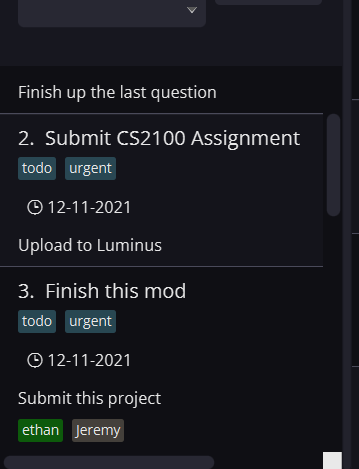
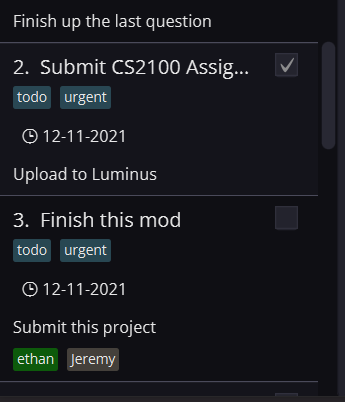
When resizing the task column, how it truncates the data changes based on how fast you go, sometimes it shortens the task name with ... at the end, and sometimes it just gets rid of the check box indicating a task is done.
Steps to reproduce
Expected
Both should result in the task name getting truncated with ...
Actual
As shown in the screenshots below:
Fast:
Slow:
I'd say this is more than a cosmetic issue as this makes it so there is no way for a user to uncheck a finished task if the check box is hidden, so the severity could be higher.