Dear developer!
In the process of using, I found a bug in layout / display. As shown in the figure, in the first page, the text overlap each other. This may be an adaptation problem. I suspect it is because display and font size are set to large (mainly due to display size).
Because of some problems with my eyesight, I often use the largest font and display.
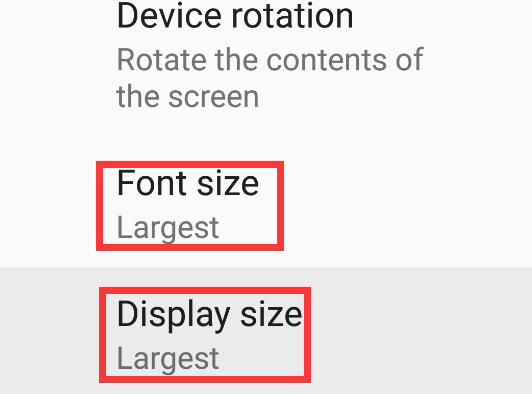
App version is 2.5.6, my mobile phone is Google nexus 6, screen resolution setting is 1920* 1080, font size and display size are the largest ! ! !, Android system is 8.0.
The above is a description of the problem. The overall experience of the software is good. You can see that the design is very attentive. Thank you very much for the efforts of the developers all the time. I hope to receive a reply.
Dear developer! In the process of using, I found a bug in layout / display. As shown in the figure, in the first page, the text overlap each other. This may be an adaptation problem. I suspect it is because display and font size are set to large (mainly due to display size). Because of some problems with my eyesight, I often use the largest font and display. App version is 2.5.6, my mobile phone is Google nexus 6, screen resolution setting is 1920* 1080, font size and display size are the largest ! ! !, Android system is 8.0.
The above is a description of the problem. The overall experience of the software is good. You can see that the design is very attentive. Thank you very much for the efforts of the developers all the time. I hope to receive a reply.