GPlates / gplates-app

GPlates Mobile App
https://www.gplates.org
2 stars 0 forks source link

Raster Menu Option #9

Closed yiyanw closed 2 years ago

yiyanw commented 2 years ago

When clicking the button (label 1), show the raster selection window (label 2). Using pictures of raster as buttons Able to scroll horizontally. image

michaelchin commented 
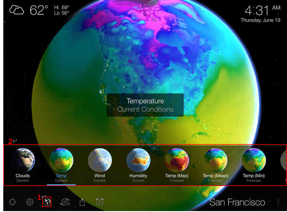
2 years ago

The small globe icons can be put into grid so that the layout can be adjusted according to the screen dimension. See the link below https://ionicframework.com/docs/api/grid

yiyanw commented 2 years ago

This is the current design, please have a look. image

michaelchin commented 2 years ago

@yiyanw it seems that the raster selection widget has not been connected to the menu button yet. Can you please connect it? I would like to check out the new widget.

michaelchin commented 2 years ago

This looks great! thanks.

Now we can try to switch globe rasters. I have added a new raster layer in our geoserver. The url is https://geosrv.earthbyte.org/geoserver/gwc/service/wmts . The layer name is "gplates:topography". See the code below. When press the raster icon, you can create a new imagery provider and then call addImageryProvider().

https://github.com/GPlates/gplates-app/blob/fa5d62e59242aea20d202ec38d661ef13c625bee/src/pages/Main.tsx#L136-L148

michaelchin commented 2 years ago

Also, please change all the old domain name from http://www.earthbyte.org:8600 to the new one https://geosrv.earthbyte.org/

michaelchin commented 2 years ago

This is a great progress! Well done! However, the issue has not been completed yet. So, reopen it. @yiyanw @matthewmerkas You can just mention an issue in a pull request if you don't intend to close the issue. As far as I know, a linked pull request will always close the issue automatically.

yiyanw commented 2 years ago

do we have ready-made icons for raster maps? @michaelchin Also the description information. image

michaelchin commented 2 years ago

do we have ready-made icons for raster maps? @michaelchin Also the description information.

I can create some icons tomorrow or Monday

michaelchin commented 2 years ago

@yiyanw Please review and merge the pull request #43.

I added another new raster layer. The url is https://geosrv.earthbyte.org/geoserver/gwc/service/wmts . The layer name is "gplates:agegrid".

I think the three rasters -- geology, topography and agegrid, will be enough for demonstration purpose. You can replace "Clouds" with the raster names. I am not sure about the "Current". Maybe just replace it with "???" and let the team to decide. Once you have updated the icons, we need to show team the progress and ask for comments from them.

By the way, good work! Thanks.

michaelchin commented 2 years ago

Hi team,

@mariaseton @nickywright @jcannon-gplates @matthewmerkas

@yiyanw has created a demonstration of this raster selection widget. Click the link below for a live demo. Comments are welcome. I am unsure if we need those subtitles (currently using ??? as placeholder). And should it align left or centre? Or the margin maybe too big?

http://10.66.32.173:8888/main

nickywright commented 2 years ago

Raster widget is awesome!!

For the text: it's really hard to read the names for the non selected rasters. Can we make the text a different colour? Maybe a pale grey or white. e.g. see here: the 'Geology' and 'Agegrid' labels disappear a little <img width="1068" alt="Screen Shot 2022-05-25 at 9 37 32 am" src="https://user-images.githubusercontent.com/19943774/170148938-a8b0b0fb-84f0-41a9-b4fa-ddafc1e2fa43.png">

For subtitles: not sure. Will we have alternative models? (e.g. lots of dynamic topography models, various versions of age grids etc?) In which case, maybe the subtitles can be used to differentiate between them. Or maybe the subtitles can give the time range option for the raster selected (e.g. topography would have present day, age grid would be 250? to 0 Ma).

Is there going to be a scale bar on the screen somewhere to give the cpt range?

Also, are we able to toggle off/on the ETOPO gradient on the age grid?

@michaelchin, the tiles still take ages to load for me, and when I spin back to the same spot in the globe it's all blurry again. Did you figure out a way to improve this?

yiyanw commented 2 years ago

For the text: it's really hard to read the names for the non selected rasters. Can we make the text a different colour? Maybe a pale grey or white. e.g. see here: the 'Geology' and 'Agegrid' labels disappear a little

it may be caused by different themes or platforms? The title is white and the top-left buttons are black in my windows. I think I can set the static title color if you want. image

michaelchin commented 2 years ago

it may be caused by different themes or platforms? The title is white and the top-left buttons are black in my windows. I think I can set the static title color if you want.

It is the difference between the "dark" mode and "light" mode in your system setting. See this issue https://github.com/GPlates/gplates-app/issues/29

Nicky is in "light" mode. Hence, the colour of the text is dark. Also, it seems the Android and iOS are different as well.

michaelchin commented 2 years ago

Is there going to be a scale bar on the screen somewhere to give the cpt range?

maybe we can put a colour bar at the lower right corner?

michaelchin commented 2 years ago

Also, are we able to toggle off/on the ETOPO gradient on the age grid?

The gradient shading is plotted in the image. It is unlike the vertical exaggeration in our portal. We can choose to use an image without shading.

michaelchin commented 2 years ago

@michaelchin, the tiles still take ages to load for me, and when I spin back to the same spot in the globe it's all blurry again. Did you figure out a way to improve this?

This one is tricky. The network to our geoserver is bit slow. It will take some time to figure out a solution.

matthew-merkas commented 2 years ago

it may be caused by different themes or platforms? The title is white and the top-left buttons are black in my windows. I think I can set the static title color if you want. image

@yiyanw If you want the raster menu to always have a dark background (50% black, regardless of light or dark theme) you will have to set the ion-card-title and ion-card-subtitle colours explicitly as these change with the theme by default.

Another option is to use Ionic colour variables to dynamically change the colour of the menu depending on the theme e.g.,

background: rgba(var(--ion-color-light-rgb), 0.5);

This will be light in light theme and dark in dark theme. This is what I've used for the top right icons. Note: you'll have to use the --ion-color-light-rgb variable not the --ion-color-light variable if you want to pass it into rgba() for transparency.

Also, another thing I've noticed is you've hard-coded the active/selected colour values (#428cff) but maybe you could use colour variables here too (e.g., var(--ion-color-primary)) to make it easier to change the app colours later on.

michaelchin commented 2 years ago

Thanks @matthewmerkas . Since you have looked into the dark/light mode thingy, do you want to take care of this issue #29 as well?

nickywright commented 2 years ago

Had a quick look at the site on my iPhone - not sure if this is how it will look for phones, but the globes are quite big and could be a tad smaller imo. Perhaps there also needs to be a subtle > at the edge of the raster scroller screen so it's obvious there are more rasters when they don't appear? Otherwise you probably wouldn't know to scroll for more options!

IMG_9127

michaelchin commented 2 years ago

@yiyanw the size of the widget should adjust according to the screen size. Not sure if the ionic grid component could help here.

yiyanw commented 2 years ago

@nickywright Which one do you prefer? (this screen is iPhone SE size: 375 * 667)

matthew-merkas commented 2 years ago

Personally, I think the first option looks a little small. Also, is there a way to make the hint arrow more salient (e.g., change to bright white)? It kind of gets lost in the globe a bit

nickywright commented 2 years ago

I agree with @matthewmerkas , first option is a little small.

Maybe something in-between the two sizes? E.g. 3 full globes across but smaller than option two. Can you also increase the spacing around the globe a little please (looks a little cramped right now)? With the increased spacing around the globes, the arrow would hopefully then not be on the globe itself so shouldn't get lost (keep the colour as is for now, and if it still gets lost we can change it).

Also I don't think the bar at the bottom is needed.

Thanks so much @yiyanw!

yiyanw commented 2 years ago

Ok, I will change it.

Also, do you want the same ratio for all devices?

for now, different resolutions will have different layout.

I can force them in same ratio like this if you want:

michaelchin commented 2 years ago

Hi team,

@nickywright @yiyanw @matthewmerkas @mariaseton @jcannon-gplates

Do you know you can control the size of your image in the comments? I just feel some of the screenshots are too huge for me. Maybe my computer monitor is too small and I should ask Dietmar to buy a 65-inch OLED monitor for me... haha

I mean the images in the comments. I am not saying the the app layout. Just some of the images in the comment section are too big.

See an example below

Screen Shot 2022-05-27 at 12 19 41 pm Screen Shot 2022-05-27 at 11 37 27 am
jcannon-gplates commented 2 years ago

Do we fit the globe vertically or horizontally when fully zoomed out? I can see it's currently done vertically, as in when the aspect ratio (width/height) gets small/thin the globe is not made smaller to fit. I think this is probably a good idea (to keep it as you currently have it). The other alternative is what GPlates does (which is to ensure the entire globe is visible at full zoom, regardless of the aspect ratio). But not sure that looks very good for a phone app (maybe doesn't even look good for GPlates?).

PS: I didn't see an interactive way to change the image size, so instead did it as described in this and this link. Using percentages is easiest (see second link).

nickywright commented 2 years ago

Thanks @yiyanw!

Also, do you want the same ratio for all devices?

probably not, we don't want things to look comically large on a tablet!

For the '<' and '>' - they should be vertically centred for the raster panel. Looks like in the examples of other resolutions your provided that they're mostly towards the bottom.

Do you know you can control the size of your image in the comments?

@michaelchin I didn't know I could, but I do now! I tried to figure it out yesterday but completely missed that 'width' flag - it actually doesn't appear when I try and add images. @jcannon-gplates's solution works - thanks John!

Do we fit the globe vertically or horizontally when fully zoomed out?

I personally prefer being able to see the entire globe at the default zoom, so similar to GPlates' behaviour. That's what the Living Earth app does on a phone and I think it looks good - see (now not giant!) screenshots below.

jcannon-gplates commented 2 years ago

For the 2D map and Columbus views, one way of doing the equivalent of fitting the globe (as GPlates does, and Nicky showed above) is to set the crossover aspect ratio to 2.0 (instead of 1.0 for the globe view). The reason for 2.0 is the map width is 360 degrees and height is 180 degrees (ratio of 2.0) - at the default orientation. So with aspect ratio 2.0 it looks like...

If the aspect ratio is greater than 2.0 then can keep the vertical perspective field-of-view fixed (or orthographic top/bottom fixed) and allow the horizontal to expand...

And if the aspect ratio is less than 2.0 then can keep the horizontal fixed and allow the vertical to expand...

So the only difference between globe and map (ie, 2D or Colombus) is changing the crossover aspect ratio.

As you can see, in the map view it doesn't fit for non-default orientations (like it does for the globe view) but I think that's OK? This is pretty much how GPlates does it. The next GPlates will have tilt and columbus-like map views that are tilt-able, and it looks fine there too (but maybe others have a different opinion?). By the way, that second row of images is from the next GPlates (the current GPlates uses a fixed horizontal in map view, regardless of aspect ratio, which is not consistent with the globe view).

yiyanw commented 2 years ago

new version:

nickywright commented 2 years ago

Hi @yiyanw, this is looking really nice!

I'm not a fan of the light mode option though. Can we make the background more translucent or something? Just looks strange (whereas in dark mode it looks nicer!).

Can we also use normal (non-bold fonts) for the rasters that aren't selected please? It all looks a little heavy.

yiyanw commented 2 years ago

I'm not a fan of the light mode option though. Can we make the background more translucent or something? Can we also use normal (non-bold fonts) for the rasters that aren't selected please? It all looks a little heavy.

ok, do you want to change for both dark and light? Or just light mode? @nickywright

nickywright commented 2 years ago

Can you change the translucency for the light mode only (dark mode looks fine there). Sounds like we'll have both modes available (i.e. #29 ) so there should probably be some differences somewhere.

Change the font weights for both modes.

thanks @yiyanw!!!

yiyanw commented 2 years ago

this is the new raster menu of light mode

yiyanw commented 2 years ago

I think we can close this issue if no more questions? @michaelchin @nickywright