The item uses the same texture for every meta, so you’d have to adjust that code and have 20+ textures vs just one. Feel the way it is now is fine tbh.
Closed aLegoz closed 3 years ago
The item uses the same texture for every meta, so you’d have to adjust that code and have 20+ textures vs just one. Feel the way it is now is fine tbh.
The item uses the same texture for every meta, so you’d have to adjust that code and have 20+ textures vs just one. Feel the way it is now is fine tbh.
Copy this 20 textures pls. I will draw myself. I need only possibility.
Why not its a nice addition to have different textures.
Integrated Circuit:
 Could be 2 decimals or 2 hex for up to 256 settings.
Nice idea with 7-segments LCD. I draw update for my texture pack when we get technical possibility.
Are this need code changes and btw where is the exsting texture located ?
Original asset here: src/main/resources/assets/gregtech/textures/items/gt.integrated_circuit.png

Could be replaced with
src/main/resources/assets/gregtech/textures/items/gt.integrated_circuit/
├── 0.png
├── 1.png
├── 2.png
├── 3.png
├── 4.png
…
└── 24.pngah ok
DIP switch has it’s visual appeal, however practically not really useful unless you have an indication on the circuit setting in the tooltip. The digit indicator makes it easy to understand for everyone. Personally I‘d have this added to a texture pack as I think the current texture is fine.
Bigger is better IMHO.
 Feel free to use if you like.
Already split images:
google drive
Here are both versions as shown in a Gregtech Assembler GUI

Note how odd size icons cannot be centered.
I made my variants for circuit. You can use this in your mod, if you need. I added psd file and made circuits for GT++ (Green and Red).
Link: Google drive
(I don't know how it looks in minecraft :D)


@leagris @Dream-Master It seems like there are several different opinions on the graphics for the numbered circuits. Though it does not count for anything, personally I am not in favour of the option that has just been merged (too spiky).
This is a very central item to the pack, so I would suggest to put the options of which graphics to use to a vote on discord.
They grey one is the neutral one and should be ok. Sure if somone want to change it better put thus in a resource texture pack
The one merged has same pins spikes as the old non-visual IC. I just rotated it horizontally to better fit digits.
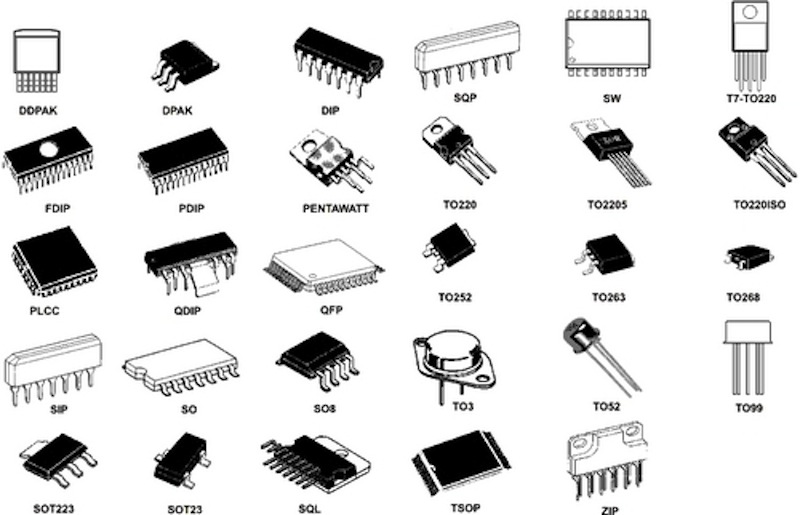
Spiky pins or shorty pins is really a matter of integrated-circuit package type:
Component packages from https://learn.sparkfun.com/tutorials/integrated-circuits/all

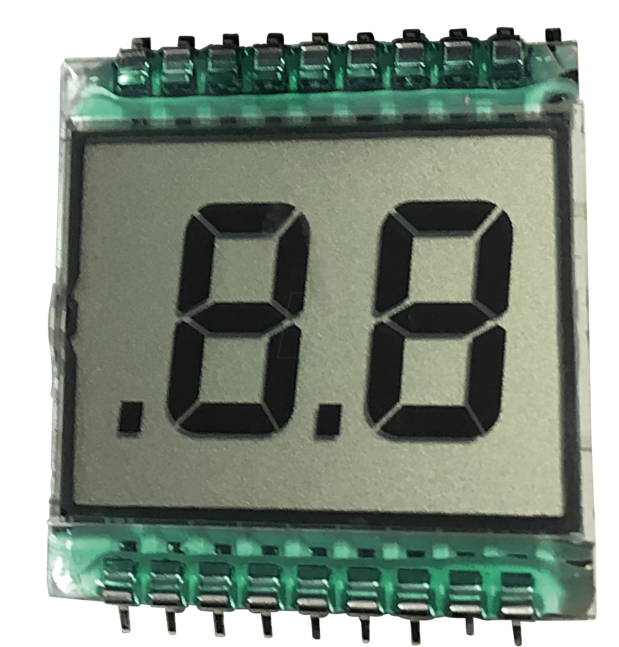
The last proposed has off liquid crystal segments brighter than background and this is not how reflective (old-style) Liquid Crystal Displays renders. Crystal polarization is same as screen polarization when off, but they are still slightly darker because scattered light from surroundings cannot pass through it unless of same polarization.
Sample design: 
I wanted to add textures for Programmable circuit, but i don`t know where search source code GT that`s why i propose to add textures for each programmable circuit. It will be help to identify which circuit need for recipe. Of course if you can.
