Gerben321 / bike-care-tracker

Issue/Suggestion tracker for Bike Care app
3 stars 0 forks source link

Add component type whenever a specific component custom title is shown #28

Closed OleksiyRudenko closed 3 months ago

OleksiyRudenko commented 3 months ago

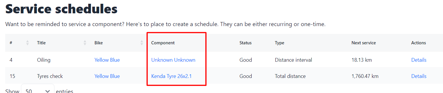
Is your feature request related to a problem? Please describe. I want to know what I am about to oil or which wheel (front or rear) to check.

Describe the solution you'd like It would be great to have component type specified (chain and front wheel in my case; see screenshot for ref). I guess it is important to know the component type in every view a specific component is shown.

Describe alternatives you've considered

  1. Remembering what I meant.
  2. Add keywords in component custom title, effectively doubling the component type picked from the predefined list.

Additional context image

Gerben321 commented 3 months ago

Sounds good. My only thought is the space available in case of either a long component name or component type. The table can look weird then, or info might be cut off.

I can either do

The first one is what I've added in the bike details page and is the most consistent, but might cut off data from the component name. I'll have a try and you can see if it looks good.

Maybe I can get rid of the ID column in all places as well for extra space. That's a bit of a habit as a developer. Not sure if that adds anything for normal poeple 😜

OleksiyRudenko commented 3 months ago

How about a column for component type? Pros:

Maybe I can get rid of the ID column in all places as well for extra space. That's a bit of a habit as a developer. Not sure if that adds anything for normal poeple 😜

Yes, please :-D

Also,

I could think of the following icon ideas for the two above:

Gerben321 commented 3 months ago

Another idea would be to give the whole row a (not too bright) color. But that might look like a circus with a lot of schedules. 🤔

"Details" => Icon (✏️) and no need in column name.

I can also make the title of the schedule a link? Not sure how 'logical' that is.

Status - make color-coded icons

I think this would be good. Might not save space, but easier/quicker to see at a glance. May even as first column.

"Distance interval", "Total distance" => icons.

Not convinced how clear that would be for new people. Now that I think about it, how much does the type of schedule add here? Maybe all you need to know is how much distance of time is left, not whether it's an interval or total distance left. When you go to the detail page you can see everything about it.

Gerben321 commented 3 months ago

This is what I've made so far: image

OleksiyRudenko commented 3 months ago

Another idea would be to give the whole row a (not too bright) color. But that might look like a circus with a lot of schedules. 🤔

I agree, that would be too much.

I can also make the title of the schedule a link? Not sure how 'logical' that is.

Makes sense as long as it leads to a specific component schedule details. Not critical tho, IMHO. However I like when everything is connected even if covers only corner cases. image

"Distance interval", "Total distance" => icons.

Not convinced how clear that would be for new people.

Agreed. Non-commonly used icon may confuse.

Now that I think about it, how much does the type of schedule add here? Maybe all you need to know is how much distance of time is left, not whether it's an interval or total distance left. When you go to the detail page you can see everything about it.

I'd keep it. Imagine, I have 2 chain-related schedules. Even if I fail to set descriptive schedule title, type of schedule can give me a quick idea on what I am supposed to do - replace the chain or just oil it. It can be a bit of overcommunication in this view but will save me a click and a page load time (it is still important as slightest delays with even not-so-often lagging optic cable connections are annoying) needed to double-check the purpose of a specific schedule.

OleksiyRudenko commented 3 months ago

This is what I've made so far: Looks clean and informative 👍

I would just change the red icon to something "saying" more about the danger than...

This particular red icon image looks a bit confusing to me, more like the "close the window" or "close the notification" control on MacOS. It could be my bias and I realize that what I proposed above has been quite a lazy choice (quickly picked emojis) and is less appropriate. But I would stick to something more prominent and screaming about danger. Altough not crtitical.

Just an example for inspiration:

image

Or even octagonal shape, distinctive from the web accessibility standpoint. You will have round (soft and nice) green, yellow triangle warning, and red octagonal. Just like "STOP" signs on the road are octagonal and you recognize it immediately among any other road signs.

Still, not critical. Feel free ignoring. It is most likely just me being overly pedantic.

Gerben321 commented 3 months ago

Thanks. Good points about the icons. I'll see which one would suit.

About the component type in the table. Would a separate column work best, or combine the component type and name?

The link would indeed go to the schedule details. I'll work on a new version for you to check. You seem to know a lot about these things so I'd like to use your expertise if that's okay!

Gerben321 commented 3 months ago

Here's a new version: image The icon looks a lot better indeed! I've removed the details column and moved that link to the title. The type is back, and I've combined the component name and type. What do you think?

OleksiyRudenko commented 3 months ago

About the component type in the table. Would a separate column work best, or combine the component type and name?

I'd put a column. This way component names would be nicely aligned along common vertical (imaginary) line. And both columns (type and name) would be sortable independently that offers greater flexibility UX-wise.

The link would indeed go to the schedule details. I'll work on a new version for you to check. You seem to know a lot about these things so I'd like to use your expertise if that's okay!

Not an expert tho. Just a really pedantic user and had a privilege to observe true UX designers working on succesful commercial projects. I am more than happy to help. You are developing a helpful project and dedicated to it. Given it is available for free, it's the least I could do for your project. You are also quite responsive and willing to listen to the users even when there quite a few of active ones. Lots of respect.

OleksiyRudenko commented 3 months ago

I've combined the component name and type. What do you think?

Looks nice in this specific setup. Not sure if component type will be significantly longer. It may disrupt visual harmony. But let's see.

Gerben321 commented 3 months ago

A column for the component type would look like this: image I get the pro's and cons of them both. I'm fine with both in this case.

Gerben321 commented 3 months ago

I'll deploy this right now. Let me know if I can improve it further on by re-opening this or opening a new issue. Thanks for the help.