Gerben321 / bike-care-tracker

Issue/Suggestion tracker for Bike Care app
3 stars 0 forks source link

Improve design and data on bike component details #59

Closed Gerben321 closed 1 month ago

Gerben321 commented 2 months ago

I think the new list of bike components is great, especially with the filtering. However there are some nice improvements that can be done. First of all I think the list items, once dropped down, don't look that great.

Here's what I imagine could improve it: image 
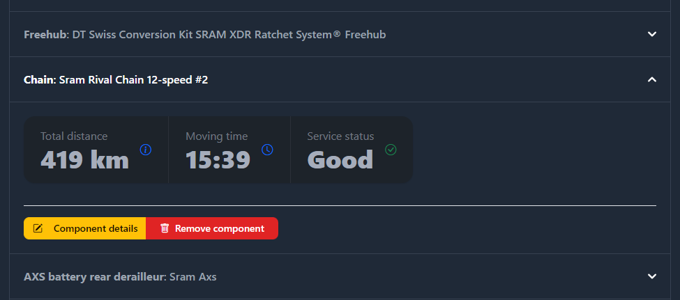
The name of the component is gone in the details because it's already in the list. The distance and moving time are now moved into a 'stats' kind of display like you can find in other places.

An addition is the service status. This is displayed like with the orange and red icons in the overview if something is (almost) overdue. This however also shows a green checkmark if it's good (like in the service overview table page).

I'm still thinking how I can improve the two buttons to edit and remove a component. It doesn't really look right, not sure why.

I also think this might be a good place to try to convince the user to create a service schedule for this component. Right now this is what I have in mind: image Maybe some text explaining how there's no service schedule so you can't track the status with a link to create one would make it easier to convince the user to create one.

What do you think so far?

Gerben321 commented 2 months ago

Here's some more progress. Would this add something? Is it useful? I realise the big fat orange and red banners and texts are maybe a bit much. I haven't changed that yet. Maybe I can fit the '-493 km overdue' in the service status card on the right. I want to show more information but also don't overload the user with a tonload of stuff.

Here's a warning message: image And an error: image

And example of showing the overdue text in the card directly: image

Only thing I miss in this is the interaction/click to the specific service schedule.

Konstantin-Levin commented 2 months ago

New look is a big improvement for sure 👍

The last image that shows all the information within the card looks best I think. Nice & clean. Could the service status card contain the remaining km/hrs etc even if not overdue.

e.g.

Service status Good: <521km

Service status Almost due: <10km

Service status Overdue: >47km

(or similar?)

Maybe clicking on the text in the service status card could link to the specific service schedule page you mention? & if no service schedule has been added, clicking on N/A would take you to the page to add one?

Just random ideas...

Konstantin-Levin commented 2 months ago

I'm still thinking how I can improve the two buttons to edit and remove a component. It doesn't really look right, not sure why.

Maybe separate the buttons slightly and give them each their own box? Play around with a different font maybe?

Gerben321 commented 2 months ago

Here is a small update for the status cards:

Good: image

Unknown: image

Overdue: image

Almost: image

Gerben321 commented 2 months ago

For the part below I still have to think about what to do with it... Maybe leave that for later when I get some creative ideas.

Gerben321 commented 2 months ago

I will now deploy a new version with the current progress of this feature. @Konstantin-Levin Can you check it out and let me know what I think? I will leave it open in case you can think of other things, or when I find some more inspiration.

Konstantin-Levin commented 2 months ago

Looks good overall. If I'm being picky I would say some of the text is redundant and could be removed:

Screenshot 2024-03-18 at 22 07 56

I don’t think 'almost overdue service' is necessary as it is already shown in the card and obvious because of the yellow icon.

Similarly:

Screenshot 2024-03-18 at 22 07 48

I don’t think 'overdue' in the red text is necessary. Just -17km in red makes it obvious (along with 'overdue' in small font below.

New component action buttons look better 👍

Gerben321 commented 2 months ago

I get what you mean. The title for the text is indeed a bit redudentent. However I want to show the text about the overdue service and without the title it doesn't really stand out I think. But I could make it more generic like 'service information'.

I also would like to add a text in case there is no service schedule at all. That way users might get triggered to create a schedule for that component.

Thinking about that. Would it help the more basis user to show random examples of schedules? General ones or linked to a type of component? To make it easier for them. That's a bit off topic and more complex then it sounds though. 😅

Gerben321 commented 2 months ago

I've removed the 'overdue' text in the -17km example from you.

Do you have a good idea how to link to the specific overdue schedule? I think it's good to link to the overdue schedule when there is one.

Konstantin-Levin commented 2 months ago

Could you include it as a third option in the component actions box and link from there? You could have that for every component regardless of the service status.

It could just say Service schedule or View/create service schedule

Might help nudge users to create a service schedule when they haven't already?

You could then remove this text entirely perhaps?: Overdue service For more information about this service schedule please click here.

Gerben321 commented 1 month ago

How about this?

State for no service schedule: image

State for overdue schedule: image

The almost overdue is really similar to it: image

And to make it complete a good schedule: image

I like the list of actions personally. Not per se visually, but functionally. This is a good way in the direction of plenty information without cluttering, but giving important information. And the 'Add service schedule' button is really fast and useful IMO already.

Gerben321 commented 1 month ago

I'll deploy this right now as well. Play around with it and let me know what you think. This is certainly going in the right direction I feel!

Konstantin-Levin commented 1 month ago

Very nice - I like it! Seems to be working well for me so far 👏

Looks clean and simple to understand/navigate.

On a good schedule:

image

I see the list of actions does not contain a link to View service schedule as with the others. The implication of this made me realise that multiple service schedules can be added to a single component. Still learning!

Gerben321 commented 1 month ago

Yeah that's done on purpose, sort of. The goal behind the link when service is (almost) overdue is to act on it. That's not needed when there's no urgence.

Should I change that button to a general button linking to the schedule overview for the specific component? So you can see them all, and you see the one with urgence there? Instead of a direct link when there is urgence? If that makes sense.

Konstantin-Levin commented 1 month ago

Should I change that button to a general button linking to the schedule overview for the specific component? So you can see them all, and you see the one with urgence there? Instead of a direct link when there is urgence? If that makes sense.

Yeah I know what you mean - that's a good idea. Every component would then have 4 options from the actions box which keeps things looking neat

Gerben321 commented 1 month ago

I've added the default link to the schedules page for all components now. Let me know if it's good now.

Konstantin-Levin commented 1 month ago

Looking good & working fine for me 👍