soc-pe-bot
commented
2 months ago
soc-pe-bot
commented
2 months ago Team's Response
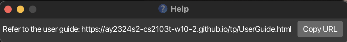
As our application includes a total of 21 commands, with some having lengthy command formats, your alternative of displaying all the formats in a single window with limited styling would not be of much help to the user. They will likely be confused at the cluttered help page.
Instead, with the current implementation, with a single click of the the copy url button and a paste, the users will be directed to our user guide where they can view all command with examples and in an easy-to-read format. They can get help for all the commands easily, which is the intention of this help tab.
Since we have already provided a easy-to-read format for user to get help which already provide convenience to user to occasional use the app smoothly, even from you justification, we believe it will only cause minor inconvenience if you insist not to go to website, hence we reduce severity to low.
Items for the Tester to Verify
:question: Issue response
Team chose [response.Rejected]
- [x] I disagree
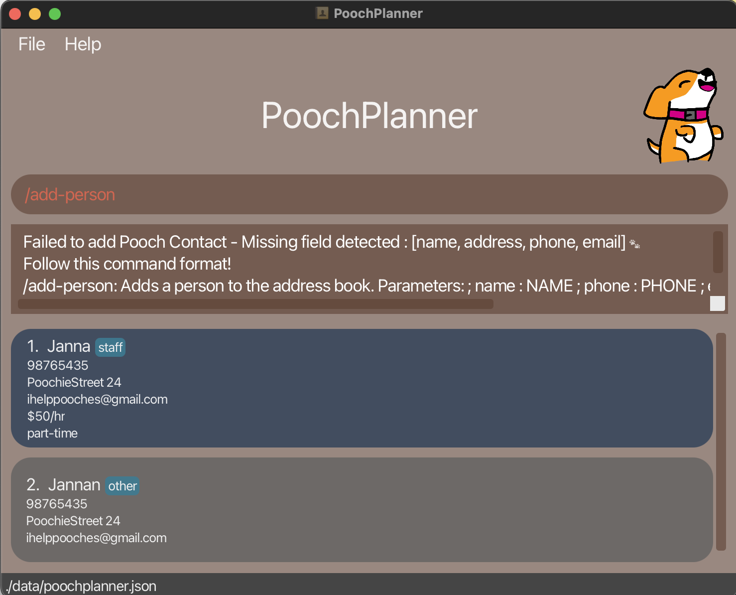
Reason for disagreement: I believe there is good reason to include a list of commands as users do not need to specifically navigate to the website. You do not need to add the full command format, instead a list of available commands and a brief description of what it does will go a long way. An example is:
-
/add-person: Adds a person to the contact list
-
/add-staff: Adds a staff to the contact list and so on.
This way users can easily know what commands are available if all they need is a reminder. Further, they can simply key the command in and get an error message specifying the parameters needed for the command, as below. This is definitely faster than having to copy the url and open up a website and navigate to the right command.
## :question: Issue severity Team chose [`severity.Low`] Originally [`severity.Medium`] - [ ] I disagree **Reason for disagreement:** [replace this with your explanation]
Steps to reproduce: Click on the Help button
Expected: Expected a list of available commands
Actual: Users have to copy the URL and go to the website to find the available commands
Screenshot: