 janus2
commented
6 years ago
janus2
commented
6 years ago Not layout version

Current PR

With +/- buttons

Closed janus2 closed 6 years ago
janus2
commented
6 years ago
 pulkomandy
commented
6 years ago
pulkomandy
commented
6 years ago On Wed, Jul 25, 2018 at 10:33:34AM -0700, janus2 wrote:
Not layout version
Current PR
With +/- buttons
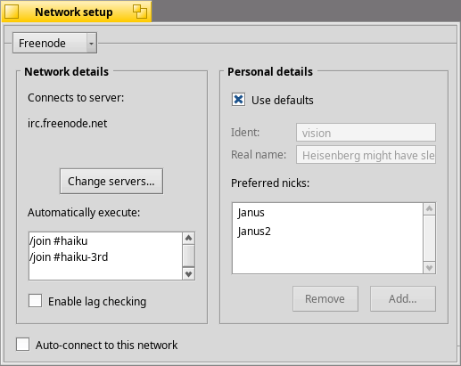
I hate nested BBoxes. How about this: http://pulkomandy.tk/drop/visionprefs.png
 jscipione
commented
6 years ago
jscipione
commented
6 years ago Nice work. I have 2 suggestions if you're up for it.
First drop the Nested BBoxes like PulkoMandy suggested, you can remove the line with: SetBorder(B_NO_BORDER);
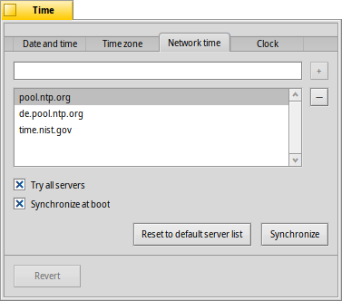
Second update preferred nicks to use a separate textview and listview with plus and minus on the right of to each respectively like in Network Time tab of Time Prefs: https://www.haiku-os.org/docs/userguide/en/images/prefs-images/time-network.png
janus2
commented
6 years ago The result with B_NO_BORDER is this:

janus2
commented
6 years ago I think for @pulkomandy solution a BSeparatorView is needed.
jscipione
commented
6 years ago That looks pretty ok to me just need to reduce the window margins, try: SetInsets(0, B_USE_SMALL_SPACING, 0, B_USE_SMALL_SPACING) (small on top and bottom, 0 on left and right) i'm thinking you'll want some bottom spacing for the checkbox. you may need to tweak to look ok.
janus2
commented
6 years ago @pulkomandy idea:

 waddlesplash
commented
6 years ago
waddlesplash
commented
6 years ago Nice!
jscipione
commented
6 years ago Really close just get the left and right margins to match the margins between the boxes try B_USE_SMALL_SPACING on all sides sry to backseat develop
janus2
commented
6 years ago Really close just get the left and right margins to match the margins between the boxes try B_USE_SMALL_SPACING on all sides sry to backseat develop
It is on purpose. I want the menuField aligned with the BBox...
janus2
commented
6 years ago The difference is minimal, but the menu and the BBox are unaligned

With B_USE_SMALL_SPACING
jscipione
commented
6 years ago Maybe B_USE_DEFAULT_SPACING on left and right, then add a negative left Inset to the BMenuField control child of the BBox to align it with the checkbox again - I'm not sure if that that will work... either way it looks much better than the Vision Network Windows I'm used to seeing!
janus2
commented
6 years ago I just look into the code of BSeparatorView the offset is fixed at 5px this is not very good...
janus2
commented
6 years ago Using the BBox the offset pixels are 8 a little better.
janus2
commented
6 years ago 

 scottmc
commented
6 years ago
scottmc
commented
6 years ago in the layout version, is the alternating white/grey background pattern still there for the servers view and just not shown in the image because you only had one showing?
janus2
commented
6 years ago in the layout version, is the alternating white/grey background pattern still there for the servers view and just not shown in the image because you only had one showing?
Even if you want you cannot remove that pattern...
janus2
commented
6 years ago Second update preferred nicks to use a separate textview and listview with plus and minus on the right of to each respectively like in Network Time tab of Time Prefs: https://www.haiku-os.org/docs/userguide/en/images/prefs-images/time-network.png
@jscipione I like the idea, but the same window is used to add a Network so I prefer consistency.
WIP PLEASE DON'T MERGE. [RFC]