 nus-pe-bot
commented
2 years ago
nus-pe-bot
commented
2 years ago Team's Response
Dev: After typing this whole reply, I realised that this bug is a feature flaw reported during the documentation only phase and hence is rejected by default. In any case, this is my reply:
It is unclear what exact problem the tester is pointing out because the command box is still there at a reasonable height for the user to execute any commands they need.
If what they mean is that they can't really see the information in the app, they can always switch to the persons, schedule or todos tab for a fuller view of the respective contents instead of staying on the dashboard tab, which is meant to merely provide a convenient "quick" view of the data (as stated in the UG). The user could also slide the black bars left/right up/down to enlarge or shrink the various sections of the dashboard (also stated clearly in the UG) if they want to stay on the dashboard tab, or they need to refer to custom goals.
In any case the developer feels like the use case demonstrated in the screenshot is not a fair one: if the user wants to refer to another document such as an excel sheet while using the app, the user could split the excel sheet side by side with this app with both of them at max / reasonable screen heights and refer to both windows comfortably (given a normal laptop screen size; refer to the screenshot below for an example). The case where a user needs to refer to more than 2 windows at the same on the same screen is an incredibly uncommon one, and in such a case the user would probably have to rationally reconsider their workflow if they want to use the app.
An example on a 13-inch macbook, with the sections split at even vertical heights:
(the truncation issue with the custom goals is addressed in another accepted bug)
Items for the Tester to Verify
:question: Issue response
Team chose [response.Rejected]
- [ ] I disagree
Reason for disagreement: [replace this with your explanation]
:question: Issue severity
Team chose [severity.VeryLow]
Originally [severity.Low]
- [ ] I disagree
Reason for disagreement: [replace this with your explanation]
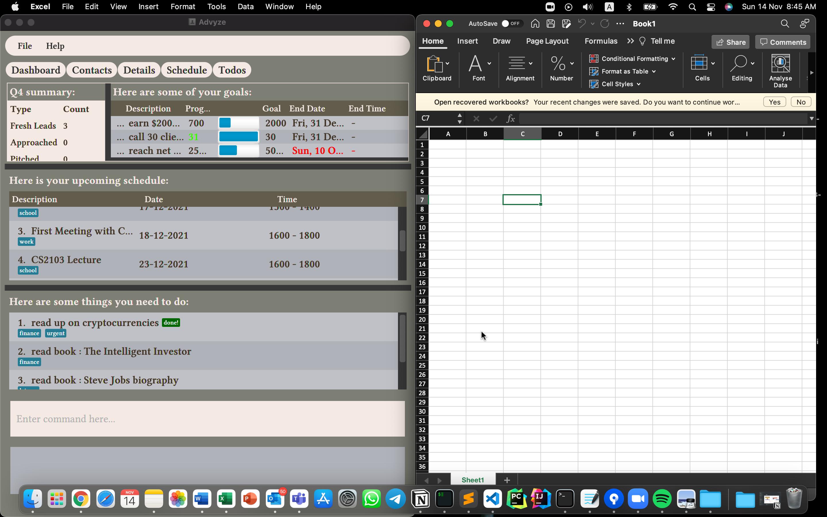
Resizing the screen causes the dashboard to look like the following: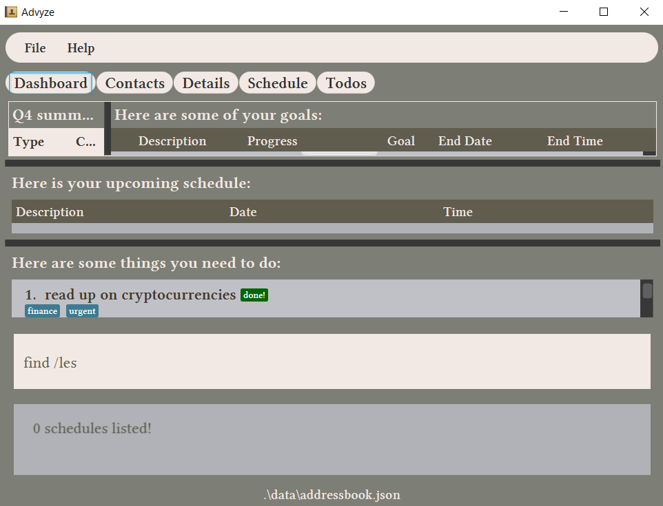 I felt like this is a low-to-medium level feature flaw, considering that the user might want to refer to another excel sheet for example, while opening up the application. I don't think that this is a rare occurrence if the user decides to add data from excel sheet one by one rather than just importing from the .ics file