 HolyZheng
commented
6 years ago
HolyZheng
commented
6 years ago Open HolyZheng opened 6 years ago
HolyZheng
commented
6 years ago HolyZheng
commented
6 years ago HolyZheng
commented
6 years ago 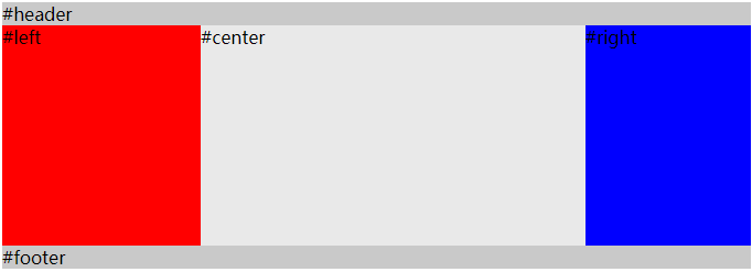
<div id="header">#header</div>

  <div id="container">
    <div id="center" class="column">#center</div>
    <div id="left" class="column">#left</div>
    <div id="right" class="column">#right</div>
  </div>

  <div id="footer">#footer</div>
实现的效果主要在container中,left 和 rgith固定宽度,center首先渲染,且自适应宽度。
    body {
      min-width: 550px;      /* 2x LC width + RC width */
    }
    #container {
      overflow: auto;        /* BFC */
      padding-left: 180px;   /* LC width */
      padding-right: 150px;  /* RC width */
    }
    #container .column {
      height: 200px;
      position: relative;
      float: left;
    }
    #center {
      background-color: #e9e9e9;
      width: 100%;
    }
    #left {
      background-color: red;
      width: 180px;          /* LC width */
      right: 180px;          /* LC width */
      margin-left: -100%
    }
    #right {
      background-color: blue;
      width: 150px;          /* RC width */
      margin-right: -150px;  /* RC width */
    }

    #header,
    #footer {
      background-color: #c9c9c9;
    }
该方案几个注意的点:
margin-left: -100%,使得left移动到container的左上角,在通过position:relative; right: 180px,移动到container的padding-left的位置上去。margin-right: -150px,使得它移动到container的padding-right的位置上去。ps: margin-left 和 margin-right 利用了浮动流的特性,使得第一行能够同时容纳center,left,right这三个元素。
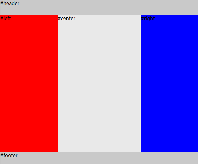
<div id="HolyGrail">
  <div id="header">#header</div>

  <div id="container">
    <div id="center" class="column">#center</div>
    <div id="left" class="column">#left</div>
    <div id="right" class="column">#right</div>
  </div>

  <div id="footer">#footer</div>
body {
min-width: 550px;
}
#HolyGrail {
display: flex;
min-height: 100vh;
flex-direction: column;
}
#container {
display: flex;
flex: 1;
}
#center {
background-color: #e9e9e9;
flex: 1;
}
#left {
background-color: red;
order: -1;
width: 150px;
}
#right {
background-color: blue;
width: 150px;
}
#header,
#footer {
height: 50px;
background-color: #c9c9c9;
}如果不考虑ie10及以下的浏览器,那么可以使用flexbox来实现圣杯布局。而且圣杯布局可以通过让container填充高度来使得footer达到一个sticky的效果。 flex兼容性
圣杯布局和双飞翼布局解决的问题是一样的,就是两边定宽,中间自适应的三栏布局,中间栏要在放在文档流前面以优先渲染。圣杯布局和双飞翼布局解决问题的方案在前一半是相同的,也就是三栏全部float浮动,但左右两栏加上负margin让其跟中间栏div并排,以形成三栏布局。不同的地方在于解决中间div内容不被遮挡的思路上面
padding-left和padding-right来使得内容div置于中间,然后再通过相对定位position:relative,配合right或left属性让左右两栏不则当中间内容。margin-left和margin-right为左右两栏留出位置。<div id="header">#header</div>
<div id="container">
<div id="center" class="column">
<div id="center-content">#center</div>
</div>
<div id="left" class="column">#left</div>
<div id="right" class="column">#right</div>
</div>
<div id="footer">#footer</div> body {
min-width: 550px; /* 2x LC width + RC width */
}
#container {
overflow: auto; /* BFC */
}
#container .column {
height: 200px;
float: left;
}
#center {
background-color: #e9e9e9;
width: 100%;
}
#center-content {
margin-left: 180px;
margin-right: 150px;
}
#left {
width: 180px;
background-color: red;
margin-left: -100%;
}
#right {
background-color: blue;
width: 150px; /* RC width */
margin-left: -150px; /* RC width */
}
#header,
#footer {
background-color: #c9c9c9;
}响应式布局就是页面根据不同的屏幕宽度,呈现不一样的布局样式。对应的方案有
html{ font-size: 62.5% }对应的工具库和ui框架有reset.css normalize.css respond.js bootstrap
reset 和 normalize的作用是:对默认样式进行重置,避免因为浏览器支持和理解的CSS规范不同,导致渲染页面时效果不一致,出现很多兼容性问题。它们的异同:异同
HolyZheng
commented
6 years ago transition属性是一个速记属性有四个属性:transition-property, transition-duration, transition-timing-function, and transition-delay。
transition: property duration timing-function delay;
Transform属性应用于元素的2D或3D转换。这个属性允许你将元素旋转,缩放,移动,倾斜等。
transform: none|transform-functions;
@keyframes myfirst
{
from {background: red;}
to {background: yellow;}
}

@-moz-keyframes myfirst /* Firefox */
{
from {background: red;}
to {background: yellow;}
}

@-webkit-keyframes myfirst /* Safari 和 Chrome */
{
from {background: red;}
to {background: yellow;}
}

@-o-keyframes myfirst /* Opera */
{
from {background: red;}
to {background: yellow;}
}

div
{
animation: myfirst 5s;
-moz-animation: myfirst 5s; /* Firefox */
-webkit-animation: myfirst 5s;  /* Safari 和 Chrome */
-o-animation: myfirst 5s;   /* Opera */
}语义化就是我们得html代码可以体现出页面的结构。语义化
语义化的标签有: h1-h6 p ul ol li table strong em header nav footer article section h1 页面的核心 h2 主栏目 h3文章标题 h4 副标题 h5 h6 小标题
HolyZheng
commented
6 years ago 弧形进度条
<!DOCTYPE html>
<!-- Learn about this code on MDN: https://developer.mozilla.org/zh-CN/docs/Web/API/Canvas_API/Tutorial/Drawing_shapes -->

<html>
 <body onload="draw();">
   <canvas id="canvas" width="200" height="200"></canvas>
   <script src="./demo.js"></script>
 </body>
</html>
let canvas = document.getElementById("canvas")
let ctx = canvas.getContext('2d')
ctx.beginPath()
ctx.strokeStyle = "orange"
ctx.lineWidth = 10
ctx.arc(100,100,50,0,Math.PI)
ctx.stroke()
作者:holyZheng 转载请注明出处
css基础
css选择器和优先级
css中常见的选择器有
css盒子模型
所有html元素可以看作一个盒子,它包括:外边距,边框,内边距,内容这几部分。
主动转换:可以通过box-sizing 对盒子模型进行转换
position
BFC
BFC(Block formatting context)直译为“块级格式化上下文”,具有BFC特性的元素可以看作是隔离了的独立容器,容器里面的元素不会布局上影响到外面的容器。 满足一下任一条件即可触发BFC特性
overflow
/ 内容会被修剪,并且其余内容不可见 / overflow: hidden;
/ 内容会被修剪,浏览器会显示滚动条以便查看其余内容 / overflow: scroll;
/ 由浏览器定夺,如果内容被修剪,就会显示滚动条 / overflow: auto;
/ 规定从父元素继承overflow属性的值 / overflow: inherit;
可继承的css属性
居中
/ 或者 / div { height: 300px; width: 400px; display: flex; align-items: center; } span { display: inline-block; width: 100px; }