Hvass-Labs
commented
5 years ago
Hvass-Labs
commented
5 years ago Thanks for the suggestion and the detailed PR description with images etc.
I can see the advantage of using the normalization. It is a good idea and I learned something here. But the downside is that it now looks like there is huge confusion. I would probably have to update the surrounding text to explain this. And then I would probably have to update the other tutorials that also use a confusion matrix. So it's maybe not as simple as just changing a few code-lines.
So I'm thinking about just leaving it as it is. I have closed this issue for now. But thanks again.
 Asciotti
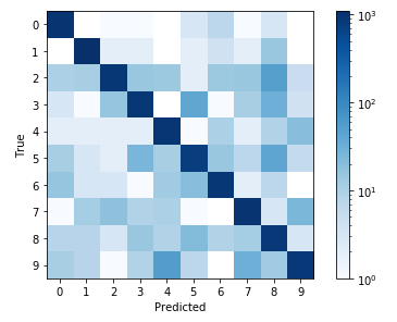
By not normalizing the data prior to plotting, the differences are difficult to see. The only caveat of this is that the colormap labels obfuscate the true data that is being plotted. There may be some tricks that can be done by manually changing the colormap object, similar example here.
Before normalization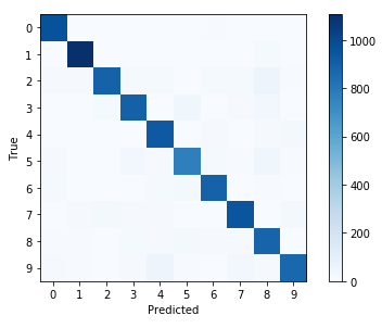
After normalization