Open modos189 opened 5 years ago
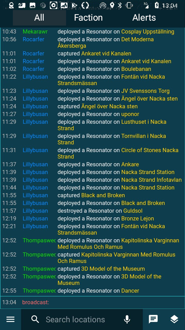
- Menu is moved to the bottom of the screen for easy pressing with one hand
- Map under status bar
- Button to open chat and notifications (+ tabs)
In my opinion we always can do swipe with one hand.
And bottom part of screen actually already have control: div#mobileinfo
('tap here for info screen'), which will become less accessible with proposed redesign.
(And in my own iitc setup right part div#innerstatus
is also used).
Free space in left sliding block, I want to move there some of the most common settings and plug-in settings. At the moment, the left block contains settings only for a very limited number of plugins.
I suppose it would be good. But please consider to separate Tools (e.g. Poltal list) from Options (e.g. Draw-tools opt). (I suppose we should separate them at desktop too)
It should be noted that swipe from bottom to open chat can not be done.
I suppose we should separate them at desktop too
agreed
It should be noted that swipe from bottom to open chat can not be done.
Right, it couldn't be directly invoked by swipe, as by swipe we open menu, from where we need to select chat tab.
About button: what of 3 chat tabs do you propose to open?
Button itself looks good, but I do not know where to place it..
Btw, it's easy to setup plugin to open chat on div#mobileinfo
'taphold' event.
At first we could open 'All' chat, and then remember last used tab.
P.S. We also could setup 'taphold' listener on input box title in chat window, it'd cycle between tabs.
BTW, I like your horizontal chat tabs.
Right, it couldn't be directly invoked by swipe, as by swipe we open menu, from where we need to select chat tab.
No, another reason. Chat opens inside WebView, but panel is part of Android UI. Theoretically, we can transfer information to application and draw messages using Android UI, but it makes little sense.
what of 3 chat tabs do you propose to open
At first we could open 'All' chat, and then remember last used tab.
yeap
I really like the idea, the chat in tabs is perfect !! I would also like to keep my suggestion to the drawer: https://github.com/IITC-CE/ingress-intel-total-conversion/issues/139 and also a change in colors, it is currently green, and I love it for being an ENL player, but I think it should be a color for both factions, maybe a dark theme? could also give an improvement in chat conversations.
@modos189 Do you have a test version ready for me to test? I'm really excited !!
No, another reason. Chat opens inside WebView, but panel is part of Android UI. Theoretically, we can transfer information to application and draw messages using Android UI, but it makes little sense
Why would we need this?
In js we are able directly call window.show('chat')
.
I suppose that call js from Java is also elementary.
and also a change in colors, it is currently green, and I love it for being an ENL player, but I think it should be a color for both factions, maybe a dark theme?
I'm thinking about using stock intel default color scheme.
@modos189 ?
it is currently green
I'm thinking about using stock intel default color scheme.
It's dark-blue now. But if change, I prefer gray. Probably. It need to test.
Do you have a test version ready for me to test?
No, for now this is a layout, even menu does not open.
Chat opens inside WebView, but panel is part of Android UI.
Why would we need this?
I mean, we can't open chat inside pull-out panel:
But clicking on button to open and close chat, of course, is possible.
I have prepared other versions of the layouts:
If i choose between these two, I prefer the second one. Besides, I'm not sure I can implement the first one.
I just wanted the map to appear under the status bar, I think it's very modern)
I mean, we can't open chat inside pull-out panel:
I see now. It would be great..
Is it possible to use swipe up as gesture only, to open usual chat pane?
but panel is part of Android UI.
What if we open WebView there? I wonder if it's possible to transfer data between webviews.
Is it possible to use swipe up as gesture only, to open usual chat pane?
I think it's possible
What if we open WebView there? I wonder if it's possible to transfer data between webviews.
In the second WebView, open a lightweight version of IITC that contains only chat? It can be done.
@modos189 How's the design going?
@Suburbanno I haven't done anything yet. Besides, I don't know yet in which direction to develop UI.
maybe something like this
@modos189 Well interesting what you did, but what do you think of using this? https://github.com/mikepenz/MaterialDrawer really like the fact that I show account information on the drawer
I'm not sure what it's possible to do with standard Android tools
omg, that's exactly what I was talking about, continue on this path and we'll have a UI/UX renewal
@modos189 I like profile info in side drawer. But not other entries:
no news? 😰
Chat could be opened by swipe-from-bottom gesture.
Okay, let's say
Misc settings deserve separate menu, like it is now (but we could move menu button in different place)
Where do put separate menu? The top panel will be overloaded with buttons
Anyway, we'd have an android developer. It seems that it will be difficult for me to implement.
Where do put separate menu?
For example, it could be represented by separate item in hamburger menu (near Settings), and for easy access additional gesture, like hold on hamburger icon (or layers icon).
Let's talk about not so big redesign. How about to transfer all links from info screen's toolbox to left side drawer?
Currently there are info, chats, and some plugins panes. But it'd be great to move all plugins there. And as we have a lot plugins it'd be convenient to organize them into accordion menu.
issue is dead? :(
@modos189 could you let me know if the idea about the redesign of IITC Mobile was abandoned? something new in mind?
I decided to play around with design and got this.
Menu is moved to the bottom of the screen for easy pressing with one hand
Map under status bar
Button to open chat and notifications (+ tabs)
Free space in left sliding block, I want to move there some of the most common settings and plug-in settings. At the moment, the left block contains settings only for a very limited number of plugins.
Screenshots
![photo_2019-04-23_13-04-18](https://user-images.githubusercontent.com/1785196/56573689-55df2f80-65ca-11e9-9d5a-667ecb87373f.jpg) ![photo_2019-04-23_13-05-19](https://user-images.githubusercontent.com/1785196/56573691-5677c600-65ca-11e9-9d11-96d68626d00f.jpg)I would like to know how much you like this idea, whether it makes sense to develop it. Also I would like to know ideas for improvements.