 eduardoinnorway
commented
7 years ago
eduardoinnorway
commented
7 years ago react-select is awesome, the only big backside issue is the styling, it is overstyled and is very unfriendly to theme. I suggest in next version to use CSS Modules.
Closed Codii closed 6 years ago
eduardoinnorway
commented
7 years ago react-select is awesome, the only big backside issue is the styling, it is overstyled and is very unfriendly to theme. I suggest in next version to use CSS Modules.
 ebrentnelson
commented
7 years ago
ebrentnelson
commented
7 years ago styled-components with theming please.
 jole78
commented
7 years ago
jole78
commented
7 years ago It's already "relative" easy to change the styling by using styled-components as an example.
import React from "react";
import ReactSelect from "react-select";
import styled from 'styled-components';

const MultiSelect = styled(ReactSelect)`
    &.Select--multi  {

        .Select-value {
            display: inline-flex;
            align-items: center;
        }
    }

    & .Select-placeholder {
        font-size: smaller;
    }
`

export (props) => <MultiSelect multi {...props} />
lstuartfry
commented
7 years ago
lstuartfry
commented
7 years ago @jole78 This works great. Any suggestions regarding conditional style rules based on props? Specifically, I'm trying to render each .Select-value item with a different background color, depending on that item's values. I have access to ReactSelect's 'value' prop (which is just an array of objects), but I can't figure how to uniquely style the backgrounds of each item in that array.
 agirton
commented
7 years ago
agirton
commented
7 years ago @lstuartfry one way is to add a className to a object in your value and then style it that way.
jole78
commented
7 years ago Yes @lstuartfry I would go with the same approach as @agirton suggested. Something like...
const SelectedCategory = styled.small`
    ${props => props.category ...etc... } // do something with it (read in styled-components docs how to...)
`;

const RenderSelectedCategory = (category) => (
    <SelectedCategory category={category}>
        {`${category.category_id} ${capitalize(category.name_display)}`}
    </SelectedCategory>
);

const CategoryPicker = ({ data: { category_choices, loading }, ...props }) => {
    return (
        <SelectMulti
            {...props}
            isLoading={loading}
            optionRenderer={RenderCategory}
            valueRenderer={RenderSelectedCategory} />
That of course shows how to render the selected item but you also have the optionRenderer to hook into if that's your use case.
lstuartfry
commented
7 years ago @agirton @jole78 Thank you for the suggestions! Following this pattern, I am able to style the inside of the .Select-value, but not the entire .Select-value itself. I apologize for my lack of experience using styled-components, as this is actually the first time I've implemented them.
Using the example above with the valueRenderer, I achieve this result:
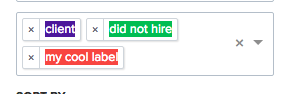
I'd like to achieve the result below, but with each selected value having a unique background color:
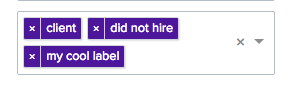
I'm only able to do this by setting a CSS rule for an entire custom ReactSelect, and selecting the first value's 'color' property in the 'values' array:
const MultiSelect = styled(ReactSelect)
     &.Select--multi {
          .Select-value {
               background: ${props => props.value[0].color};
               }
          }
I'm not sure if it's possible to target the parent .Select-value class and give it a unique rules based on each value in the 'values' prop. I'm going to give it a shot and check back in if I come up with a working solution. Thanks for the help!
agirton
commented
7 years ago Hi @lstuartfry another option is to use your own valueComponent and you can style it to your hearts content.
lstuartfry
commented
7 years ago @agirton Thanks! I was not aware we could pass our own custom valueComponent. This will work great.
For anyone looking for a similar solution, there's a good discussion in issue #1263 regarding the same topic.
 JedWatson
commented
6 years ago
JedWatson
commented
6 years ago I've implemented custom styling comprehensively in v2: https://deploy-preview-2289--react-select.netlify.com/styled
I'm working to finalise the API at the moment so anyone who's interested, please take a look at the alpha and open issues with feedback.
 oliviertassinari
commented
6 years ago
oliviertassinari
commented
6 years ago components property is a replacement for the renderXXX properties:
https://github.com/JedWatson/react-select/blob/692fe676813d9bc3382dcc405bc7e5ad1d35d2c7/src/components/index.js#L52-L74Any insight on this decision? I'm assuming you are fine with react-select increasing the bundle size of 10 kB gzipped. It was one of my main concern with using a CSS-in-JS runtime on Material-UI side. What's the server-side rendering story?
JedWatson
commented
6 years ago @oliviertassinari Thanks for taking a look! I really appreciate review + feedback at this stage.
You're right, the component injection pattern is a replacement for the old render{Component} properties. Thoughts on this:
optionComponent and optionRenderer are basically the same thing point with slightly different implementations) so I wanted to clean it upcomponent prop on react-router's <Route> is effectively prior art)innerProps for things Select thinks should be added but it's super flexible.I explored render props but that's basically what downshift does, and imo it moves way too much implementation detail onto the consumer. What I like about component injection is you can switch out (or wrap) what you need to while leaving the framework to do the heavy lifting and inherit the behaviour you don't actually need to re-implement.
re: Glam, yep, I'm loving it.
Basically it does everything I could want, and is the lightest / fastest implementation for what I need that I've found (so far). However I haven't dug into the SSR story yet and it's a shame that @threepointone isn't planning to do much with it going forward...
I'm not stuck on any implementation specifically, just the pattern. We've isolated the usage of it to the Primitive components, everything else just passes down css objects. So in theory, we could possibly ship a variant without a css-in-js dependency and let the consumer provide their own - for instance, I'm working on Atlaskit at the moment which uses styled-components.
I may also ship with something more mature / maintained if it becomes important. e.g. emotion looks pretty great and supports basically the same API. So I don't feel locked into glam, and it's working for now.
re: size, that's a downside for sure, and something I care about. The reason that the Animated components are in their own entry point is I don't want to ship react-transition-group unless people opt into it.
So I'm exploring ways to mitigate the size issue, but compared to the difficulty of maintaining and extending styles in v1 even if it adds 10kB I think it's a reasonable trade-off. It keeps the API simple and clean and has been so much easier to work with than less/scss - let alone supporting both.
 threepointone
commented
6 years ago
threepointone
commented
6 years ago happy to implement SSR alá glamor, shouldn't be too hard
jole78
commented
6 years ago As a comment to the v2 api in regards to styling I would say that. (these are more general comments)
It's usually pretty hard for a UI lib like this (or react-bootstrap, semantic ui, react-widgets etc) to both provide styling and options to change that styling. In general people, like me, use these libs because we are too lazy (or less skilled) to implement the styling ourselves. Generally they also have some logic as to how selects are handled and if you where to abstract just that part and leave the styling (or rendering) up to us, the users, it would more be something along the lines of what downshift is trying to do. But I would say that styling these libs often comes with using a the provided stylesheets which is fine. If I want to change the styling...I'll have to change the stylesheet...simple as that. If I want to use any sort of css-in-js lib...that's up to me as long as the library supports className that's fine. The library could support theming though...and usually what do people want to change?? colors I would say. So some sort of theming support is often nice. But maybe not theming through changing the css...perhaps more like a theme prop that has color and what not. I would not enforce people to use glam, styled-components, or any of those things...because people have different tastes. If you where to use glam for this...people will say say I don like object styles...and also the opposite. So...in closing...keep it as it it is and maybe allow for easier style changing perhaps and perhaps add theming support (maybe its already there)
oliviertassinari
commented
6 years ago @JedWatson Thanks for the details. I'm happy to see you pushing this path forward. Once the API is more stable, I will try upgrading the react-select on Material-UI side to the v2. There is a lot of API decisions to make when trying to implement an extendable component like this one :).
 tomprogers
commented
6 years ago
tomprogers
commented
6 years ago A better solution for flexible theming might be to separate essential layout styles from coloring styles, and then implement the default theme using reasonable selectors. Consumers can then copy the theme sheet and swap out color values.
As a web person, I consider styled-components grotesque. It seems like restyling react-select takes about as long as it would to simply re-implement the subset of features I actually need.
JedWatson
commented
6 years ago @tomprogers
As a web person, I consider styled-components grotesque. It seems like restyling react-select takes about as long as it would to simply re-implement the subset of features I actually need.
Are you saying that specifically having looked at the way custom styling is implemented in react-select@v2? or just more generally? or are you talking about v1.x?
To be clear, we are providing extensive classNames in v2 to make style overrides easy for users, regardless of their preferred approach to css (vanilla, scss, less or css-in-js).
 a-x-
commented
6 years ago
a-x-
commented
6 years ago Where I can find styles docs?
can I apply followed styles via styles prop?:
I want to fix Material-UI wrapper (file on github)
 GarrettGeorge
commented
6 years ago
GarrettGeorge
commented
6 years ago What's a modern approach to using styled-components I've tried implementing the example above but the styles aren't being applied.
StyleCreatable:
import React from 'react';
import { Creatable } from 'react-select';
import styled from 'styled-components';

const StyledCreatable = styled(Creatable)`
    .Select-multi-value-wrapper {
        margin-bottom: 5px;

        &.Select-value {
            border-radius: 15px;
        overflow: hidden;
        border: none;
        font-size: 13pt;

        &.Select-value-icon {
                padding: 3px 8px 3px 0px;
            border: none;
            background: #4A90E2;
            border-radius: 0;
            color: white;
        }

        &.Select-value-label {
            background-color: #4A90E2;
            color: white;
            border-radius: 0;
            padding: 3px 10px;
            float: left;
        }
        }
    }
`

export default (props) => <StyledCreatable {...props} />
dvzrd
commented
6 years ago
dvzrd
commented
6 years ago I'm having the same problem as GarrettGeorge
Seems like the select component's class names have been replaced by auto generated ones in the new version (v2).
The react-select markup renders with class names that look something like this: css-1aya2g8 so that's why targeting class names inside the wrapper doesn't work anymore.
You need to add classNamePrefix prop to your select component and the markup that gets rendered will have usable class names you can then target inside your wrapper.
 gus3inov
commented
5 years ago
gus3inov
commented
5 years ago @dvzrd thanks !!!
 newyorrker
commented
5 years ago
newyorrker
commented
5 years ago Ok, how i can remove the classNames like this: css-1aya2g8?
And second question, how i can disable default styles?
 voyagertravel
commented
5 years ago
voyagertravel
commented
5 years ago Ok, how i can remove the classNames like this:
css-1aya2g8? And second question, how i can disable default styles?
 ThugDebugger
commented
5 years ago
ThugDebugger
commented
5 years ago @newyorrker Did you figure out how to remove this?
 koutsenko
commented
5 years ago
koutsenko
commented
5 years ago Same question, can i remove default styles? I inserted TextField as Control component, but still have wrong font size and strange margin & paddings
 sudhamab
commented
4 years ago
sudhamab
commented
4 years ago @JedWatson thanks for this really amazing library! It is very close to what we need and very easy to plug in. Except It’s consuming a lot of time trying to customize some of the UI
I am trying to customize react-select to add a couple of Typeform like behaviours
I used the code in the sample below and it’s really good https://material-ui.com/components/autocomplete/#react-select
I would be grateful if you can help me as I’ve tried a lot of other libraries and react-select seems the ideal starting point
Disclaimer: As you may tell, I am not a CSS expert and only recently doing a lot of front end in React so getting familiar with all the great libraries
thanks a ton!
regards Sudhama
oliviertassinari
commented
4 years ago I used the code in the sample below and it’s really good https://material-ui.com/components/autocomplete/#react-select
@sudhamab The link to Material-UI is outdated as of yesterday, it should be https://material-ui.com/components/integrated-autocomplete/ instead.
sudhamab
commented
4 years ago thanks very much @oliviertassinari ! this is useful and it got me one step ahead but I still need help with the things I mentioned earlier. Would be immensely grateful to have a solution for these as it offers for a very fast user experience
if I type something which is not in the menu. I should NOT see the "No options" menu item. I should just be able to proceed with what I have typed
Then, I should have a way to listen to Enter button so I can proceed with the option I typed or then the one I selected ( after I click on enter to pick the option )
I want to be able to clear the text by clicking on the back button as I type OR Select All ( Command / Cntrl + A ) and then deltee EVEN AFTER I select from the Drop down
oliviertassinari
commented
4 years ago @sudhamab You might like the freeSolo prop.
sudhamab
commented
4 years ago thanks @oliviertassinari ! not seeing this in the react-select docs so adding it to
sudhamab
commented
4 years ago @oliviertassinari react-select has isClearable prop which helped. Now, I just need to solve to "not show the drop down of No Option. And finally see how to listen to the Enter event and pass the selected value to redux store.
 mdere-unbound
commented
4 years ago
mdere-unbound
commented
4 years ago Is there a comprehensible list of the classnames somewhere?
 remjx
commented
4 years ago
remjx
commented
4 years ago Is there a comprehensible list of the classnames somewhere?
I think this is what you're looking for https://react-select.com/styles#style-object and this shows how to style them https://react-select.com/styles#select-props
Hi !
I like using react-select, but I am less comfortable with the given possibilities to style the component.
We are supposed to include a css stylesheet to make it work. Which leaves us few choices if we want to deeply customize the component :
It looks ok for most of the cases, but when we want to customize the component more seriously, things become messy real quick.
What if for instance, we want the component to have a variable width and behave like an autosize input ? (If we set
width: auto;to the component, it kind of works but doesn't make the component fit the whole width of the selected value. -- But it might be an other issue on the component styles.What would be awesome would be to use a BEM approach to define a set of classes respectful to the DOM hierarchy of the component -> Which would be possibly overridden with a "theme" prop.
That would have the good benefit to let users extend styles of the component with css modules, or just using a more clear structure like BEM if he wants to stick with css.
I really like the way react-autowhatever deals with the issue, see : https://github.com/moroshko/react-autosuggest#theme-optional Possibly a good source of inspiration.