 KisaragiEffective
commented
4 years ago
KisaragiEffective
commented
4 years ago +1, it will make it more readable and make text art easier
Open STRRL opened 4 years ago
KisaragiEffective
commented
4 years ago +1, it will make it more readable and make text art easier
 philippnurullin
commented
4 years ago
philippnurullin
commented
4 years ago @STRRL Hi, at firs a thought that i understood your request & now i think a don't. Can you explain more about the monospace CJK. You want the support for the language system or something els? Sorry if my questions is stupid.
 STRRL
commented
4 years ago
STRRL
commented
4 years ago You want the support for the language system or something els?
Sorry, I don't know anything about font or language system. I could only show you the differences as a user.
It will use a fallback one when current font does NOT support a character. Most common case: source code of markdown table. Pay attention to line 9
Font: Sarasa Mono T SC; No fallback font

Jetbrains Monol; No fallback font
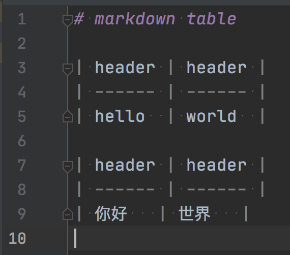
The last | in line 9 is not at same position with previous line.
philippnurullin
commented
4 years ago @STRRL To achieve that we need proper support of CJK languages. Currently we don't have the expertise to add thees languages, so it will be nice if you can recommend someone.
 delphinus
commented
4 years ago
delphinus
commented
4 years ago @STRRL You should set CJK fonts on your app in addition to JetBrains Mono. For example, iTerm2 can achieve this in preferences.

But it is sure that some apps cannot set another font for double-with characters. So it is desired that JetBrains Mono includes CJK glyphs. JetBrains Mono has glyphs with 1000 (height) x 600 (width), and CJK glyphs have 1 x 1 typically. It is a bit problem.
delphinus
commented
4 years ago FYI, I use this setting and feel comfortable in the terminal ;) SF Mono Square is my own project.

 thynson
commented
4 years ago
thynson
commented
4 years ago Most monospace font is 5:3 instead of 2:1, which does not align with CJK characters well, which are always fit into a square, except a few fonts (e.g. Inconsolata and Ubuntu Mono) and fonts designed to align well with CJK fonts(e.g. Sarasa Mono). So actually what CJK users need is a condensed version. Personally I use Inconsolata, through it lacks some features, e.g. ligatures but I'm satisified with it.
 Firestar-Reimu
commented
3 years ago
Firestar-Reimu
commented
3 years ago But if you make CJK characters twice as wide as a Latin character, then the latin letters will be very thin and small. I do not like Sarasa Mono's Latin display.
delphinus
commented
3 years ago @thynson @1900011604
So actually what CJK users need is a condensed version.
That is not always needed. You can insert spaces into top/bottom of latin glyphs, and combine with CJK glyphs.
For one example, I made up SF Mono Square (mentioned above). I did below.
SF Mono has 1:1.61794 (golden ratio). I shrank glyphs to fit 1x2 boxes.
| before | after |
|---|---|
 |
 |
I also shrank CJK glyphs to fit latin ones. I used 82% for tis.
Combined them.
Here is an example.

Each glyph box has 1x1 or 1x2, but latin glyphs still have their own shapes.
One problem is that the font size becomes different to get the same look with the original (SF Mono) and the combined one (SF Mono Square). It is because of the shrinking process for glyphs.
| SF Mono Square 16pt | SF Mono 13pt |
|---|---|
 |
 |
It is a bit annoying but permissible, I think.
thynson
commented
3 years ago But if you make CJK characters twice as wide as a Latin character, then the latin letters will be very thin and small. I do not like Sarasa Mono's Latin display.
I don't like Sarasa Mono, too. You can try Inconsolata if you don't need those modern features.
Firestar-Reimu
commented
3 years ago What about calculate the needed spaces and automatically added them symmetricly before and after the texts?
In Windows Terminal or Konsole on Manjaro, they added spaces between characters to make CJK characters twice the width of Latin letters, its drawback is: CJK texts looks ugly.
 (Look at Line 3 and 4, My fallback font is Microsoft Yahei)
https://zhuanlan.zhihu.com/p/65213649
(Look at Line 3 and 4, My fallback font is Microsoft Yahei)
https://zhuanlan.zhihu.com/p/65213649
Firestar-Reimu
commented
3 years ago @thynson @1900011604
So actually what CJK users need is a condensed version.
That is not always needed. You can insert spaces into top/bottom of latin glyphs, and combine with CJK glyphs.
For one example, I made up SF Mono Square (mentioned above). I did below.
1. [SF Mono](https://developer.apple.com/fonts/) has 1:1.61794 ([golden ratio](https://en.wikipedia.org/wiki/Golden_ratio)). I shrank glyphs to fit 1x2 boxes.

   before
   after

   <img alt="" width="300" src="https://user-images.githubusercontent.com/1239245/96712779-98a9df80-13da-11eb-8772-0f556710f24b.png">
   <img alt="" width="300" src="https://user-images.githubusercontent.com/1239245/96712796-a0698400-13da-11eb-9308-7c812b7b1230.png">

2. I also shrank CJK glyphs to fit latin ones. I used 82% for tis.

3. Combined them.
Here is an example.
Each glyph box has 1x1 or 1x2, but latin glyphs still have their own shapes.
One problem is that the font size becomes different to get the same look with the original (SF Mono) and the combined one (SF Mono Square). It is because of the shrinking process for glyphs. SF Mono Square 16pt SF Mono 13pt
It is a bit annoying but permissible, I think.
why not 1:1.61803?
thynson
commented
3 years ago That is not always needed. You can insert spaces into top/bottom of latin glyphs, and combine with CJK glyphs.
@1900011604 This project is a font project, not an editor project. If any editor aligns CJK character with any monospace font well, that's good. But if there was a condensed variant of JetBrains Mono that aligns well with CJK character by design while also looks good in 1:2 ratio, any editor can benefit from it.
 wisenut2009
commented
3 years ago
wisenut2009
commented
3 years ago The font mixed with MS YaHei and JetBrains Mono can be downloaded from CSDN. There are also mixed fonts for FiraCode, Source Code Pro, Menlo, etc.
 wytsai7660
commented
8 months ago
wytsai7660
commented
8 months ago Sorry if this is a bit off-topic. I'm currently looking for a fallback Chinese font (specifically TC) that maintains a strict 2:1 ratio with JetBrains Mono. Does anyone have any recommendations? I'm currently using Maple Mono SC NF, but the issues are quite apparent since this project is primarily designed for SC. I'm hoping for other options or if there's a specific term for fonts of this type that we can search for. Thanks.
wisenut2009
commented
8 months ago https://pan.baidu.com/s/1uUT4OplTetoyPll4j1lzuw?pwd=sd6n
Not sure if that helps.
From: wytsai7660 Date: 2023-12-29 22:34 To: JetBrains/JetBrainsMono CC: wisenut2009; Comment Subject: Re: [JetBrains/JetBrainsMono] CJK monoscape support? (#20) Sorry if this is a bit off-topic. I'm currently looking for a fallback Chinese font (specifically TC) that maintains a strict 2:1 ratio with JetBrains Mono. Does anyone have any recommendations? I'm currently using Maple Mono SC NF, but the issues are quite apparent since this project is primarily designed for SC. I'm hoping for other options or if there's a specific term for fonts of this type that we can search for. Thanks. — Reply to this email directly, view it on GitHub, or unsubscribe. You are receiving this because you commented.Message ID: @.***>
thynson
commented
8 months ago https://pan.baidu.com/s/1uUT4OplTetoyPll4j1lzuw?pwd=sd6n Not sure if that helps. From: wytsai7660 Date: 2023-12-29 22:34 To: JetBrains/JetBrainsMono CC: wisenut2009; Comment Subject: Re: [JetBrains/JetBrainsMono] CJK monoscape support? (#20) Sorry if this is a bit off-topic. I'm currently looking for a fallback Chinese font (specifically TC) that maintains a strict 2:1 ratio with JetBrains Mono. Does anyone have any recommendations? I'm currently using Maple Mono SC NF, but the issues are quite apparent since this project is primarily designed for SC. I'm hoping for other options or if there's a specific term for fonts of this type that we can search for. Thanks. — Reply to this email directly, view it on GitHub, or unsubscribe. You are receiving this because you commented.Message ID: @.***>
@wytsai7660 wants a Traditional Chinese Font, while YaHei will not be the one he would satisfied with.
Sorry if this is a bit off-topic. I'm currently looking for a fallback Chinese font (specifically TC) that maintains a strict 2:1 ratio with JetBrains Mono. ...
I would suggest that, instead of looking for a Chinese fallback font fallback, use a 2:1 ratio monospace font, e.g. Inconsolata, and increase the font size by 2pt in your editor (e.g. changing it 14pt from 12pt); or, use Sarasa Mono which provides Traditional Chineses character support. Most of the combined fonts were made by scaling up the Chineses font by 20%, which often makes the baselines inconsist between CJK characters and Latin characters.
How about supporting keeping monoscape with Chinese, Japanese, Korean character like Sarasa Mono
It makes every CJK character as width as two latin character
It is really cool!