JetBrains / JetBrainsMono

JetBrains Mono – the free and open-source typeface for developers
https://jetbrains.com/mono
SIL Open Font License 1.1
10.57k stars 299 forks source link

IJ #578

Open mulliganaceous opened 1 year ago

mulliganaceous commented 1 year ago

As of now, the font is still missing the IJ glyph in Latin Extended-A.

The best design for the capital IJ should look like a broken U.

JBIJij

philippnurullin commented 1 year ago

Hi @mulliganaceous Thanks for the feedback. You are absolutely right, there is no such symbol in JetBrains Mono, and it is by design. This traditional ligature breaks the golden rule of monospaced typeface: never modify the number of symbols in the line. It merges two symbols into one and also merges the space taken by the symbols.

Every ligature we have in JetBrains Mono is taking the same amount of space regardless of legation.

Why do you need this particular glyph?
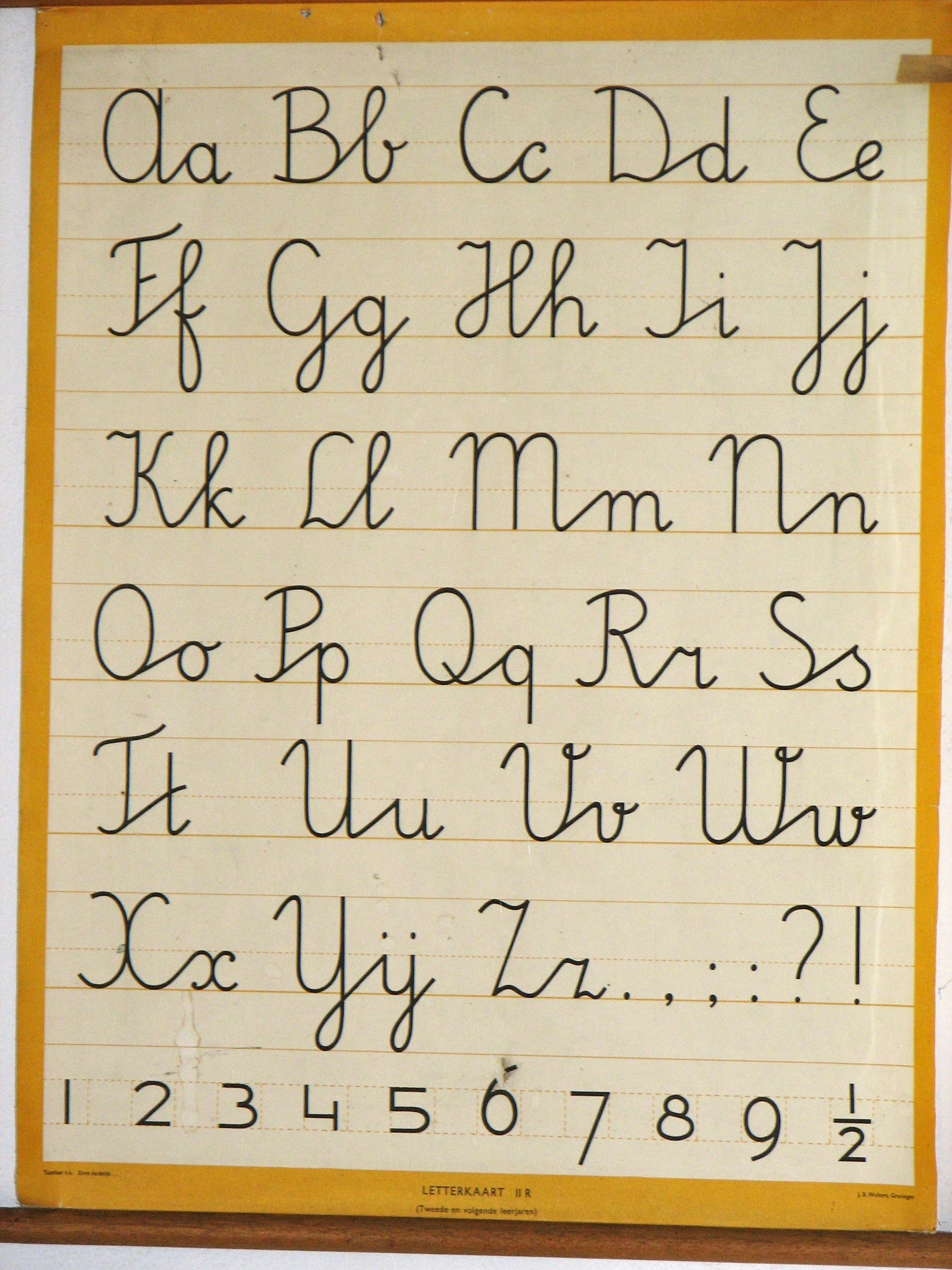
mulliganaceous commented 1 year ago

Some Dutch say this is a single letter; there is a monogram for IJ. Likewise, serbicroatian has Lj Nj Dž digraphs.

smups commented 1 year ago

tl;dr: ij/IJ is very much the same as æ/Æ and œ/Œ: technically they're just two letters smushed together, but they are often considered to be a single letter as they don't make the sound as their constituent letters (at all) and must always be capitalised together.

Longer story: the combination ij has a special place in dutch orthography and spelling. It would be nice to have the option to use the characters ij/IJ for those who prefer to indicate that it is a single letter; like how the Danes often prefer to write æ over ae.

In addition, in handwriting ij is always written as a single letter (like y/Y with dots on top). Some users might want to emulate that look by using the ij/IJ characters. For reference, this is what Dutch handwriting (as taught in school) looks like:

wikipedia

The main difference between Danish æ and Dutch ij is that the status of ij as a single letter is much more contentious than the status of æ as a single letter. The situation is comparable to French œ, in the sense that computers don't have a separate key for œ/ij, and it's not incorrect or something to write the two as separate letters.

Right so this is why one might argue that ij is a single letter:

For different reasons, it's often thought of as two letters too:

Some more examples from wikipedia

wiki

smups commented 1 year ago

Oh and btw, I think OP was asking for characters for the IJ (U+0132) en ij (U+0133), s.t. Dutch users can have access to nice letters without annoying non-dutch users with an unexpected/unwanted ligature.

philippnurullin commented 1 year ago

Hi @smups Thanks for the deep dive in the issue.

How do Dutch users usually access the IJ ij?

smups commented 1 year ago

@philippnurullin I don't think I can really speak for most users tbh, since I suspect that most don't use it (even though I personally really like ij), because it's a bit of a hassle to type and ij looks just fine for non-monospaced/Dutch specific fonts.

As for access to the glyph, on OS's with a compose key you it's quite easy to type: compose + i + j. You can make the capital version by typing compose + I + J. This is what I personally prefer. On Windows, you can use an alt code alt + 0307 for the small letter and alt + 0306 for the capital. MacOS has no support for ij at all beyond picking it from a special characters menu.

smups commented 1 year ago

Most Dutch (Netherlands) users use a standard US QWERTY keyboard with dead keys or a compose key btw, AZERTY (the French layout) is also common in Belgium cuz of the whole bilingual thing they got going on.

philippnurullin commented 1 year ago

Sounds like a pain. )

If there is no ligation expected from I+J and i+j then the symbols can be added.

Thanks again for the very helpful and interesting conversation. The numbers on the Dutch handwriting manual are my absolute favorite. And "A dude in the 1920's said so" historically speaking, is a very solid argument. I mean, it really is. ))

smups commented 1 year ago

If there is no ligation expected from I+J and i+j then the symbols can be added.

That'd be cool! I know it´s a bit of a niche issue (even amongst Dutch users), but it would make some of us (me) very happy if those symbols would be available :)

In case you're wondering about who exactly the dude from the 20's is that said so, I'm actually wrong about that lol, he (Kollewijn) supported the usage of y over ij. IJ was already official at that point because another two dudes had said so 40 years prior (De Vries en Te Winkel, 1880's). South Africa actually implemented Kollewijns spelling reforms, which is why contemporary Afrikaans has y instead of ij, and -lik instead of -lijk (amongst other differences).

smups commented 1 year ago

Hi again!

Thank you so much for adding ij and IJ, they look great!

I tried out the dev. version of the font. I think it works very well. I really like what you did with the capitol IJ, I think it looks great, although I think it might not work so well at a distance/with a small font size.

This first example I think really shows that the ij ligature significantly improves readability - the word "dijing" especially looks a lot better with the new ij.

image

The next example I have is a comparison between an ad of the Rijksmuseum with their own custom font and a recreation with the new ligatures: image image

mulliganaceous commented 5 months ago

Saw this, quite surprised that "ij" is still up to consideration. Personally, jetbrains mono is also a great ux font!