Team's Response
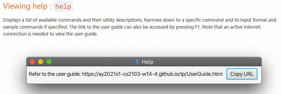
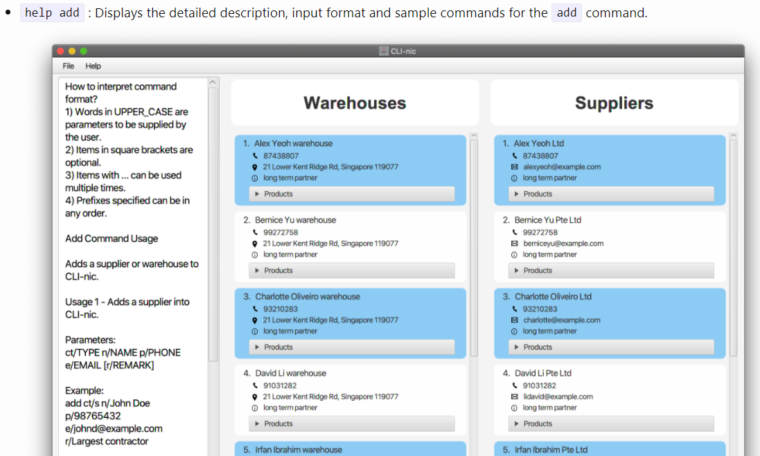
The help message is meant to be comprehensive for users who may want an overview of all commands without leaving the app or when not connected to the internet. If the user is interested in a specific command, the user can use help [COMMAND] instead as shown below.

There are multiple alternatives that are available to suit different users if readability is the issue, provided that they are willing to leave the app and/or have access to the internet. To share a few:
- By visiting the User Guide through clicking
F1or help at the top left hand corner to obtain link to UG.

- Viewing help for specific commands can reduce the volume of information

Items for the Tester to Verify
:question: Issue response
Team chose [response.Rejected]
- [x] I disagree
Reason for disagreement: I disagree with the team on the statement that There are multiple alternatives that are available to suit different users if readability is the issue, provided that they are willing to leave the app and/or have access to the internet..
I feel the application should be user friendly for the user to use. If they do not have enough information to understand the application, the user will go the help section to refer to the user guide. Not only that, the alternative mentioned which is the user guide is not as comprehensive as the help in the application. (Much information can be transferred to the user guide and important details should be left in the application).
Summary of all the commands under
helpmay be shorter. There's too much information to take in. It is also difficult to read long texts vertically in a column.