nus-se-bot
commented
1 year ago
nus-se-bot
commented
1 year ago Team's Response
No details provided by team.
The 'Original' Bug
[The team marked this bug as a duplicate of the following bug]
Lack of visuals
Note from the teaching team: This bug was reported during the Part II (Evaluating Documents) stage of the PE. You may reject this bug if it is not related to the quality of documentation.
The UG only had 1 picture, I believe that adding more visuals such as screenshots could be useful in helping the readers understand.As a user I felt that this portion was hard to understand, adding a image here would have been useful.
[original: nus-cs2103-AY2223S1/pe-interim#3555] [original labels: severity.VeryLow type.DocumentationBug]
Their Response to the 'Original' Bug
[This is the team's response to the above 'original' bug]
- It is not feasible to show multiple visuals for each feature, especially for features that are easily understandable. If a feature has 3-5 screenshot visuals, the user would need to do a lot of scrolling and that would make the experience less convenient.
Items for the Tester to Verify
:question: Issue duplicate status
Team chose to mark this issue as a duplicate of another issue (as explained in the Team's response above)
- [x] I disagree
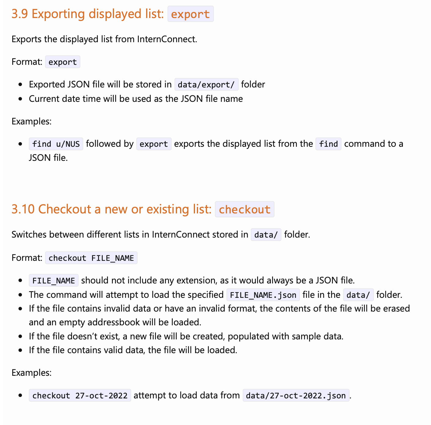
Reason for disagreement: The original issue was a lack of multiple visuals for all the features. However, my issue is with the lack of visuals overall. My issue is that there needs to be at least visuals for features that are hard to visualise or use like export, checkout.
:question: Issue response
Team chose [response.Rejected]
- [x] I disagree
Reason for disagreement: According to the grading, UG bugs include lack of visuals if they hinder readers, in this case it does as readers would not know how to find the files in command like export and checkout, or visualise the outcome of their commands.
:question: Issue severity
Team chose [severity.VeryLow]
Originally [severity.Low]
- [ ] I disagree
Reason for disagreement: [replace this with your explanation]
There is a lack of visual aids like diagrams and screenshots. There is only 1 screenshot at the start that shows the default look of the app. Perhaps diagrams like arrows and pointers can be added to the default look of the app to tell users where is the command box, where the current list is. Users may not know where to type in the commands or know where each result will display at.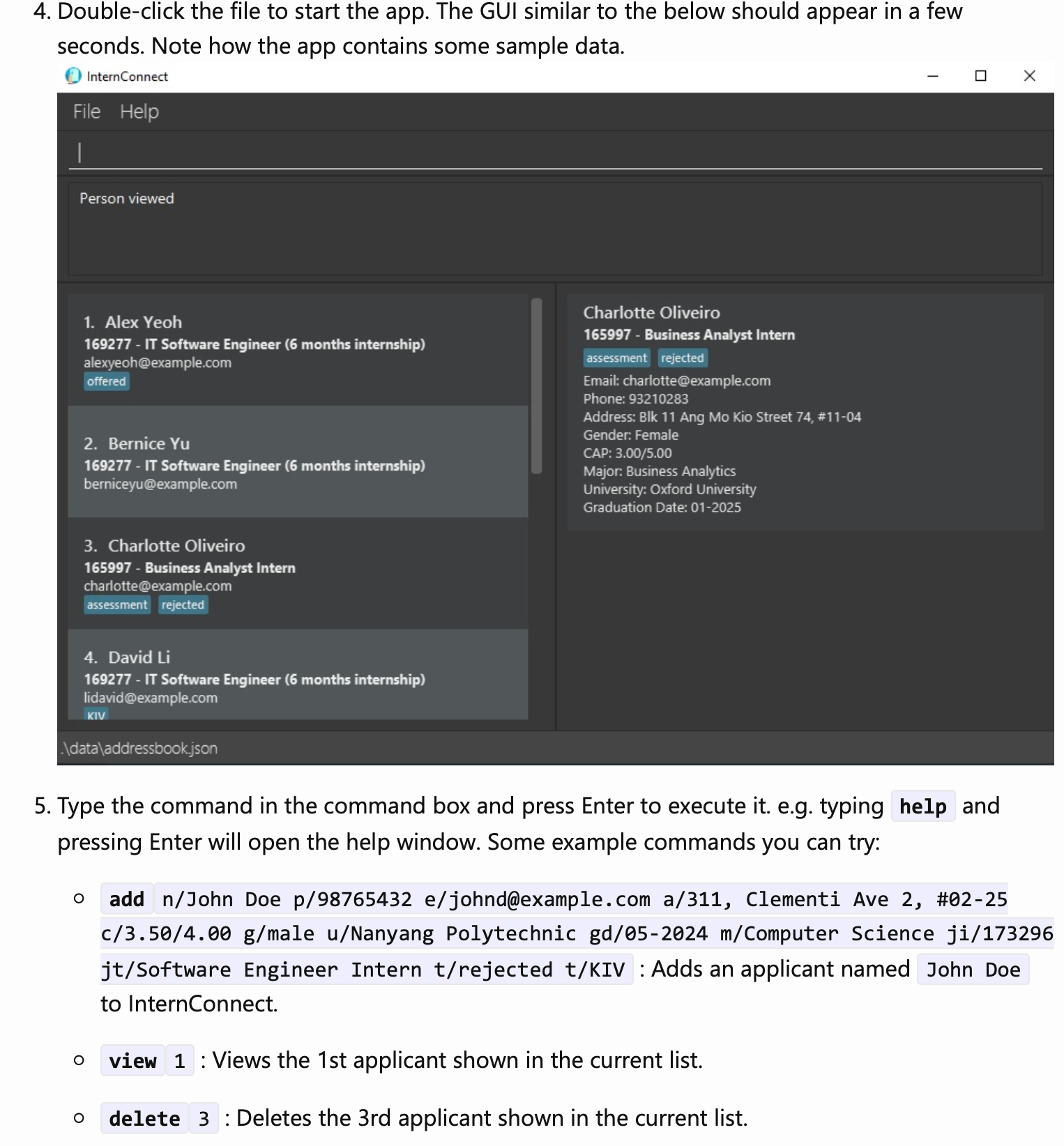
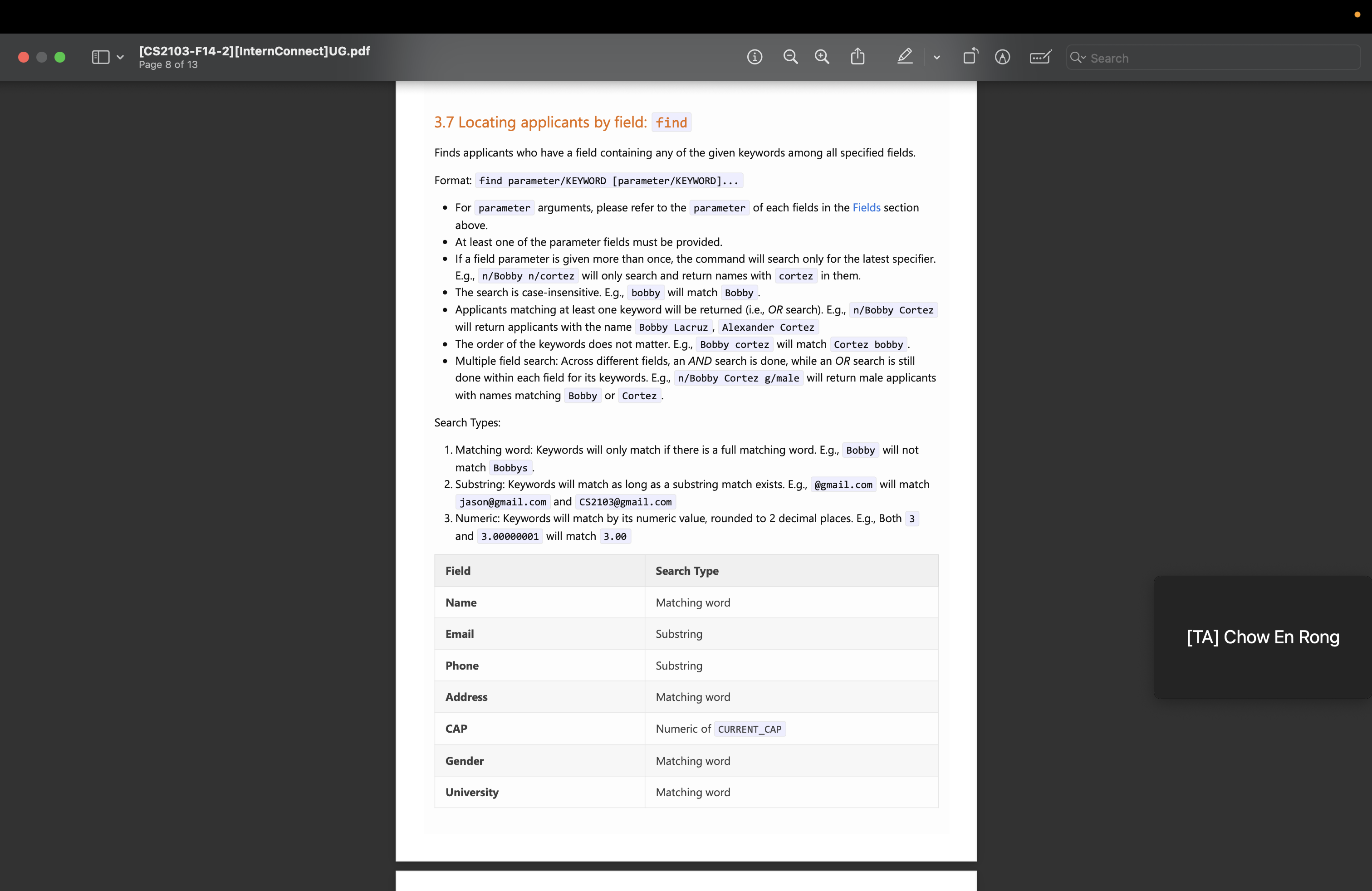
Perhaps adding screenshots to commands like find can be great, so that users know how the found profiles will be shown.